Table of Contents
- INTRODUCTION
- BUTTON LOCATION TO CREATE CHARTS IN EXCEL
- BENEFITS OF USING CHARTS IN EXCEL
- STEPS TO INSERT A CHART IN EXCEL
- CHANGE AXIS OF CHART [SWITCH ROW/COLUMN] IN EXCEL
- CHANGE THE TYPE OF CHARTS IN EXCEL
- CHANGE THE LAYOUT OF CHARTS IN EXCEL
- INSERT/EDIT THE CAPTIONS OF CHARTS IN EXCEL
- CHANGE THE STYLE OF CHARTS IN EXCEL
- HOW TO EDIT/CHANGE THE DATA FOR CHARTS IN EXCEL ?
- HOW TO EDIT/CHANGE THE SOURCE OF DATA FOR CHARTS IN EXCEL ?
INTRODUCTION
CHARTS are the graphic representation of any data . As we know that EXCEL is a super analytical tool.
Analysis of data is the process of deriving the inferences by finding out the trends,totals, subtotals other operations etc. about different parameters.
Data is everywhere. There is no work, where we don’t deal with the data.
Sales data in business, employee data, patient data in hospitals, students data in school etc. Maximum data is presented in the tables but we all know that visual representation is easier to interpret. That is the reason EXCEL provides many options to create different types of useful charts.
EXCEL gives us a variety of charts which are beautiful, colorful, more customizable and more powerful.
This article help you to learn the basics of charting in Excel.
In this article we would learn –
- How to create a chart in EXCEL
- Change the style [look and feel] of the chart.
- Add axis elements
- Edit the data of the chart
- Edit the captions of the charts.
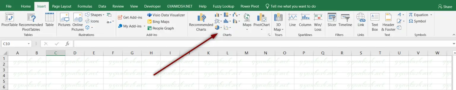
BUTTON LOCATION TO CREATE CHARTS IN EXCEL
There is a separate section for creating charts under the INSERT TAB.
The charts options are present under the INSERT TAB under CHARTS SECTION.
We can choose RECOMMENDED CHARTS option from the charts section to choose the desired chart type or we can choose from the different given chart buttons.
BENEFITS OF USING CHARTS IN EXCEL
There are many benefits of charts or graphs such as:
- While analyzing tabular data, we can’t have the proper insight about the trends whether any parameter like sales, buyers etc. are increasing or decreasing.But with the charts of graphs, these parameters and the pace of increase or decrease can easily be judged by the slope of the charts.
- We can check the contribution of any task or process as a percentage at a glance using the pie charts.
- We can compare the values using the columns or bars instantly.
- We can watch the hierarchy using sunburst charts in a second.
- Similarly, there are many types of charts which are apt for different situations and are very easy to use.
STEPS TO INSERT A CHART IN EXCEL
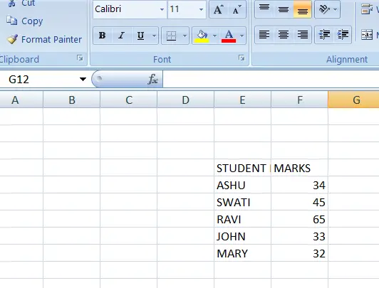
A chart is always made from the data in the tabular form. So before making a chart , we need the data in the tabular form.
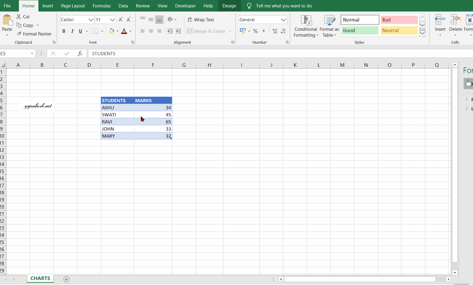
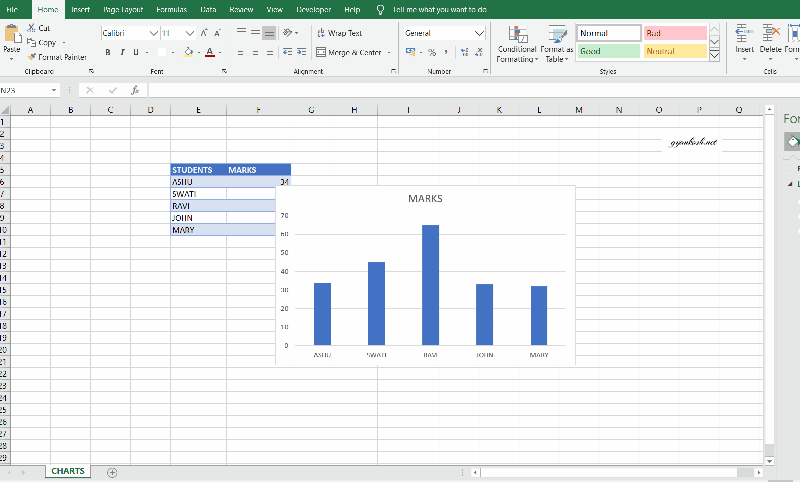
Suppose we have the marks of the students as given in the table.
Before the steps, let us check the available data.
DATA SAMPLE:
The data is simple and short. It comprises of marks of 5 students. Lets try to make different charts for this data.[DATA CAN BE COPIED EASILY FOR PRACTICE]
| STUDENTS | MARKS |
| ASHU | 34 |
| SWATI | 45 |
| RAVI | 65 |
| JOHN | 33 |
| MARY | 32 |
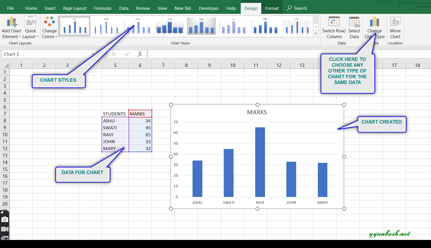
STEPS TO INSERT A CHART IN EXCEL:
- Select the complete data.(The complete table including headers)
- Click the insert tab and click the button for any type of chart as per the requirement. The charts are present under the charts section.
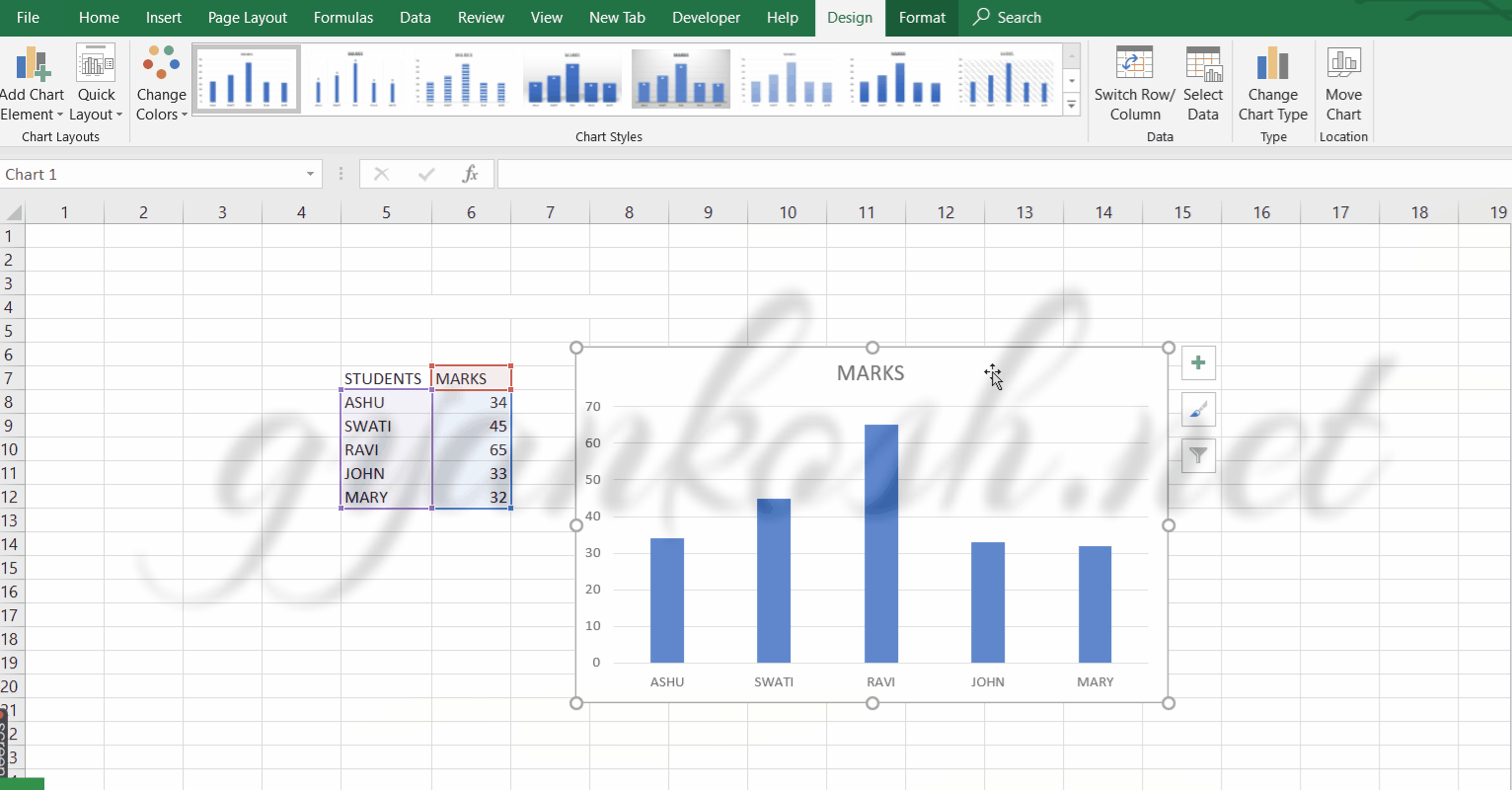
- The chart will appear adjacent to the table.
- The following picture shows the chart created for the given table.
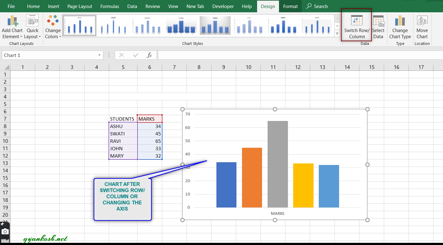
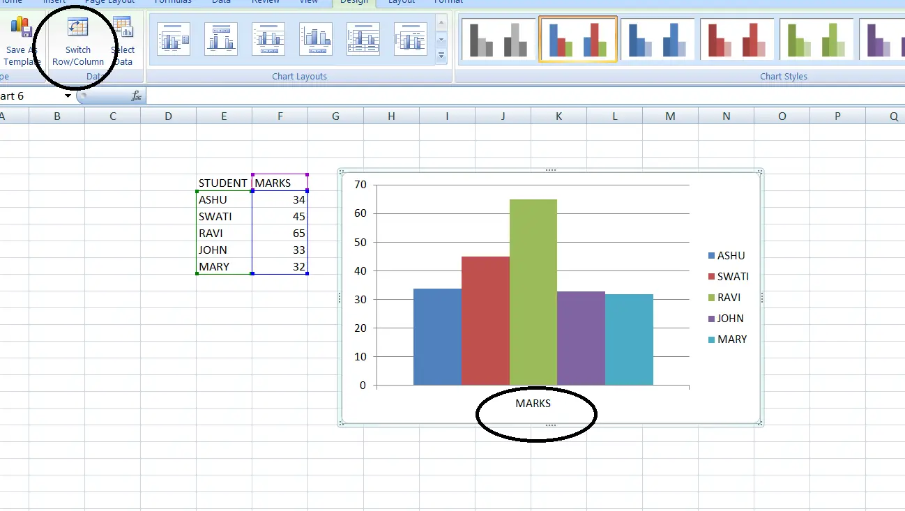
CHANGE AXIS OF CHART [SWITCH ROW/COLUMN] IN EXCEL
The axis in the chart can be changed in the following ways. We also know this feature as Switching row to column and vice versa.
There are two axis in the 2d charts or graphs. One is the X AXIS or the HORIZONTAL AXIS and the other is Y AXIS or VERTICAL AXIS.
The data is plotted against the horizontal and vertical axis both. A need can arise when we want to change the axis, which means, to put the data on the horizontal axis on the vertical and vice versa.
Follow the steps to change the axis in the chart.
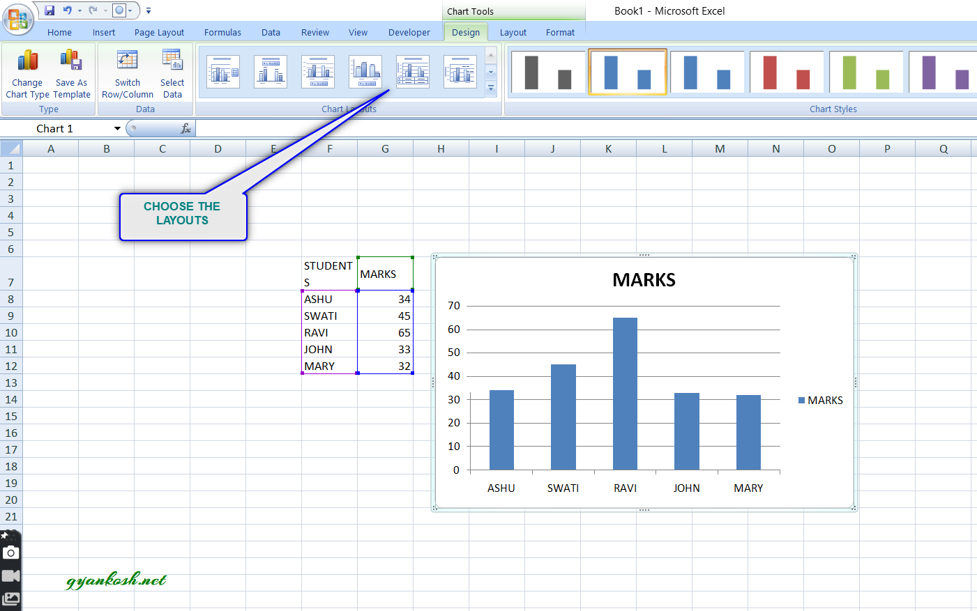
- Axis in charts can be easily changed if we change the table data from rows to columns.
- It can be done by double clicking the chart (It’ll open the design mode of charts) and after that clicking the button present in the upper left SWITCH ROWS/COLUMNS easily.
- The button is marked in the picture below.
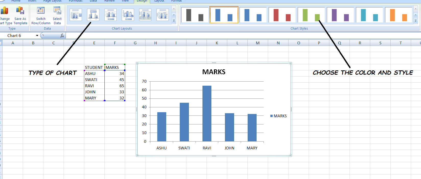
CHANGE THE TYPE OF CHARTS IN EXCEL
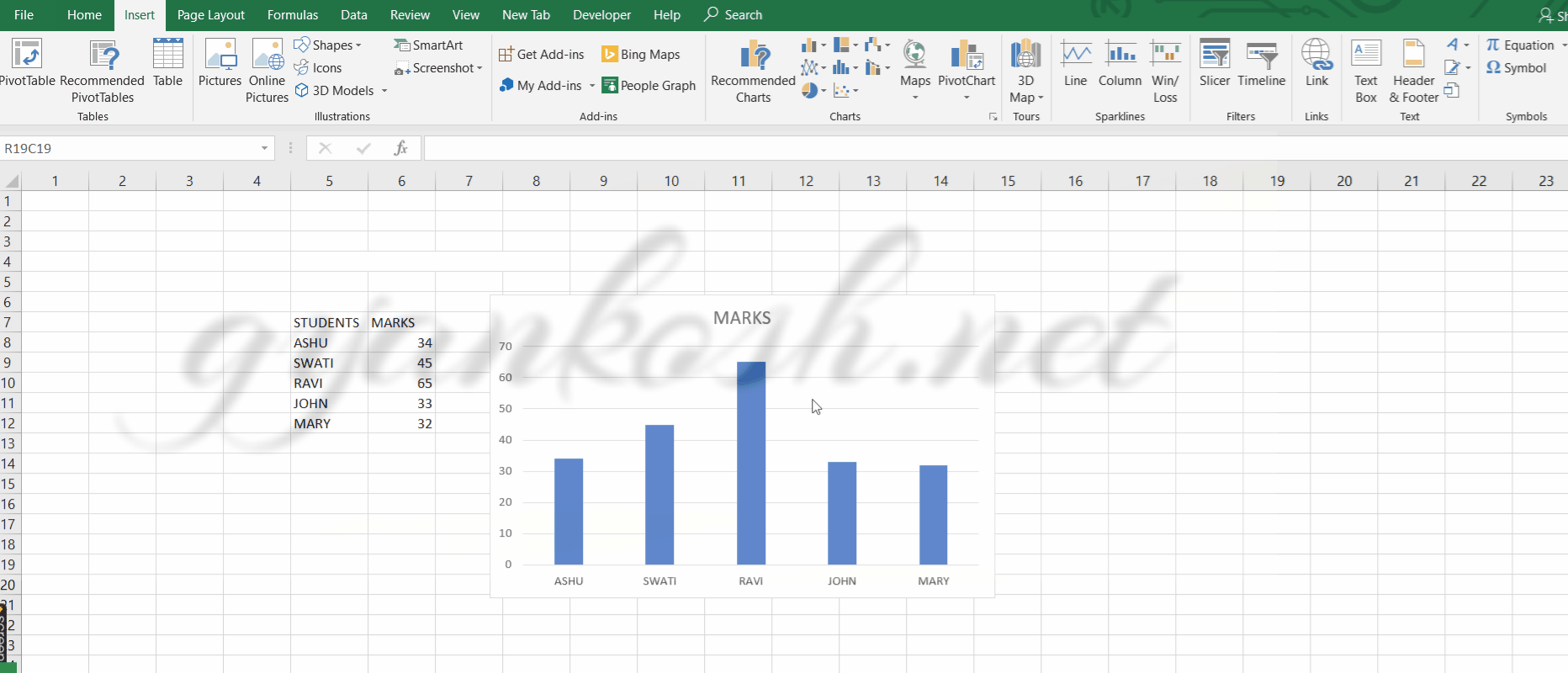
Excel offers a variety of chart types. e.g. column type, line type, pie type,sunburst, histogram and many more shown in the pic. We can easily change the chart type by easily clicking on the type as per our need.
The need of chart depends upon the type of data to be presented.
There is no need to do anything to the data. Lets try to change the chart type of the above mentioned data.
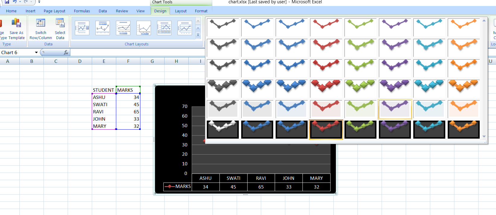
STEPS TO CHANGE THE CHART TYPE IN EXCEL:
- Double click the chart.
- Click , change chart type.
- Choose the chart as per choice.
Look at the picture below .
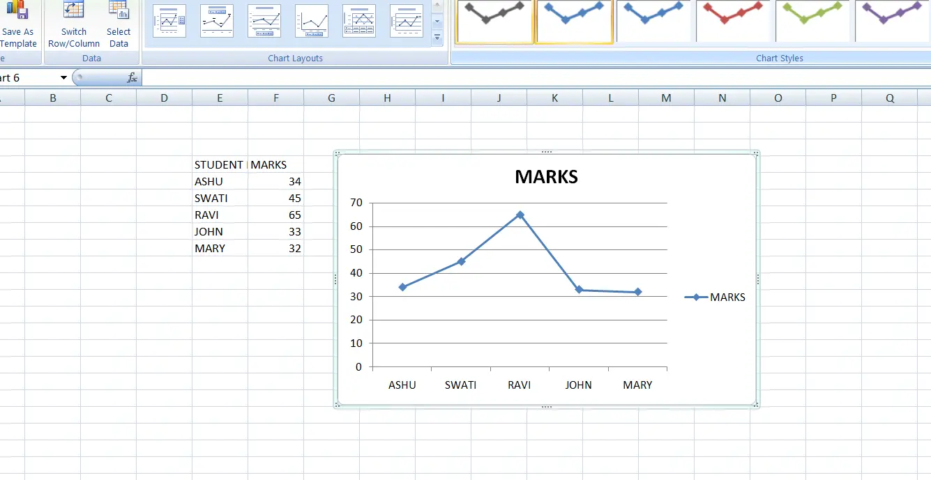
In the example [EXCEL 2007], we have chosen a line chart. Similarly we can choose any type of Chart as per need. In addition to this, there are several options of the layout provided by Excel for the same.
CHANGE THE LAYOUT OF CHARTS IN EXCEL
LAYOUT is the way in which the information is presented. Suppose we have a pie chart (The circular chart in which the portions are fixed as per percentages.)
Now there can be different layouts for a pie chart. e.g.
The written information can be far away or written with the portions, written on the portion etc. Color Scheme can be chosen and many more.For changing the layout of the chart do the following steps.
STEPS TO CHANGE THE LAYOUT OF CHART:
- Double click on the chart.
- A design menu will open.
- Choose any of the layout(The arrangement of Captions and details) as per requirement. The options provide different kind of information in different layouts.
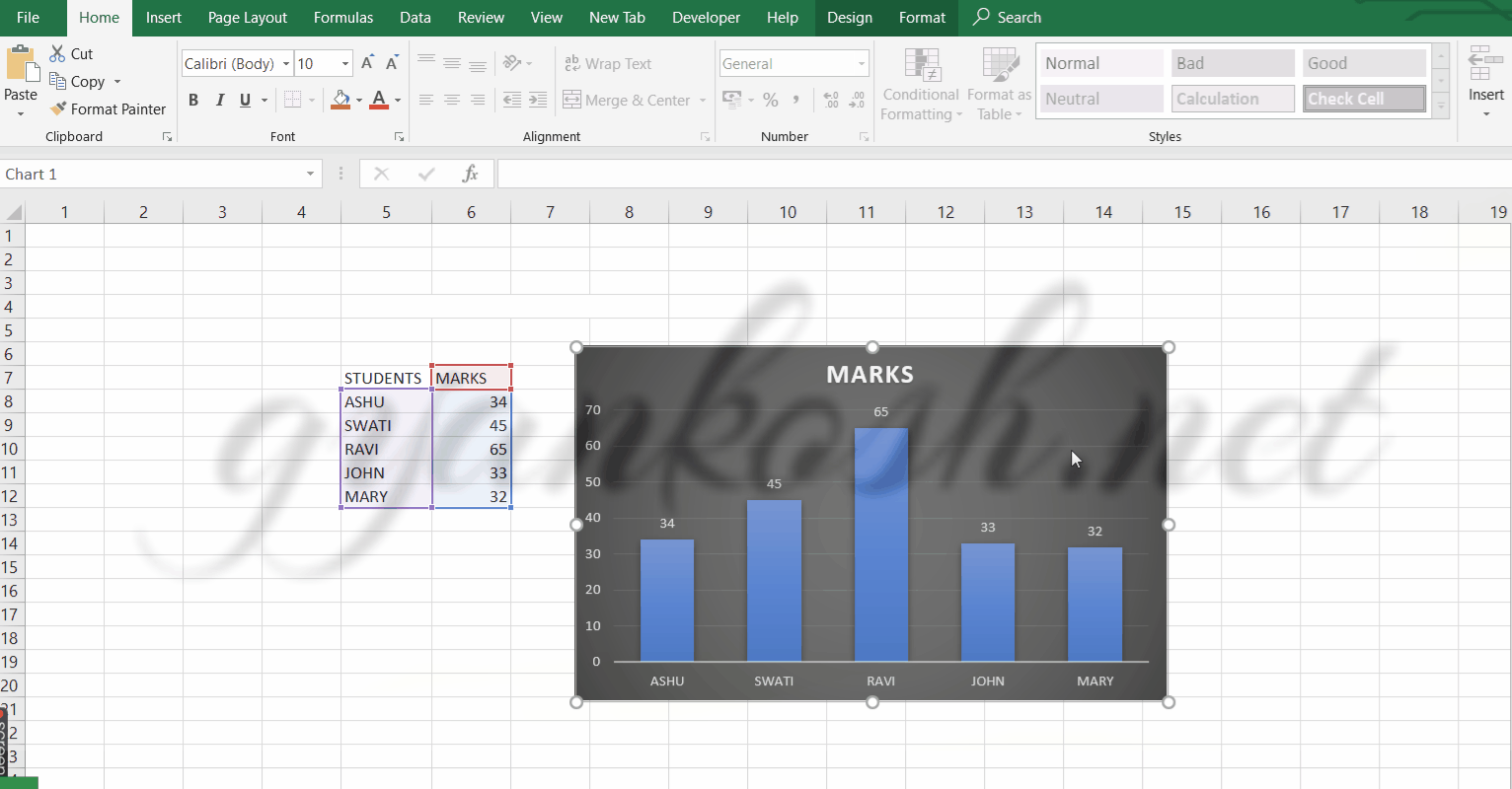
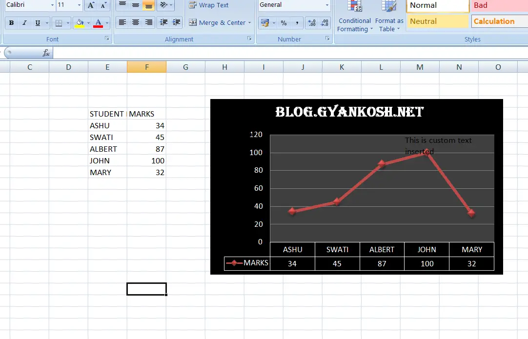
INSERT/EDIT THE CAPTIONS OF CHARTS IN EXCEL
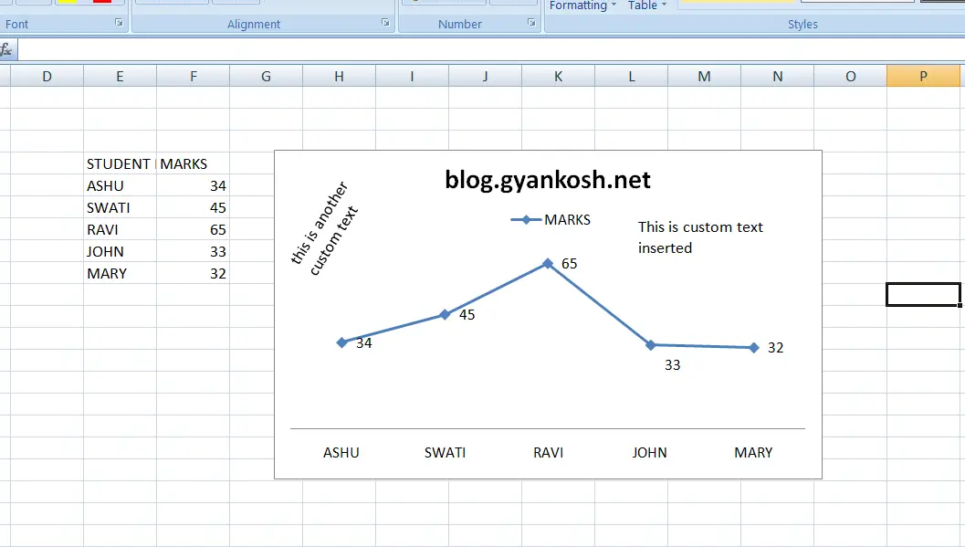
In a standard chart there are many captions[labels]. For example, the chart name, horizontal axis names, vertical axis names, etc.
If the layout chosen for the chart doesn’t fulfill your desired presentation , you can always insert or edit any captions of the axis or any
details in the chart. Lets give some random names to the chart details. We can also insert new captions or text anywhere on the chart.
STEPS TO INSERT/EDIT CAPTIONS:
1.Double click any text which you want to change. The text will go to the edit mode and cursor will start blinking. Just make the changes and click ENTER.
2. If you need to insert any new text. Just go to insert tab and click on the add text. Add it and drag it to the place where you need it. The text can be rotated by grabbing the small green circle at the top of the text box which appears when selected.
CHANGE THE STYLE OF CHARTS IN EXCEL
The style comprise of the colors of the charts, fonts of the text used, the 2d or 3d format of the shapes used in charts etc. The presentation style always depends on the way you want to show it to others.
There are ample options for the styling of your charts.Steps to change the style of the charts in excel:
- DOUBLE CLICK the chart and go to DESIGN TAB.
- The CHART STYLE option will be activated.
- Select any style which suits you.
FONTS: If any font needs to be changed, simply select the text and go to HOME TAB. Change the font as per need.
HOW TO EDIT/CHANGE THE DATA FOR CHARTS IN EXCEL ?
The charts are dynamic. The charts change the shape as soon as we make a change in the data.
The data can be easily changed by just changing the values in the source table.
FOLLOW THE STEPS TO CHANGE OR EDIT THE DATA OF THE CHART:
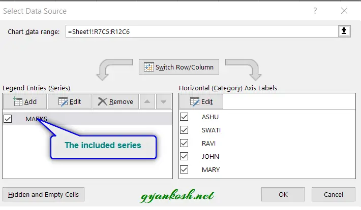
- If the table is not visible, RIGHT CLICK the chart and choose SELECT DATA.
- The SELECT DATA will open a small dialog box as shown below.
- This dialog box is used to change the source but as we have already selected the source and we need not change it, click OK without making any changes to it.
- Change the data in the table itself.
- The chart will be updated instantly.
HOW TO EDIT/CHANGE THE SOURCE OF DATA FOR CHARTS IN EXCEL ?
In the previous section, we discussed about changing the data of the charts i.e. the values of the chart data. We changed it and the chart changed accordingly. But what if we need to change the complete source for the chart.
Suppose , we need to change the complete marks of the whole class [For our example the number is just 5].
We have a table of updated marks as .
UPDATED MARKS
STUDENTS MARKS
ASHU 32
SWATI 41
RAVI 85
JOHN 96
MARY 41
We can tackle this problem in two ways. One, by deleting the old chart and creating new one or by editing the data. Deleting your work is not always the best choice.
For the sake of understanding we have taken small data, but it is not going to be small always.
Here we would learn how to edit the data of the chart.
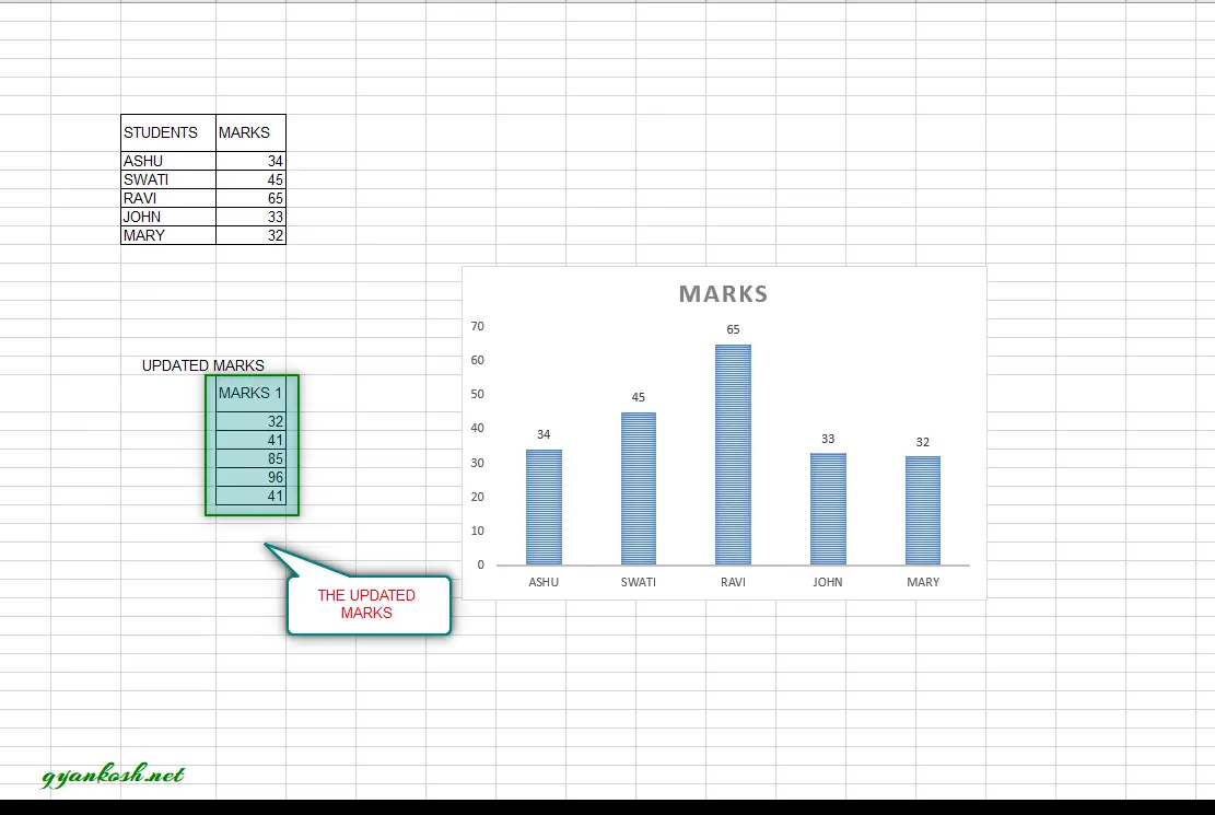
We can do so by following the steps mentioned below.
The data can be easily changed by just changing the values in the source table.
FOLLOW THE STEPS TO CHANGE OR EDIT THE DATA OF THE CHART:
RIGHT CLICK the chart and choose SELECT DATA.
The SELECT DATA will open a small dialog box as shown below.
Select the series MARKS and click EDIT as shown in the picture below.Following dialog box will open.
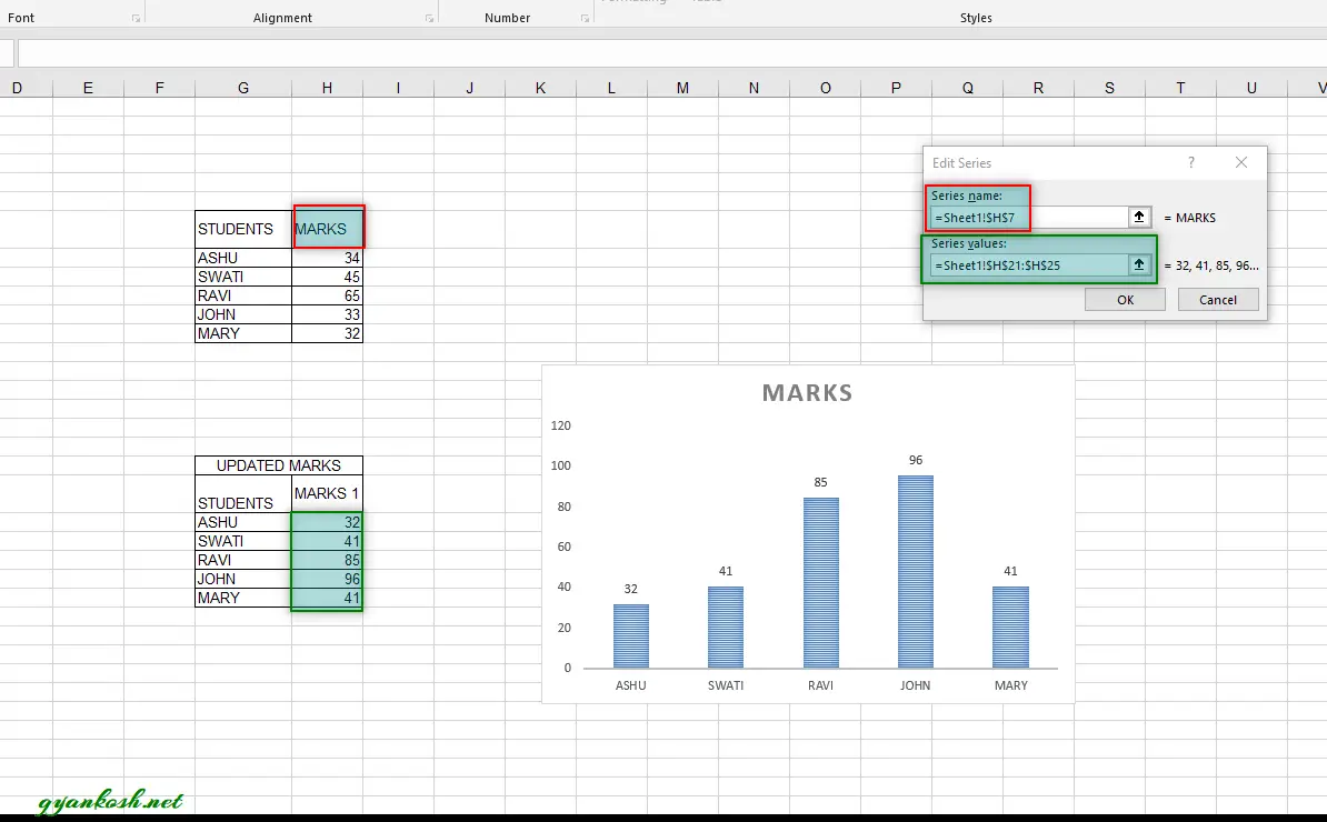
- The dialog box opened have two fields. SERIES NAME and SERIES VALUES. Series name , we’ll select the cell which contains the series name, we have kept it same as MARKS. For Series Value, we have selected the MARKS1 column.
- Click Ok. We’ll reach the SELECT DATA SOURCE dialog box.
- Again Click OK.
- Check the chart.
- The chart is changed and the data has been updated which is reflecting in the charts.