INTRODUCTION
CHARTS are the graphic representation of any data . Google Sheets provide us a number of visualization options in the form of different charts and graphs etc.
Excel gives us a variety of charts which are beautiful, colorful, more customizable and more powerful.
In this article we are going to discuss one particular type of the charts which are known as PIE CHART.
PIE CHARTS SHOW THE DATA IN THE FORM OF A CIRCLE (PIE) WHERE THE AREA OF EACH SLICE REPRESENTS THE PERCENTAGE OF A PARTICULAR ITEM IN THE WHOLE PROCESS.
In PIE CHARTS, the area shown by a portion shows the percentage or value of particular category.
WHERE IS THE OPTION FOR PIE CHARTS IN GOOGLE SHEETS
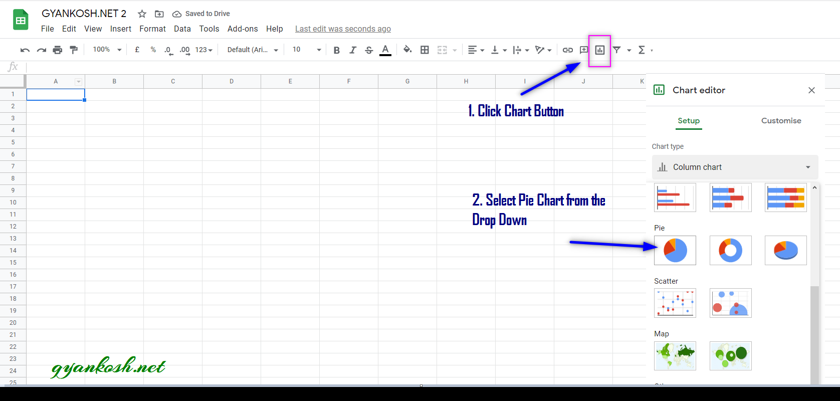
The pie chart can be easily inserted by the chart button on the toolbar itself.
The button location is shown in the picture below.
- Click the CHARTS BUTTON which will open the Chart Editor.
- In the Charts Editor, Select PIE CHART from the CHART TYPE DROP DOWN as shown in the picture below.
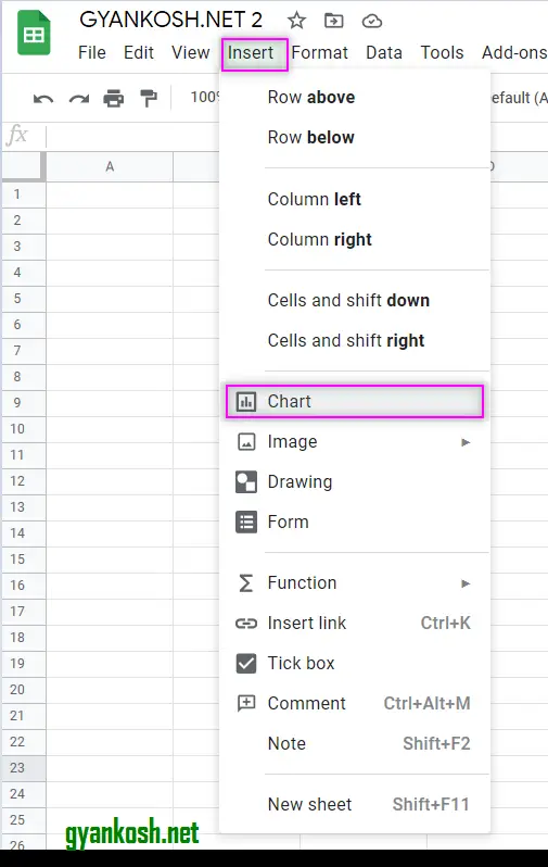
MENU OPTION TO INSERT PIE CHART:We can insert a chart using the Menu also as chart option is available in the menu too.
- Go to INSERT MENU > CHART.
- After clicking the CHART , CHART option will appear.
- Choose PIE CHART from the CHART TYPE DROP DOWN.
The location is shown below in the picture.
STEPS TO INSERT A PIE CHART IN GOOGLE SHEETS
EXAMPLE DETAILS
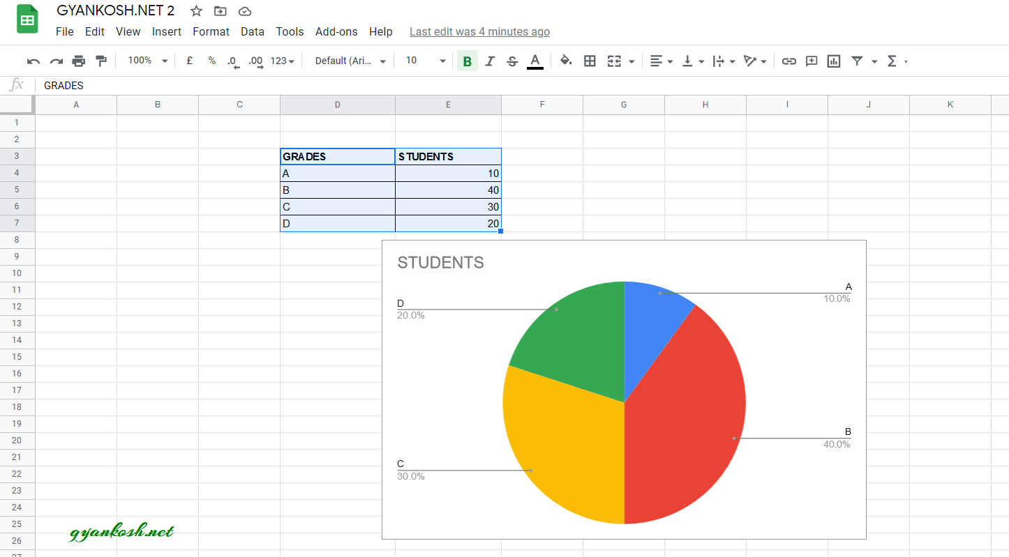
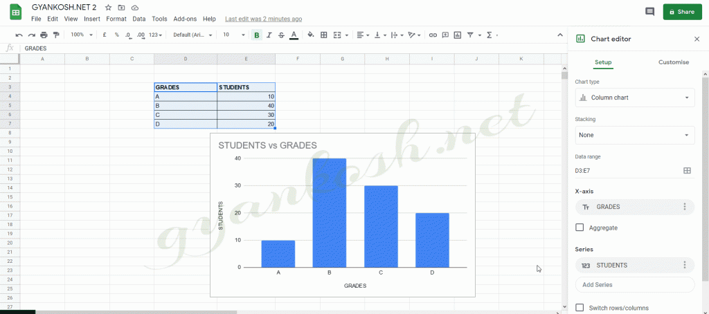
We can demonstrate the chart using an example.We are taking the example of a class.The total students are 100 and grades of the students in MATHEMATICS are given below in the table.
| TOTAL STUDENTS | 100 |
| GRADES | STUDENTS |
| A | 10 |
| B | 40 |
| C | 30 |
| D | 20 |
The procedure to insert a pie chart are as follows:
STEPS TO INSERT A PIE CHART IN EXCEL:
- The first requirement of any chart is data . So create a table containing the data. [ We have already created in the form of table above]
- Refer to our data above, we have grades of 100 students.
- Select the complete table including the HEADER NAMES.
- Go to TOOLBAR > CHARTS .
- At first, Google Sheets will create a chart on its own. [ As per data it would try to suggest us the chart ].
- The chart will be created and shown to you as the following picture
- In our example, Google Sheets itself opted for the PIE CHART and created one for us.
CHANGE ANY CHART INTO PIE CHART
So , we have successfully created a PIE CHART in GOOGLE SHEETS.
But , what if the google sheets didn’t create pie charts directly and created some other type for us.
In that case, we can simply click the chart, go to CHART TYPE and select PIE CHART.
The result will be same.
Let us change the type to COLUMN CHART and then change it to PIE CHART.
We are forcibly converting the PIE CHART to COLUMN CHART so that we become comfortable with the steps to convert it to PIE again if google creates any chart other than PIE in the first place.
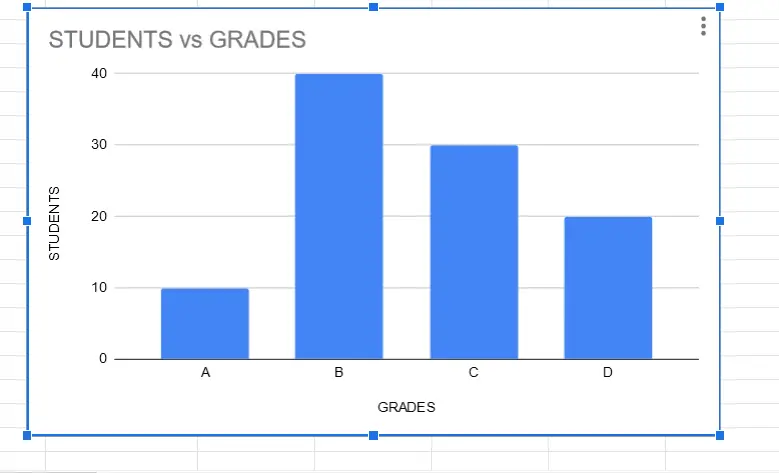
FOLLOW THE STEPS TO CONVERT COLUMN CHART INTO PIE CHART
- Click on the chart.
- Chat Editor will open on the right of the screen.
- Go to Chart Type.
- Select PIE CHART from the Drop Down.
Refer to the animated picture below for the procedure.
NOTE:
FOR ALL OTHER TASKS LIKE CHANGING THE NAME OF THE CHART, CHANGING THE AXIS , CHANGING THE CHART STYLE ETC. VISIT HERE [HOW TO CREATE A CHART IN GOOGLE SHEETS ].