Table of Contents
- INTRODUCTION
- BUTTON LOCATION TO CREATE CHARTS IN GOOGLE SHEETS
- BENEFITS OF CHARTS
- STEPS TO INSERT A CHART IN GOOGLE SHEETS
- CHANGE AXIS IN CHART [SWITCH ROW/COLUMN]
- CHANGE THE TYPE OF CHARTS IN GOOGLE SHEETS
- CHANGE THE LAYOUT OF CHARTS IN GOOGLE SHEETS
- EDIT THE CAPTIONS OF CHARTS IN EXCEL
INTRODUCTION
CHARTS are the graphic representation of any data .
Analysis of data is the process of deriving the inferences by finding out the trends,totals, subtotals other operations etc. about different parameters.
Data is everywhere. There is no work, where we don’t deal with the data.
Sales data in business, employee data, patient data in hospitals, students data in school etc. Maximum data is presented in the tables but we all know that visual representation is easier to interpret.
GOOGLE SHEETS gives us a variety of charts which are beautiful, colorful, more customizable and more powerful.
In this article we would learn –
- How to create a chart in GOOGLE SHEETS
- Change the style [look and feel] of the chart.
- Add axis elements
- Edit the data of the chart
- Edit the captions of the charts.
BUTTON LOCATION TO CREATE CHARTS IN GOOGLE SHEETS
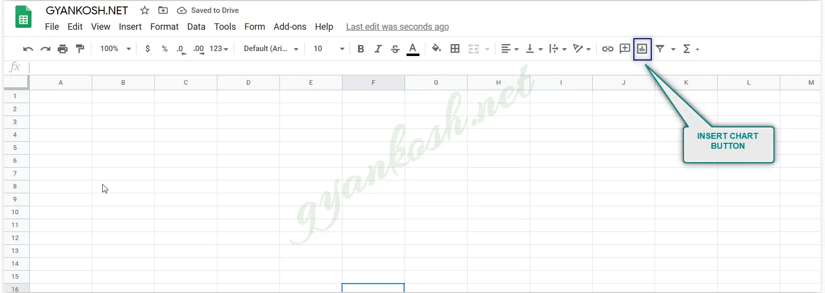
INSERTING CHART USING THE TOOLBAR
- We can choose INSERT CHART option from the standard tool bar as shown in the picture below.
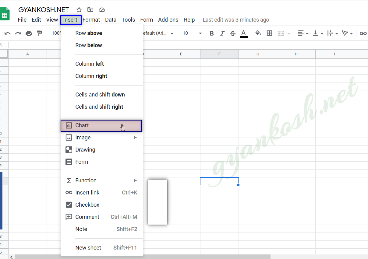
INSERTING CHART THROUGH MENU:
- We can insert Chart through the menu options too.
- Go to INSERT MENU> CHART as shown in the picture below .
BENEFITS OF CHARTS
There are many benefits of charts or graphs such as:
- While analyzing tabular data, we can’t have the proper insight about the trends whether any parameter like sales, buyers etc. are increasing or decreasing.But with the charts of graphs, these parameters and the pace of increase or decrease can easily be judged by the slope of the charts.
- We can check the contribution of any task or process as a percentage at a glance using the pie charts.
- We can compare the values using the columns or bars instantly.
- We can watch the hierarchy using sunburst charts in a second.
- Similarly, there are many types of charts which are apt for different situations and are very easy to use.
STEPS TO INSERT A CHART IN GOOGLE SHEETS
A chart is always made from the data in the tabular form. So before making a chart , we need the data in the tabular form.
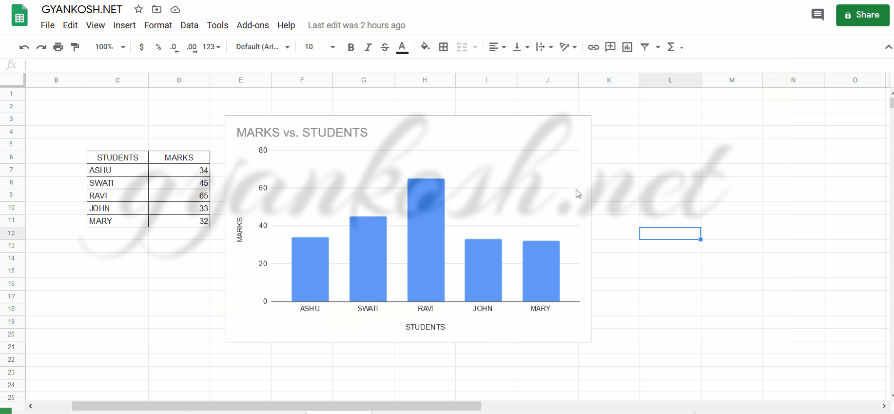
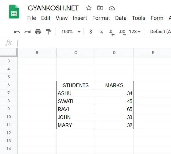
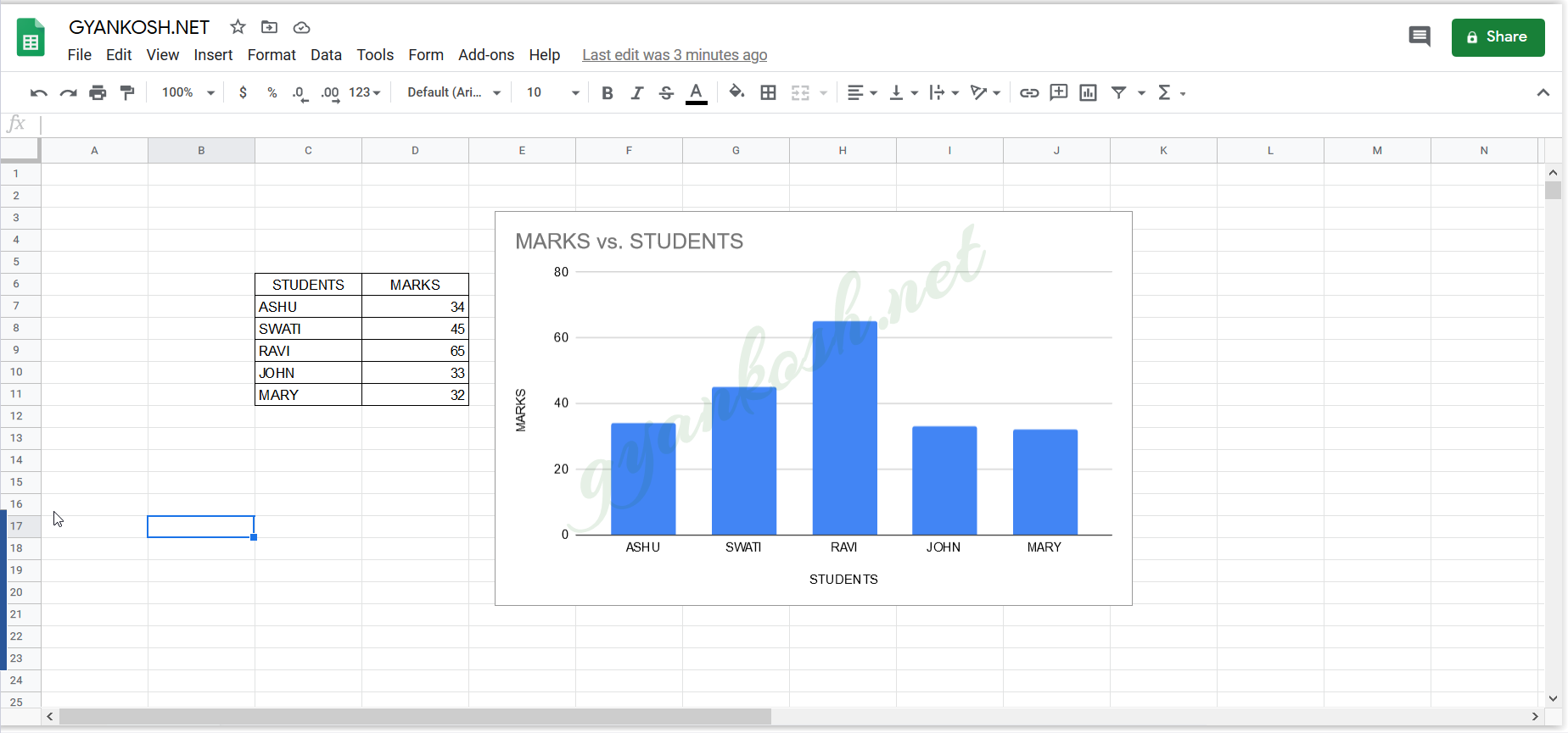
Suppose we have the marks of the students as given in the table.
Before the steps, let us check the available data.
DATA SAMPLE:
The data is simple and short. It comprises of marks of 5 students. Lets try to make different charts for this data.[DATA CAN BE COPIED EASILY FOR PRACTICE]
| STUDENTS | MARKS |
| ASHU | 34 |
| SWATI | 45 |
| RAVI | 65 |
| JOHN | 33 |
| MARY | 32 |
STEPS TO INSERT A CHART:
- Select the complete data.(The complete table including headers)
- Click the insert chart button from the toolbar or through the menu as mentioned in the previous section.
- The chart will appear .
- The GOOGLE SHEETS will give us a chart which it assesses suitable for the data. [ Although it is not necessary that it matches our requirement. No worries! we can always change it.
- The following picture shows the chart created for the given table.
CHANGE AXIS IN CHART [SWITCH ROW/COLUMN]
The axis in the chart can be changed in the following ways. We also know this feature as Switching row to column and vice versa.
There are two axis in the 2d charts or graphs. One is the X AXIS or the HORIZONTAL AXIS and the other is Y AXIS or VERTICAL AXIS.
The data is plotted against the horizontal and vertical axis both. A need can arise when we want to change the axis, which means, to put the data on the horizontal axis on the vertical and vice versa.
Follow the steps to change the axis in the chart.
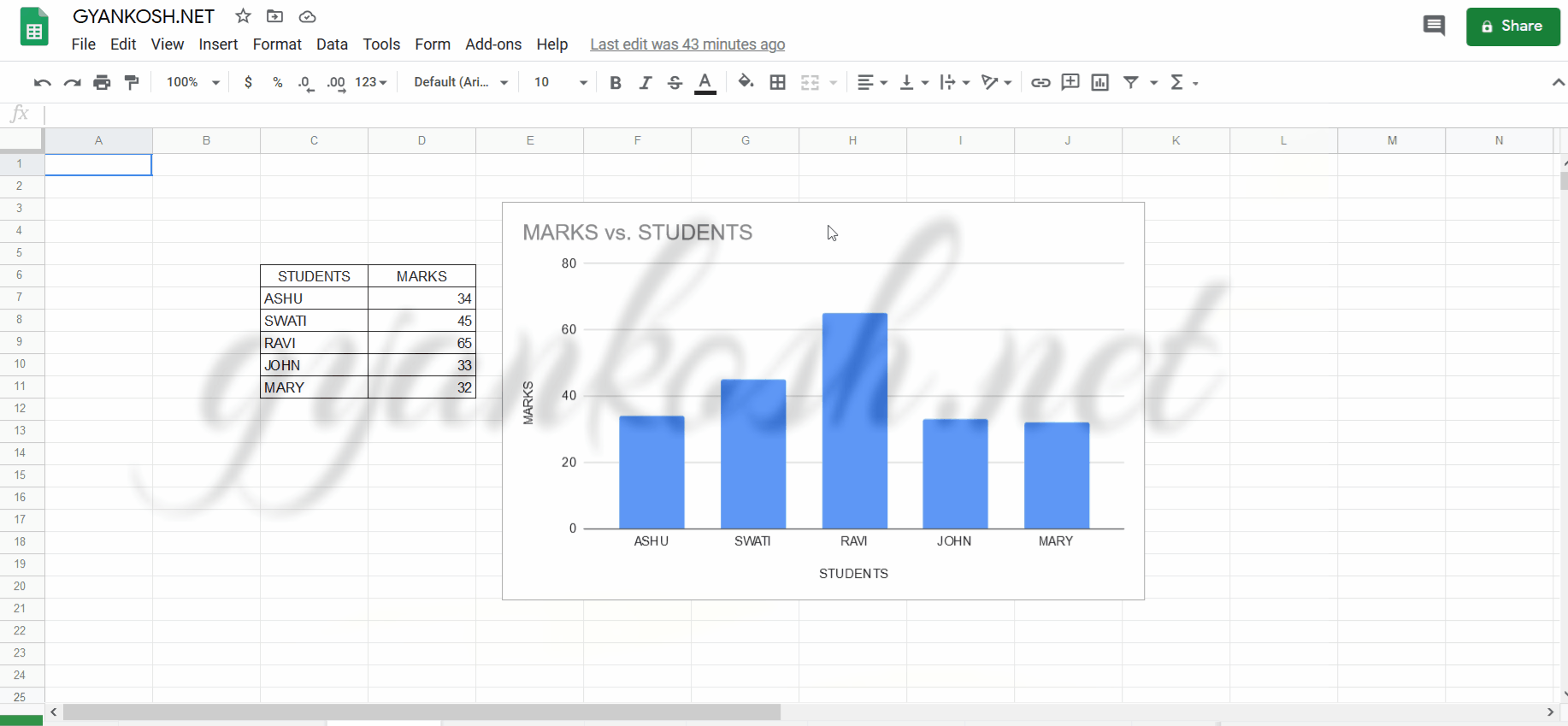
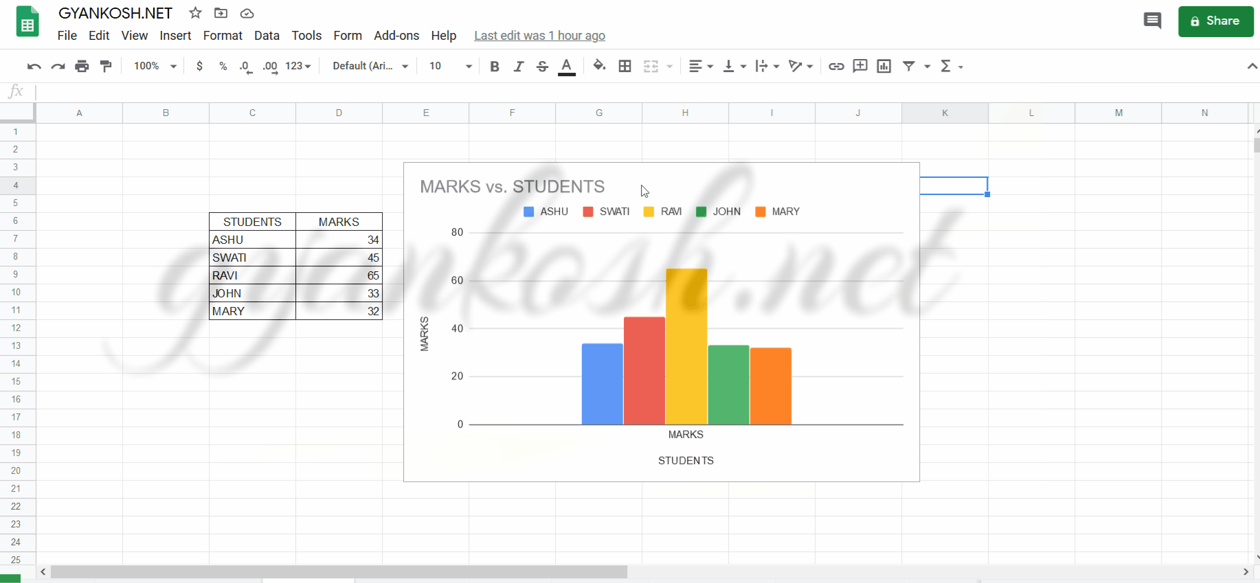
- Axis in charts can be easily changed if we change the table data from rows to columns but we have better option too.
- It can be done by double clicking the chart (It’ll open the design mode of charts by opening the CHART EDITOR on the right side of the screen) and choosing the SWITCH ROWS/COLUMNS (SETUP TAB ) after scrolling down the SETUP TAB in CHART EDITOR.
- The CONVERSION PROCESS OF ROWS INTO COLUMNS OR COLUMNS INTO ROWS of charts in google sheets is shown below in the animated picture.
CHANGE THE TYPE OF CHARTS IN GOOGLE SHEETS
GOOGLE SHEETS offers a variety of chart types. e.g. column type, line type, pie type and many more shown in the pic. We can easily change the chart type by easily clicking on the type as per our need.
The need of chart depends upon the type of data to be presented.
There is no need to do anything to the data. Lets try to change the chart type of the above mentioned data.
STEPS TO CHANGE THE CHART TYPE IN GOOGLE SHEETS:
- Double click the chart.
- Select the chart type from the CHART TYPE in CHART EDITOR-SETUP TAB.
- Choose the chart as per choice.
Look at the picture below .
CHANGE THE LAYOUT OF CHARTS IN GOOGLE SHEETS
LAYOUT is the way in which the information is presented. Suppose we have a pie chart (The circular chart in which the portions are fixed as per percentages.)
Now there can be different layouts for a pie chart. e.g.
The written information can be far away or written with the portions, written on the portion etc. Color Scheme can be chosen and many more.For changing the layout of the chart do the following steps.
There are no ready made options for the layouts but we can create them by choosing the different options and locations of captions, information etc.
EDIT THE CAPTIONS OF CHARTS IN EXCEL
In a standard chart there are many captions[labels]. For example, the chart name, horizontal axis names, vertical axis names, etc.
Google Sheets picks up these names from the Headers of the data table.
If the auto names given for the chart doesn’t fulfill your desired presentation , you can always insert or edit any captions of the axis or any details in the chart. Lets give some random names to the chart details. We can also insert new captions or text anywhere on the chart.
In this section, we would learn to change the chart name, axis names of the charts or graphs made in google sheets.
STEPS TO EDIT CAPTIONS:
1.Double click any text [CHART NAME or AXIS NAME, which you want to change ]. The text will go to the edit mode and cursor will start blinking. Just make the changes and click ENTER.
2.Click ENTER and the new caption will be finalized.
We can do the same using the CHART EDITOR OPTIONS too.
- Double click anywhere on the chart.
- The CHART EDITOR OPTIONS will open.
- Go to CUSTOMIZE TAB.
- Go to CHART AND AXIS TITLES.
- CHOOSE CHART TITLE from the drop down and type the Chart title as needed.
- Choose HORIZONTAL or VERTICAL AXIS and enter the desired axes names.
The following picture shows the process.