Table of Contents
- INTRODUCTION
- WHEN DO WE USE COLUMN CHARTS ?
- WHERE DO WE FIND COLUMN CHARTS OPTION IN EXCEL
- STEPS TO CREATE A COLUMN CHART IN EXCEL
- TYPES OF COLUMN CHARTS IN EXCEL
- WHAT IS CLUSTERED COLUMN CHART IN EXCEL
- HOW TO CREATE 3D CLUSTERED COLUMN CHART IN EXCEL
- WHAT IS STACKED COLUMN CHART IN EXCEL ?
- WHAT IS 3D STACKED COLUMN CHART IN EXCEL ?
- WHAT IS 100% STACKED COLUMN CHART IN EXCEL ?
- WHAT IS 3D 100% STACKED COLUMN CHART IN EXCEL ?
- NOTE:
INTRODUCTION
CHARTS are the graphic representation of any data . As we know that EXCEL is a super analytical tool , it gives us access to a big number of ready to use chart options.
Analysis of data is the process of deriving the inferences by finding out the trends, averages etc. about different parameters.
Data is everywhere. There is no work, where we don’t deal with the data.
Sales data in business, employee data, patient data in hospitals, students data in school etc. Maximum data is presented in the tables but we all know that visual representation is easier to interpret. That is the reason that as the Excel developed, so the charts options in Excel.
Excel gives us a variety of charts which are beautiful, colorful, more customizable and more powerful.
In this article we are going to discuss one particular type of the charts which are known as COLUMN CHART.
In column charts, the data is represented by the tall columns which represent the data with their heights.
WHEN DO WE USE COLUMN CHARTS ?
Charts are a visual representation of the data. Although nobody can give a fixed answer for this question about the usage of any specific chart at some special situation, but even then , we can list out a few situation when it is apt to use COLUMN CHARTS.
Here is the list of situations when we should use COLUMN CHARTS.
- When there is quantity comparison between a few categories such as sales comparison. Which year had bigger sales number and which has smaller etc. in a particular year.
- We need to visualize the numbers of values of different products for different years.
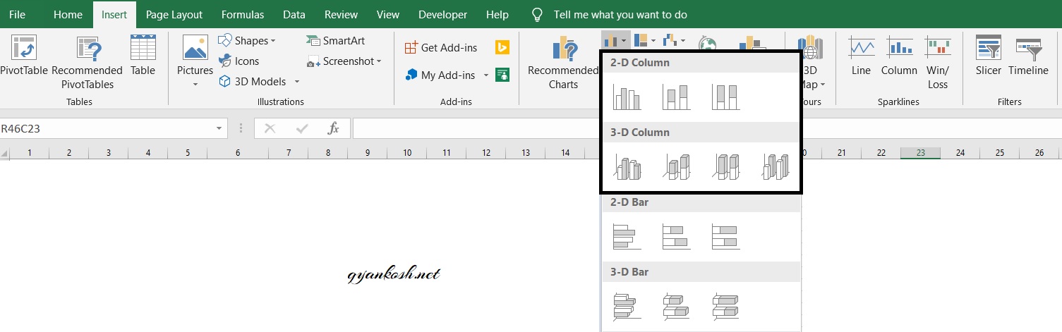
WHERE DO WE FIND COLUMN CHARTS OPTION IN EXCEL
The button for column chart is found under the INSERT TAB under the CHARTS SECTION.
STEPS TO CREATE A COLUMN CHART IN EXCEL
EXAMPLE DETAILS
We can demonstrate a chart by the use of an example.
So first of all we’ll take a simple chart.The following data is of company ABC for the sales of 5 years.
| YEAR | SALES(MILLION) |
| 2016-17 | 235 |
| 2017-18 | 452 |
| 2018-19 | 786 |
| 2019-20 | 1230 |
| 2020-2021 | 1500 |
The procedure to insert a column chart are as follows:
STEPS TO CREATE A COLUMN CHART IN EXCEL:
- The first requirement of any chart is data. So create a table containing the data.
- Refer to our data above, we have sales figures for five years.
- In this example we have a simple representation of sales. Comparison is between the years only.
- Select the complete table including the HEADER NAMES.
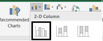
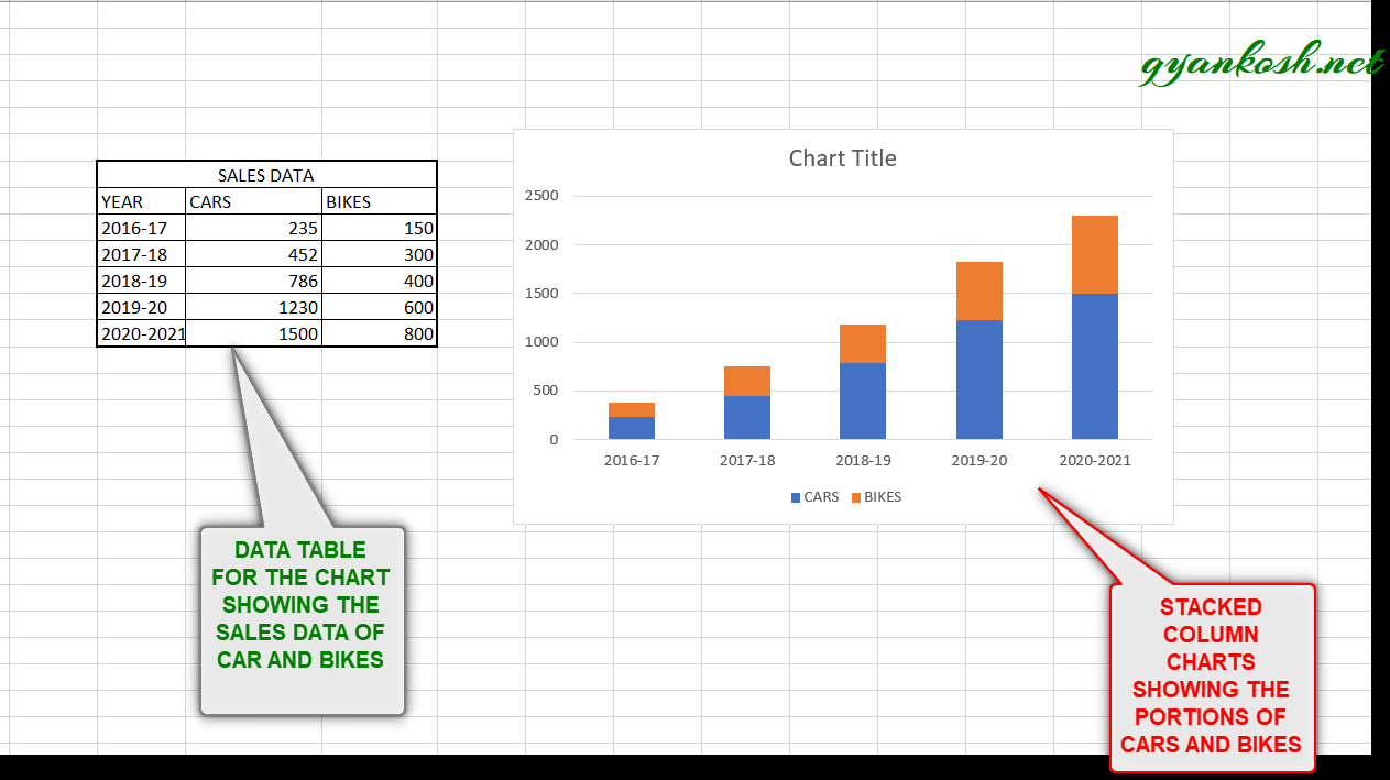
- Go to INSERT TAB> CHARTS> and click the 2D COLUMN button as shown in the BUTTON LOCATION above.
- The chart will be created and shown to you as the following figure.
The complete process is shown in the animated picture below.

So , we have successfully inserted the chart. We can see that we have inserted a 2-D column chart.
The chart shows the sales of different years .
Now we can see that inferences from the chart are easier to interpret than the table. This is the benefit of the charts or graphs.
Now, after we have already created a chart , let us check the different types of column charts available.
TYPES OF COLUMN CHARTS IN EXCEL
There are a few other types of column charts found in Excel . They are as follows.
- CLUSTERED COLUMN
- STACKED COLUMN
- 100% STACKED COLUMN
For these charts we need more than one category so that we can understand its usage.
So let us now elaborate our same table and take the sales of two products for the same years.
So the table becomes
| SALES DATA | ||
| YEAR | CARS | BIKES |
| 2016-17 | 235 | 150 |
| 2017-18 | 452 | 300 |
| 2018-19 | 786 | 400 |
| 2019-20 | 1230 | 600 |
| 2020-2021 | 1500 | 800 |
We’ll check how to create and use these charts for the above table.
WHAT IS CLUSTERED COLUMN CHART IN EXCEL
Clustered column chart is simply the column chart which we discussed. The clustered word is used as when we have more than one category, the columns are clustered for each year. Let us create the clustered chart. The process is same as we discussed earlier.
STEPS TO CREATE CLUSTERED COLUMN CHART IN EXCEL
The procedure to insert a column chart are as follows:
STEPS TO INSERT A CLUSTERED COLUMN CHART IN EXCEL:
- The first requirement of any chart is data. So create a table containing the data.
- Refer to our data above, we have sales figures of two categories CARS and BIKES for five years.
- In this example we have a simple representation of sales. Comparison is between the years only.
- Select the complete table including the HEADER NAMES.
- Go to INSERT TAB> CHARTS> and click the 2D CLUSTERED COLUMN button as shown in the BUTTON LOCATION
- The chart will be created and shown to you as the following figure.
- The output is shown below.
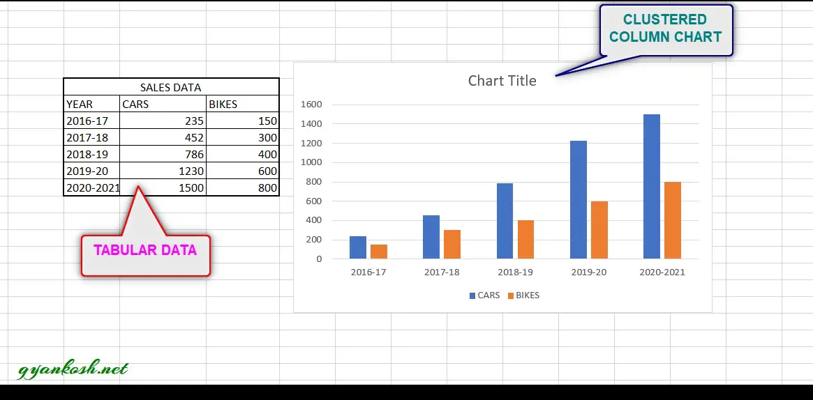
We use CLUSTERED COLUMN CHART when we need to perform a simple comparison. In this chart, we can get the clear indication if bikes are sold more or cars in any particular year.
HOW TO CREATE 3D CLUSTERED COLUMN CHART IN EXCEL
We just created a 2D or simple Clustered Column Chart in Excel.
The same chart can be created in 3D also. There is no difference in both except the looks.
STEPS TO INSERT A CLUSTERED COLUMN CHART IN EXCEL:
- The first requirement of any chart is data. So create a table containing the data.
- Refer to our data above, we have sales figures of two categories CARS and BIKES for five years.
- In this example we have a simple representation of sales. Comparison is between the years only.
- Select the complete table including the HEADER NAMES.
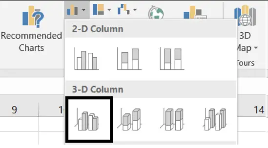
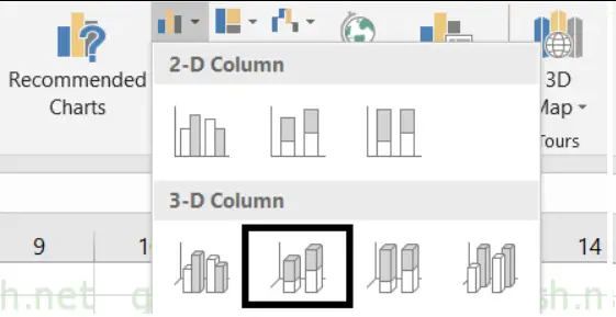
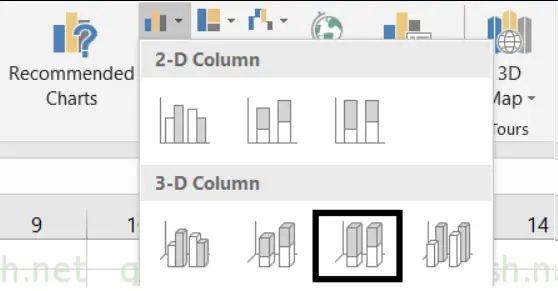
- Go to INSERT TAB> CHARTS> and click under the 3D CLUSTERED COLUMN button as shown in the BUTTON LOCATION
- The chart will be created and shown to you as the following figure.
- The output is shown below.
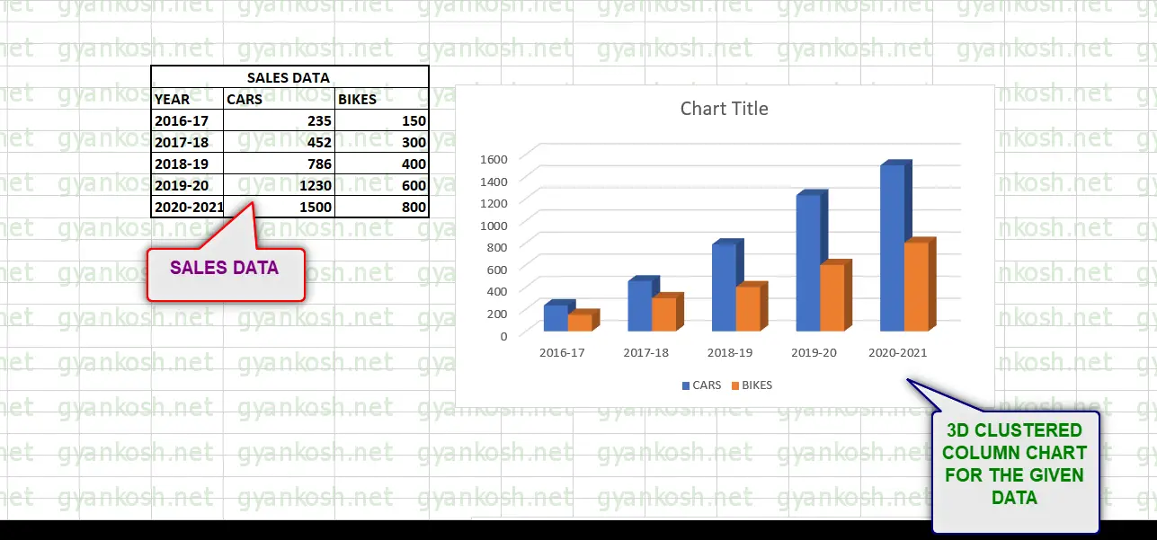
We use 3D CLUSTERED COLUMN CHART when we need to perform a simple comparison. In this chart, we can get the clear indication if bikes are sold more or cars in any particular year.
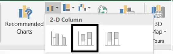
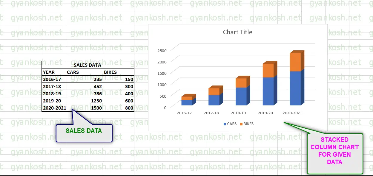
WHAT IS STACKED COLUMN CHART IN EXCEL ?
Other type of the COLUMN CHARTS is the STACKED COLUMN CHART.
The STACKED COLUMN CHART shows the data one stacked on the other.
WHEN TO USE STACKED COLUMN CHART:
We can use this type of chart when we need to show one data as a part of other. Something like A is this much portion of TOTAL.
HOW TO CREATE STACKED COLUMN CHART IN EXCEL ?
The procedure to insert a column chart are as follows:
STEPS TO INSERT A STACKED COLUMN CHART IN EXCEL:
- The first requirement of any chart is data. So create a table containing the data.
- Refer to our data above, we have sales figures of two categories CARS and BIKES for five years.
- In this example we have a simple representation of sales. Comparison is between the years only.
- Select the complete table including the HEADER NAMES.
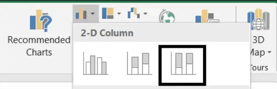
- Go to INSERT TAB> CHARTS> and click the 2D STACKED COLUMN button as shown in the BUTTON LOCATION .
- The chart will be created and shown to you as the following figure.
- The output is shown below.
We use STACKED COLUMN CHART when we need to show the portion of any category with respect to the total.
In the chart we can see that each category shown with a color, represent a portion of the total.
The total value can be found , so the other two values of the portions.
WHAT IS 3D STACKED COLUMN CHART IN EXCEL ?
The STACKED COLUMN CHART can be made in 3D also.There is no difference in 3D chart from the 2D chart except the look and feel.
WHEN TO USE 3D STACKED COLUMN CHART:
We can use this type of chart when we need to show one data as a part of other. Something like A is this much portion of TOTAL.
HOW TO 3D CREATE STACKED COLUMN CHART IN EXCEL ?
The procedure to insert a column chart are as follows:
STEPS TO INSERT A 3D STACKED COLUMN CHART IN EXCEL:
- The first requirement of any chart is data. So create a table containing the data.
- Refer to our data above, we have sales figures of two categories CARS and BIKES for five years.
- In this example we have a simple representation of sales. Comparison is between the years only.
- Select the complete table including the HEADER NAMES.
- Go to INSERT TAB> CHARTS> and click the 3D STACKED COLUMN button as shown in the BUTTON LOCATION .
- The chart will be created and shown to you as the following figure.
- The output is shown below.
We use 3D STACKED COLUMN CHART when we need to show the portion of any category with respect to the total.
In the chart we can see that each category shown with a color, represent a portion of the total.
The total value can be found , so the other two values of the portions.
WHAT IS 100% STACKED COLUMN CHART IN EXCEL ?
Other type of the COLUMN CHARTS is the 100% STACKED COLUMN CHART.
The STACKED COLUMN CHART shows the data one stacked on the other.
WHEN TO USE 100% STACKED COLUMN CHART:
In simple stacked column charts we have the values, whereas in 100% STACKED COLUMN CHARTS we have the percentages. It shows the percentage of each category.
STEPS TO CREATE 100% STACKED COLUMN CHART IN EXCEL
The procedure to insert a column chart are as follows:
STEPS TO INSERT 100% STACKED COLUMN CHART IN EXCEL:
- The first requirement of any chart is data. So create a table containing the data.
- Refer to our data above, we have sales figures of two categories CARS and BIKES for five years.
- In this example we have a simple representation of sales. Comparison is between the years only.
- Select the complete table including the HEADER NAMES.
- Go to INSERT TAB> CHARTS> and click the 2D 100% STACKED COLUMN button as shown in the BUTTON LOCATION .
- The chart will be created and shown to you as the following figure.
- The output is shown below.
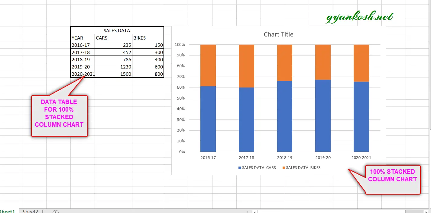
We use 100% STACKED COLUMN in the situations where we need to show the percentage participation of any number of categories say 2 ,3 4 and so on.
In our example, we have two categories , so for any year we can find easily the data like how many bikes were sold for the total number of vehicles sold for any particular year.
This is a it better than simple STACKED COLUMN CHART as it shows the result in PERCENTAGE %.
WHAT IS 3D 100% STACKED COLUMN CHART IN EXCEL ?
Other type of the COLUMN CHARTS is the 100% STACKED COLUMN CHART.
The 100% STACKED COLUMN CHART can also be made in 3D. There is no difference in 3D chart from the 2D chart except the look and feel.
WHEN TO USE 3D 100% STACKED COLUMN CHART:
In simple stacked column charts we have the values, whereas in 100% STACKED COLUMN CHARTS we have the percentages. It shows the percentage of each category.
STEPS TO CREATE 3D 100% STACKED COLUMN CHART IN EXCEL
The procedure to insert a column chart are as follows:
STEPS TO INSERT 3D 100% STACKED COLUMN CHART IN EXCEL:
- The first requirement of any chart is data. So create a table containing the data.
- Refer to our data above, we have sales figures of two categories CARS and BIKES for five years.
- In this example we have a simple representation of sales. Comparison is between the years only.
- Select the complete table including the HEADER NAMES.
- Go to INSERT TAB> CHARTS> and click the 2D 100% STACKED COLUMN button as shown in the BUTTON LOCATION .
- The chart will be created and shown to you as the following figure.
- The output is shown below.
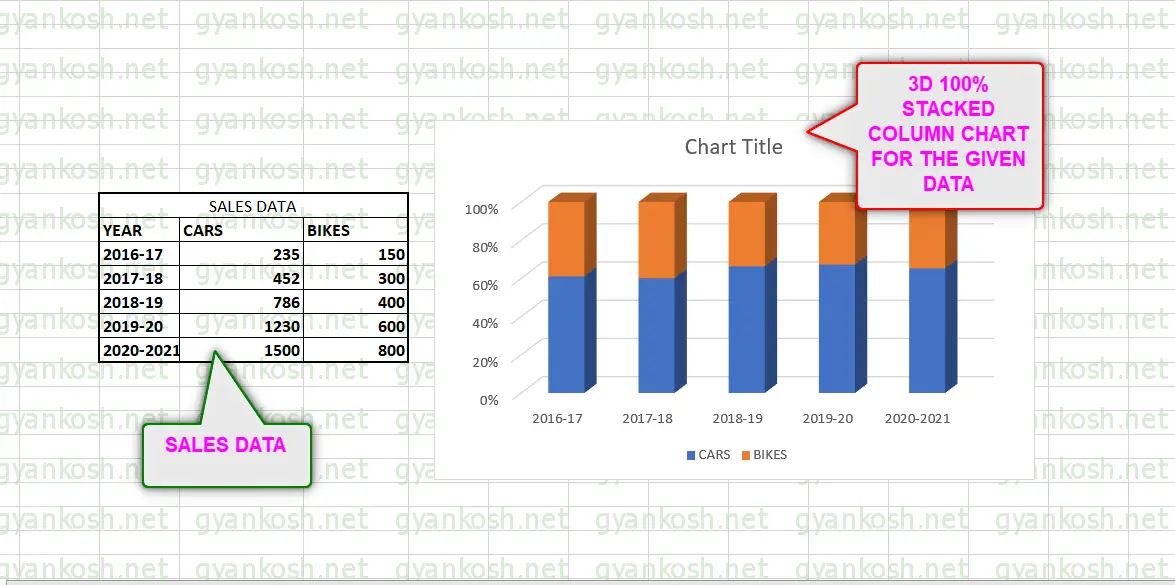
We use 3D 100% STACKED COLUMN in the situations where we need to show the percentage participation of any number of categories say 2 ,3 4 and so on.
In our example, we have two categories , so for any year we can find easily the data like how many bikes were sold for the total number of vehicles sold for any particular year.
This is a it better than simple STACKED COLUM CHART as it shows the result in %.
NOTE:
FOR ALL OTHER TASKS LIKE CHANGING THE NAME OF THE CHART, CHANGING THE AXIS , CHANGING THE CHART STYLE ETC. VISIT HERE [HOW TO CREATE A CHART IN EXCEL].
