Table of Contents
- INTRODUCTION
- WHEN TO USE SUNBURST CHARTS
- BUTTON LOCATION FOR SUNBURST CHARTS
- STEPS TO INSERT A SUNBURST CHART IN EXCEL
- DIFFERENCE BETWEEN SUNBURST CHART, DOUGHNUT CHART, PIE CHARTS IN EXCEL
- NOTE: CHANGING THE NAME OF THE CHART, CHANGING THE AXIS , CHANGING THE CHART STYLE ETC.
- DIFFERENCE BETWEEN TREEMAP AND SUNBURST IN EXCEL
INTRODUCTION
CHARTS are the graphic representation of any data . As we know that EXCEL is a super analytical tool.
Analysis of data is the process of deriving the inferences by finding out the trends, averages etc. about different parameters.
Excel provides us with a variety of charts and graphs to make our life easier. Although any chart can be used for any type of data, even then there are certain types which are apt for a particular type of data.
This is a standard excerpt for the charts.
Now, in this article , we will discuss about the SUNBURST CHARTS which are specifically designed to present the HIERARCHY of the processes or values.
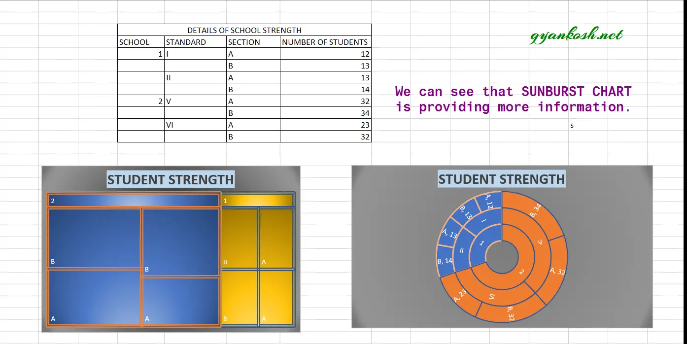
The SUNBURST chart is a kind of layered doughnuts and represent the subcategories with a new layer outside of the inner layer. A sample SUNBURST CHART picture is given above for the reference.
Sunburst chart is a hierarchy showing chart which shows the processes and subprocesses connected to each other by presenting the pieces of the circle.
WHEN TO USE SUNBURST CHARTS
SUNBURST CHARTS CAN BE USED PREFERABLY WHEN
- We have to present hierarchy in a chart.
- The data consist of subcategories, which needs to be presented.
- The subcategories are not same for all the categories. i.e. the data is not in a fashion.
- We want to show the proportion of the value with its parent value.
- Compare different hierarchical values.
BUTTON LOCATION FOR SUNBURST CHARTS
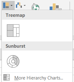
The button for column chart is found under the INSERT TAB >CHARTS SECTION under the button INSERT HIERARCHY CHARTS >SUNBURST. The location is shown in the picture below.

STEPS TO INSERT A SUNBURST CHART IN EXCEL
EXAMPLE DETAILS
We can demonstrate the chart using an example.
We are taking the example of a School Structure with student numbers.We create a chart showing the number of classes with sections.
| DETAILS OF SCHOOL STRENGTH | |||
| SCHOOL | STANDARD | SECTION | NUMBER OF STUDENTS |
| A | I | A | 12 |
| B | 13 | ||
| II | A | 13 | |
| B | 14 | ||
| B | V | A | 32 |
| B | 34 | ||
| VI | A | 23 | |
| B | 32 |
The procedure to insert a doughnut chart are as follows:
STEPS TO CREATE A SUNBURST CHART IN EXCEL:
- The first requirement of any chart is data. So create a table containing the data. [We have already created in the form of table above]
- Refer to our data above, we have the student strength of few classes of two different schools.
- Select the complete table including the HEADER NAMES.
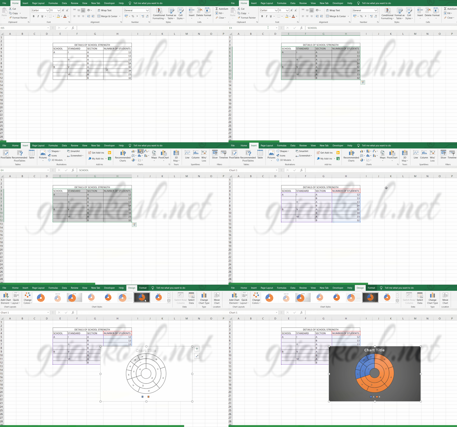
- Go to INSERT TAB> CHARTS> and click the SUNBURST CHART under INSERT HIERARCHY CHARTS BUTTON as shown in the BUTTON LOCATION above and in the following picture for reference.
- The chart will be created and shown to you as the following figure.
The complete process is shown in the animated picture below.
So , we have successfully created a sunburst chart.
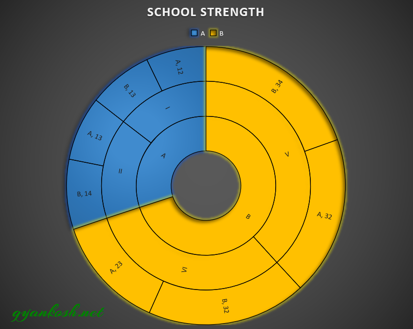
The first level of series is represented by the innermost circle.Its sub categories are shown by the subdivisions of the main class portion divided into parts by the outer circles.
We can check the chart.
The school A and B are represented by the INNERMOST CIRCLES.
After that the next circles are the portions of the innermost classes and respective classes are shown by the portions of the main classes only.
The final chart is shown below.
DIFFERENCE BETWEEN SUNBURST CHART, DOUGHNUT CHART, PIE CHARTS IN EXCEL
The concept of SUNBURST CHART, DOUGHNUT CHART and a PIE CHART are almost same. All three have the same basic traits.
All three represent the data in a filled circle by representing the portions of the circles proportionate to the values. But even then there are differences in all three.
The PIE CHART represent a single series, whereas DOUGHNUT CHARTS can represent the multiseries and SUNBURST CHARTS can represent the multiple series including the sub series of the main series.
If we make the hole size of doughnut chart with a single series zero, it’ll be another pie chart only.
If we don’t have any sub series, the sunburst chart is simply a doughnut chart.
If we don’t want to compare, we can create the same chart in all the three chart types.
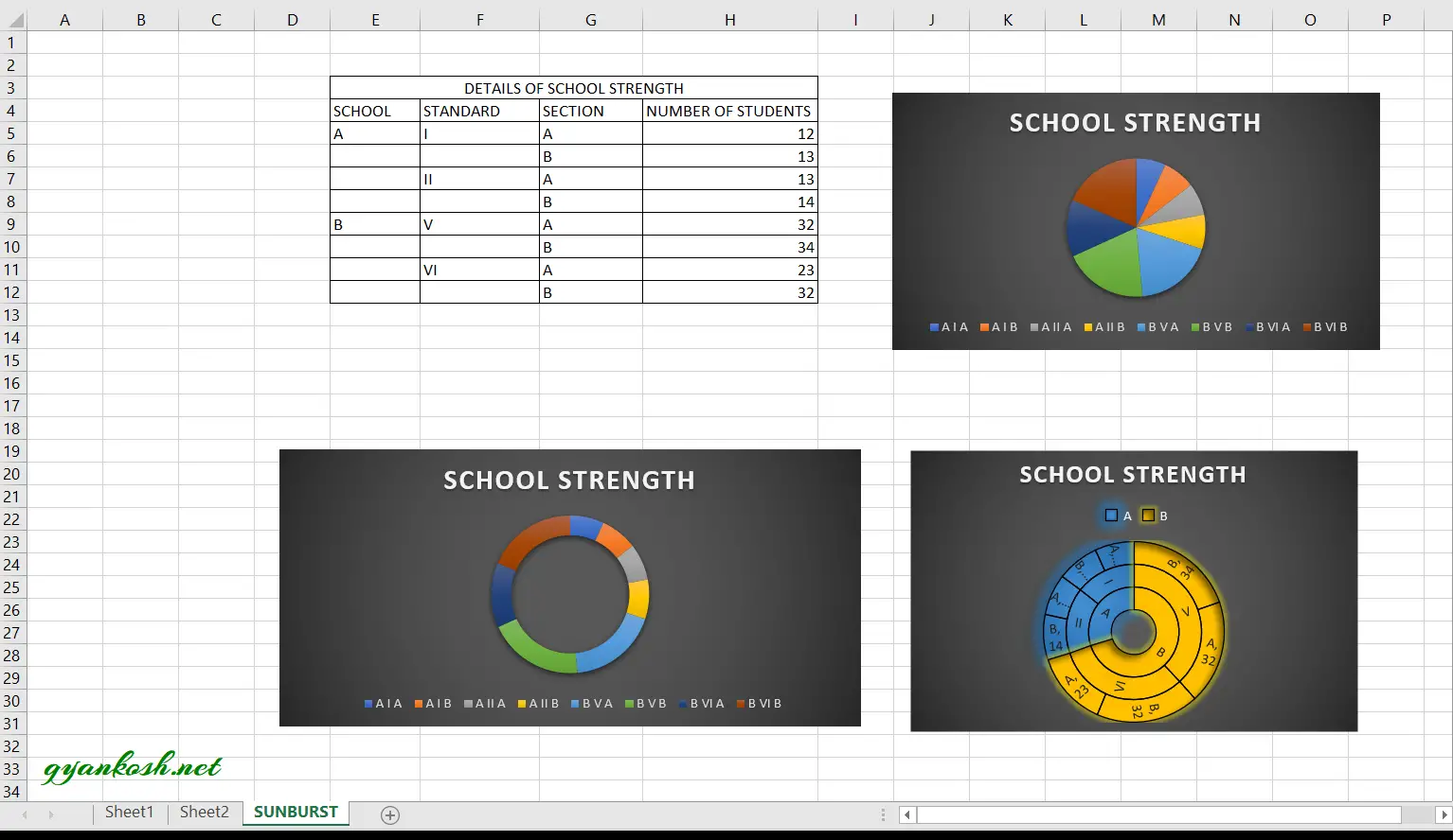
In the PIE CHART and DOUGHNUT CHART, the chart will be created by putting up all the sections on the same axis, but we won’t be able to make any type of comparison between the categories and it won’t be telling us about the hierarchy which will take away our main purpose.
The following picture shows the chart made by all three techniques.
NOTE: CHANGING THE NAME OF THE CHART, CHANGING THE AXIS , CHANGING THE CHART STYLE ETC.
FOR ALL OTHER TASKS LIKE CHANGING THE NAME OF THE CHART, CHANGING THE AXIS , CHANGING THE CHART STYLE ETC. VISIT HERE [HOW TO CREATE A CHART IN EXCEL].
DIFFERENCE BETWEEN TREEMAP AND SUNBURST IN EXCEL
Treemap and Sunburst are the hierarchy charts available in the Excel.
Now, we know that we can use them when we need to show any hierarchical data, but let us find out which one should be used in a particular situation.
USE SUNBURST CHARTS WHEN
- We need to show all the hierarchy including all the categories and sub categories.
- When we need to show the values.
- When we are comfortable with the circular display of the chart.
USE TREEMAP CHARTS WHEN
- We need to show only the top category and the last subcategory before the values.
- When we need not to show the values necessarily.
- we want to show the data in the rectangles.
SUNBURST CHARTS comparatively better options if we don’t have any problem with circular display. It is because it shows more information and is visually easier to interpret if we compare it with the TREEMAP CHARTS.
