Table of Contents
- INTRODUCTION
- PREREQUISITE KNOWLEDGE NEEDED TO CREATE A PROGRESS CHART
- WHAT IS A PROGRESS CHART?
- STEPS TO CREATE A PROGRESS CHART
- PREPLANNING
- STEP 1: INSERTING A 2D CLUSTER CHART
- STEP 2:CREATING AN EMPTY BAR
- STEP 3: DELETING ALL THE EXTRAS
- STEP 4: FINALIZING AND RUNNING
- OTHER ALTERNATIVES
INTRODUCTION
As we are already acquainted ourselves with the charts which are one of the very important parts of data analysis.
The one we are going to discuss now is very interesting a fabulous chart type but not directly available in Excel.
If want to know how to create the basic charts. CLICK HERE.
A PROGRESS CHART is horizontally placed and used to show the progress.
There is no direct provision in MICROSOFT EXCEL for creating a chart that will show the progress.
So here, we’ll try to create a PROGRESS CHART in EXCEL.
This kind of chart is useful for certain conditions where we want to express the progress of any task visually.
In this article, we’ll learn step by step process of creating a PROGRESS CHART.
PREREQUISITE KNOWLEDGE NEEDED TO CREATE A PROGRESS CHART
Although, anybody can create a progress or thermometer chart, but it would be easier if we have basic knowledge about the process of creating a simple chart first. CLICK HERE to have a look at the simple chart-making process.
WHAT IS A PROGRESS CHART?
A chart that shows the progress of any task is known as a PROGRESS BAR CHART or simply the PROGRESS CHART.
Suppose there are 1000 people who need to take a survey. Till now, only 100 have taken it.
So, if we want to tell the progress, it’ll be best shown by a progress chart.
You must be aware of a progress chart or progress bar. Whenever a heavy application loads, it shows a progress bar, which shows the current status and the final level up to which it has to go, is a progress bar.
The normal charts don’t show the highest possible value but only the current value, that’s why we need to use this trick to get it done.
STEPS TO CREATE A PROGRESS CHART
PREPLANNING
We’ll start creating a progress chart.
Here is the plan to create a progress chart.
- We’ll use the data as the percentage of completion i.e. if 300 voters have voted out of the total 1000 voters, 30% of voting is completed.
- For the task, 2D cluster chart type of charts are perfect as they represent the different series with the different columns which can be merged.
- The plan is to overlap the two columns over each other when one column is transparent and the other is having a solid color.
- The control of the value will be given only to the solid color column so that it looks like a progress bar.
- The graphics can be edited as per choice.
STEP 1: INSERTING A 2D CLUSTER CHART
Let us first understand the case.
We have a city and there are 1000 voters. We want to create a progress chart for the current number of people who have cast their votes.
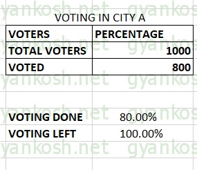
Here is the data. We have found out the percentage of voting done using the formula. VOTING LEFT IS NOT USED IN THIS METHOD FOR CALCULATION.
| VOTING IN CITY A | |
| VOTERS | PERCENTAGE |
| TOTAL VOTERS | 1000 |
| VOTED | 800 |
| VOTING DONE | 80.00% |
| TOTAL VOTING | 100.00% |
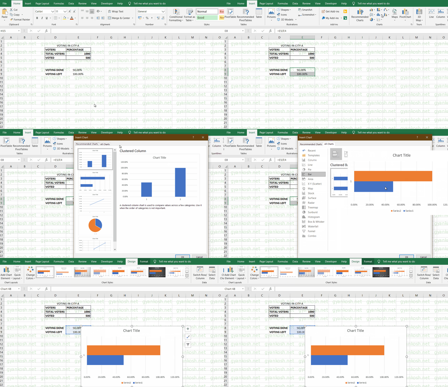
- Select the columns voting done and VOTING LEFT/TOTAL VOTING percentage and go to INSERT>CHARTS>RECOMMENDED CHARTS.
- Select ALL CHART TYPES and select BARS and select MULTICOLOR bars as shown in the picture below.
- Select the chart and click ok. The following picture will follow.
The above picture shows the chart selected.
STEP 2:CREATING AN EMPTY BAR
After inserting the chart, we have two bars in the chart with the colors, orange and blue.
One of the bars is at 100% and one at 50% for now. (the one which is changeable)
The next step is to create an empty bar that will always be there to show the full progress [UPPER LIMIT] and which will be created to be shown as empty in the background with a solid line.
STEPS:
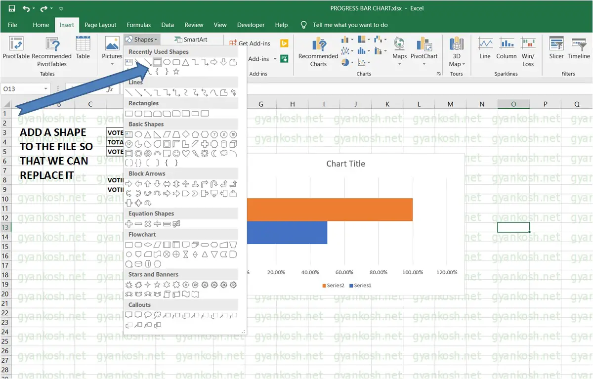
- Go to INSERT TAB.
- Go to SHAPES as shown in the picture.
- Select RECTANGLE and draw one rectangle which looks like a bar.
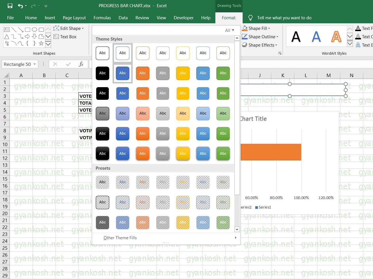
After creating the bar. we need to make it look empty which we can do by selecting it from the styles.
STEPS TO MAKE THE BAR EMPTY
When we create the bar, it’ll be a filled one i.e. filled with a solid color.
- Double click the bar.
- The design choice box will open.
- Choose the one with the outline only as shown in the PICTURE BELOW.
- Our empty bar is ready.
- Click on the empty bar to select it and copy it using CTRL+C.
- Select the bigger bar on the chart, i.e. orange one (SET AT 100%), and press CTRL+V to paste it.
Now the bar which was stuck at 100% has been replaced by our new empty bar.
The next step is to delete all the extras from the chart.
STEP 3: DELETING ALL THE EXTRAS
Right now we have a chart with a 50% solid bar and a 100% empty bar. Now we’ll get rid of
all the extras available with us like chart title, axes etc. which are not needed. but before that, we need to fix the axis’s highest and lowest values.
REPLACING THE BAR WITH THE NEW TRANSPARENT BAR
Select the new bar which looks like empty by now. But remember that the bar is not empty but filled with white color. To use it further let us make it transparent.
STEPS:
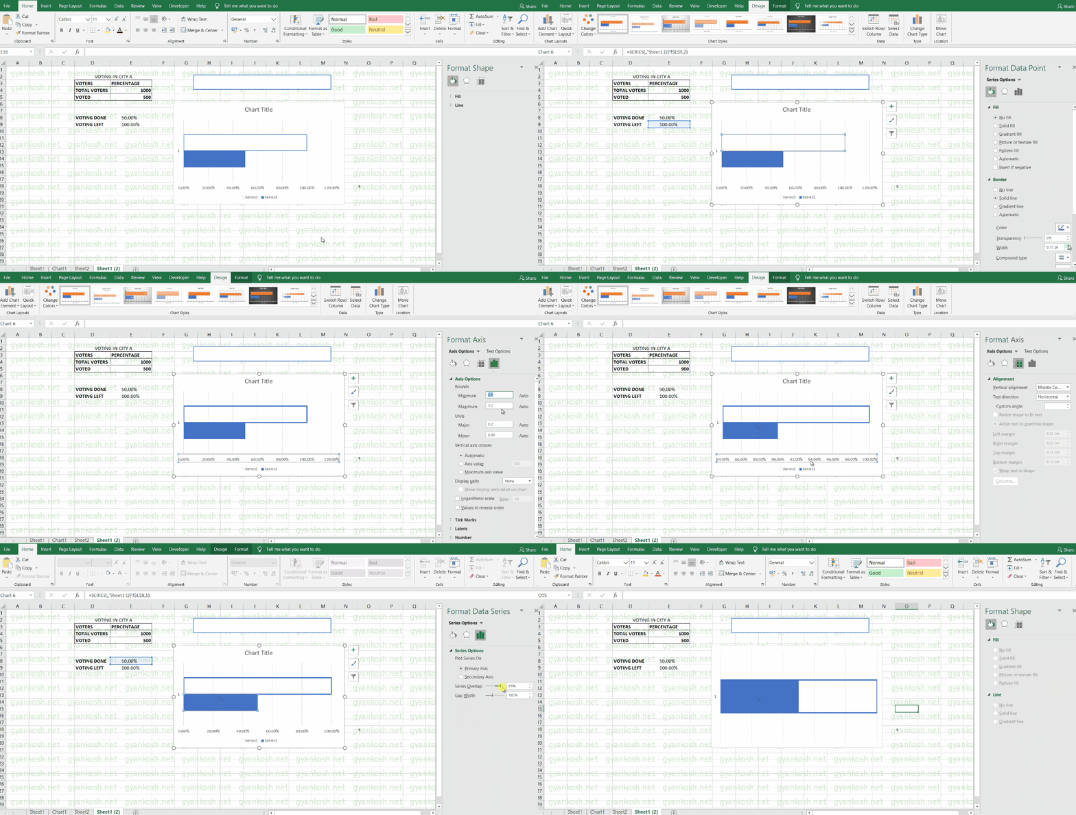
- Double click the new transparent bar.
- A window with different options will open up on the right side of the screen.
- FORMAT DATA POINT will open.
- Go to Fill and select no fill.
- Go to border and select solid line.
- You can set the color of the border to dark blue for our case and increase the width a bit.
SETTING THE DATA POINTS IN THE AXES.
REFER TO THE ANIMATED PICTURE ABOVE
- After setting the bar as transparent, Double click the horizontal axis.
- AXIS OPTIONS will open on the right side.
- Go to AXIS OPTIONS on the rightmost side.
- Change the minimum value to 0 and the maximum value to 1.
NOTE: WE CHANGED THE VALUE TO 900 WHICH TRANSLATED TO 90%. SUDDENLY THE GRAPH FELL . THE GRAPH FELL BECAUSE THE SCALE CHANGED AUTOMATICALLY TO A LOWER ONE BECAUSE IT WAS REACHING ITS HIGHEST VALUE.TO TREAT THIS, WE AGAIN CLICK THE AXIS AND CHANGE ITS VALUES FROM 0 TO 1. NOW IT’LL BE SET AND WON’T CAUSE A PROBLEM.
MERGING THE BARS
Now both bars are ready so let us overlap them.
For that, double-click the solid color bar and follow the steps given below.
- Go to series options.
- Drag the overlap the series to 100% [positive].
- It’ll put both the bars on one of each other and it’ll look like the progress bar is filled upto a percentage.
- NOW DELETE ALL THE EXTRAS LIKE CHART TITLES, ALL THE AXES MARKERS, BARS BEHIND THE BARS ETC.
- Our progress bar or progress chart is ready.
- Let us do a few more tweaks.
STEP 4: FINALIZING AND RUNNING
PUTTING THE LABEL ON THE GRAPH
The graph should look like the one without any other labels or axis. Just the bar and everything else should be selected and deleted as we don’t need any of those labels.
LET US PUT A PERCENTAGE LABEL ON THE BAR.
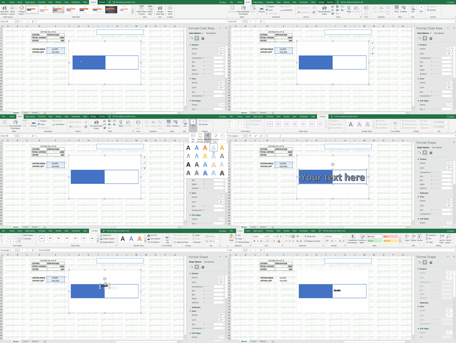
The following animated picture shows the process. The description is given below.
STEPS:
- Go to INSERT TAB and choose WORDART of your choice.
- A text box will appear.
- Go to the address bar after selecting the text box and type
- =Address of the cell containing the percentage.
- In our case it is E8. So after selecting the box we type in the address bar “=E8” [“” are not part of the formula.]
- The word art will start showing the percentage of the bar.
- Drag it to the middle of the bar.
- Set the size etc. by the HOME TAB FONT controls.
- Make necessary tweaks using the right side option for modifying the text and picture.
- Do whatever beautifying techniques you want.
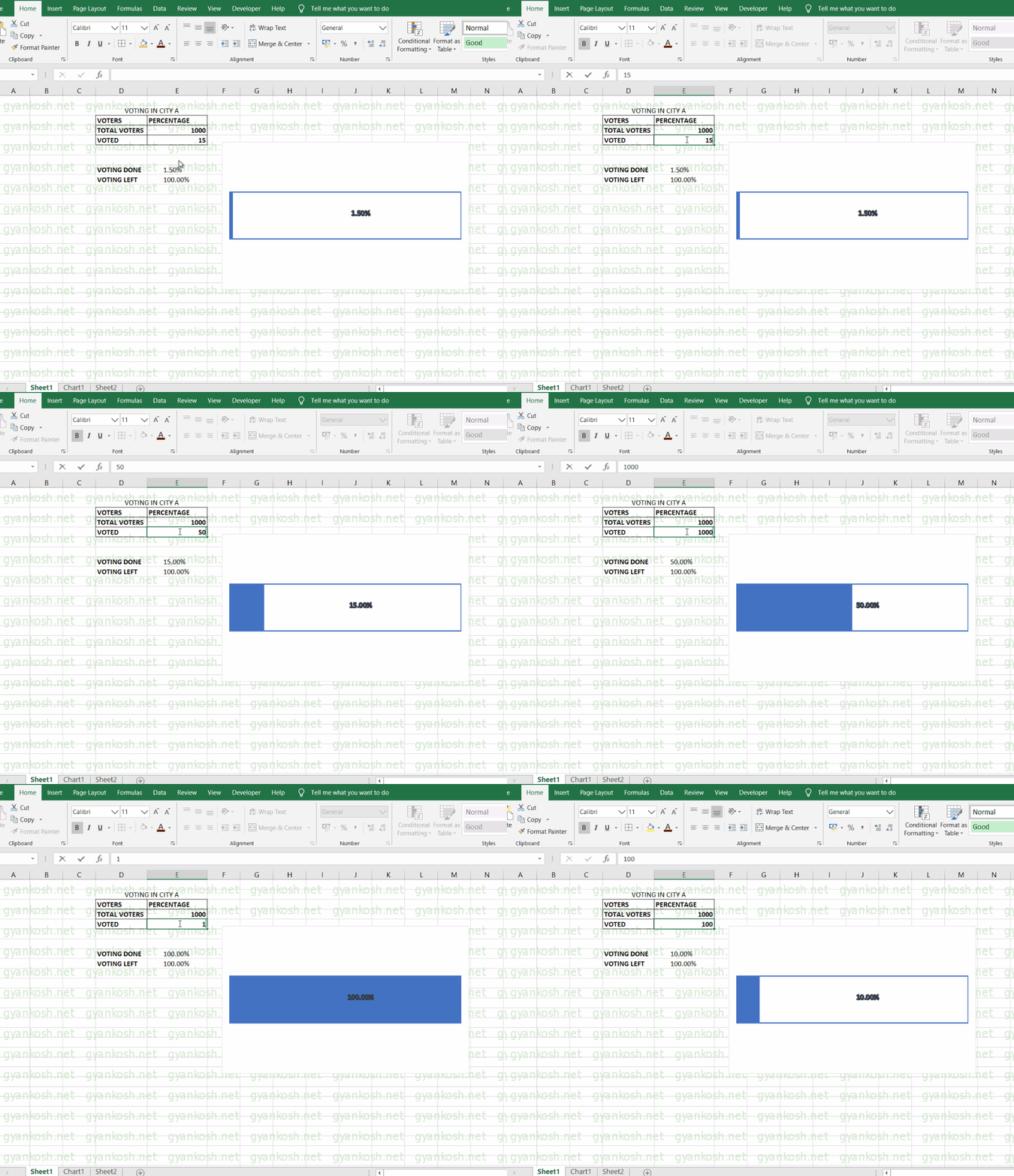
- Now when we change the VOTED votes field, the percentage of the progress bar changes as shown in the picture.
RUNNING THE PROGRESS CHART
The picture below shows the running of the progress chart. We change the field in VOTED and the corresponding change is seen in the progress bar chart.
Select the LABEL and choose your favorite color, font, and size, etc. going to a home bar and word art choices.
Double Click the solid portion of the column and choose from the available options to decorate your chart as per choice.
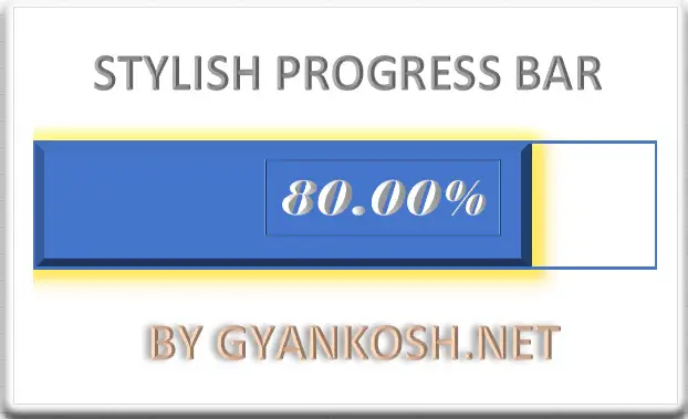
The image, in the beginning, is only the tweaking that has been left to let you make your own version.
OTHER ALTERNATIVES
The progress bar shows the progress in a horizontal manner. If it suits us, there are a few more options too such as a THERMOMETER CHART.
A THERMOMETER CHART is the one, which is the same in all the matter but behaves like a thermometer.
It is kept vertical and shows the progress or the temperature.
CLICK HERE TO LEARN HOW TO CREATE A THERMOMETER CHART IN EXCEL
