Table of Contents
- INTRODUCTION
- PREREQUISITE KNOWLEDGE NEEDED TO CREATE A THERMOMETER CHART
- WHAT IS A THERMOMETER CHART IN EXCEL?
- STEPS TO CREATE A THERMOMETER CHART IN EXCEL
- PRE-PLANNING TO CREATE A THERMOMETER CHART IN EXCEL
- STEP 1: INSERTING A 2D CLUSTER CHART IN EXCEL
- STEP 2 : CREATING CUSTOM COLUMNS IN EXCEL
- STEP 3: 3D DESIGNING OF COLUMN SHAPES IN EXCEL
- STEP 4: MERGING THE COLUMNS AND DELETING EXTRAS IN EXCEL
- STEP 4: RUNNING THERMOMETER CHART IN EXCEL
- OTHER ALTERNATIVES
INTRODUCTION
In this article, we’ll learn step by step process of creating a THERMOMETER CHART in Excel.
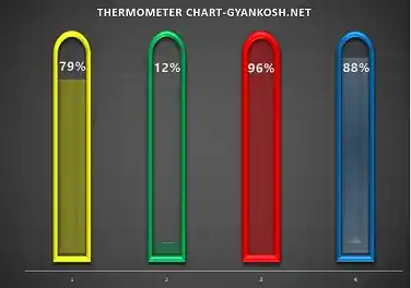
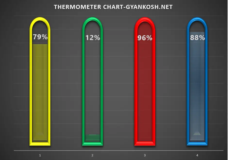
Have a look at the chart above; fascinating! isn’t it??
(Didn’t like?? Even if you didn’t like it, don’t worry, you’ll make it better. We are teaching how to make any kind of chart as per your imagination )
This is a step by step guide to create a THERMOMETER CHART in Excel. The article contains pictures and info graphics to help you understand easily and correctly.
Kindly go through the article if you want to learn how to make this chart and of course, you can create your own design too.
But before trying to create this chart, you must know the basics of chart creation.
If want to know how to create the basic charts. CLICK HERE.
The procedure of creating a thermometer chart is almost like the progress chart which we tried last time.
There is no direct provision in MICROSOFT EXCEL for creating a chart that will show the progress.
So here, we’ll try to create a THERMOMETER CHART in EXCEL.
This kind of chart is useful for certain conditions where we want to express the progress of any task visually. We can also use the thermometer chart to show the level of any parameter.
PREREQUISITE KNOWLEDGE NEEDED TO CREATE A THERMOMETER CHART
Although, anybody can create a progress or thermometer chart, but it would be easier if we have basic knowledge about the process of creating a simple chart first.
CLICK HERE to have a look at the simple chart making process.
WHAT IS A THERMOMETER CHART IN EXCEL?
A chart that shows the progress of any task is known as a THERMOMETER CHART or the PROGRESS CHART.
The progress is mostly expressed as a percentage and it resembles the thermometer which has an upper limit and a value starts reaching the highest value slowly, hence the name, thermometer chart.
Suppose there are 1000 people who need to take a survey. Till now, only 100 have taken it.
So, if we want to tell the progress, it’ll be best shown by a progress chart.
You must be aware of a progress chart or progress bar .
Whenever a heavy application loads, it shows a progress bar, which shows the current status and the final level up to which it has to go, is a progress bar. Similar to PROGRESS BAR CHART which is horizontal, the THERMOMETER CHART is vertical and can be used to show temperature, precipitation,level etc. in the beautiful customized chart columns.
The normal charts don’t show the highest possible value but only the current value, that’s why we need to use this trick to get it done and create a chart which shows the maximum possible vlaue too.
STEPS TO CREATE A THERMOMETER CHART IN EXCEL
PRE-PLANNING TO CREATE A THERMOMETER CHART IN EXCEL
We’ll start creating a THERMOMETER chart in Excel.
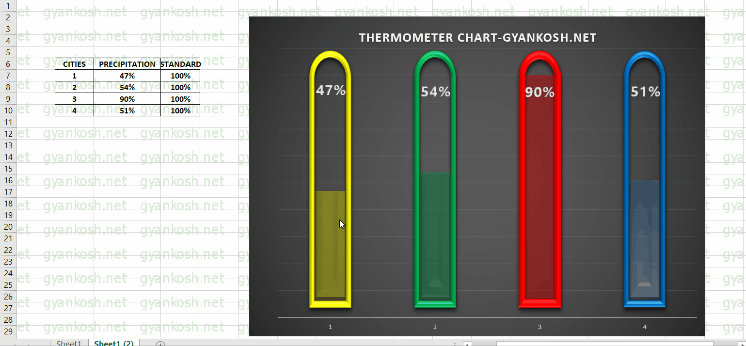
WE’LL CREATE A CHART TO SHOW THE CHANCES OF PRECIPITATION ON A PARTICULAR DAY IN FOUR DIFFERENT CITIES NAMELY 1, 2, 3, AND 4.
Here is the plan to create a THERMOMETER chart.
- We’ll use the data as the percentage of chances-of-precipitation.
- For the task, 2D cluster chart type of charts are perfect as they represent the different series with the different columns which can be merged.
- The plan is to overlap the two columns over each other, where one column is transparent and the other is having a solid color.
- The control of the value will be given only to the solid color column so that it looks like mercury in the thermometer.
- The graphics can be edited as per choice.
- Our thermometer chart is ready.
STEP 1: INSERTING A 2D CLUSTER CHART IN EXCEL
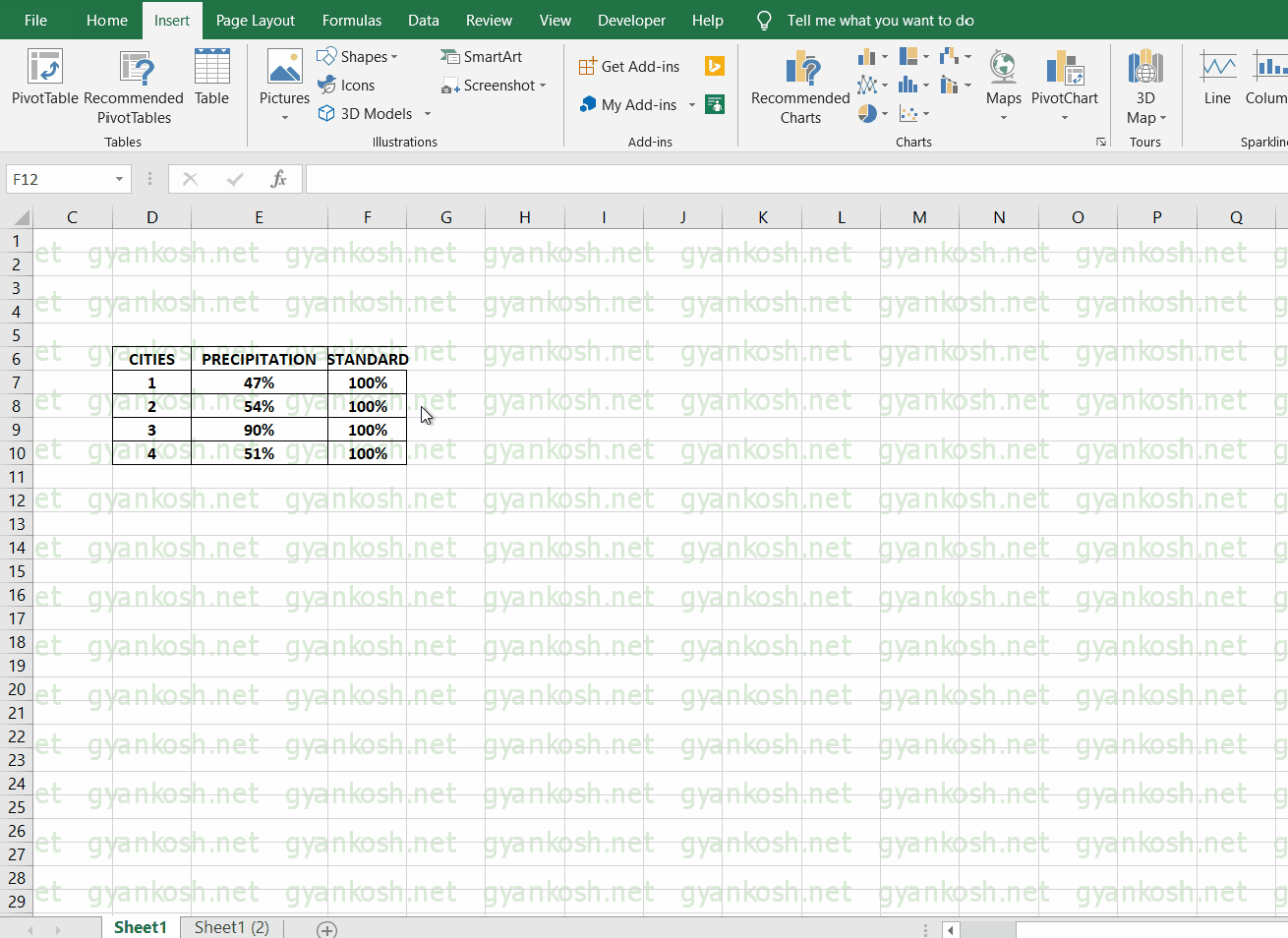
Let us first understand the case.
We have four cities 1, 2, 3 and 4. The chances of precipitation are given in the table shown below.
| CITIES | PRECIPITATION | STANDARD |
| 1 | 47% | 100% |
| 2 | 54% | 100% |
| 3 | 90% | 100% |
| 4 | 40% | 100% |
- Select the columns PRECIPITATION AND STANDARD and go to INSERT> CHARTS>RECOMMENDED CHARTS.
- Select ALL CHART TYPES TAB NEXT TO RECOMMENDED CHARTS and select COLUMN and select MULTICOLOR CLUSTERED COLUMN as shown in the picture below.
- Select the chart and click OK. The following picture will follow.
The above picture shows the chart selected.
STEP 2 : CREATING CUSTOM COLUMNS IN EXCEL
After inserting a chart, we have four columns each for the precipitation and corresponding four columns as standards.
The next step is creating four empty columns which will always be there to show the full progress (representing the standard value of 100%) and which will be created to be shown as empty in the background with a solid line.
STEPS: [ The pictorial help is in the animation below. Refer to the steps and the picture ]
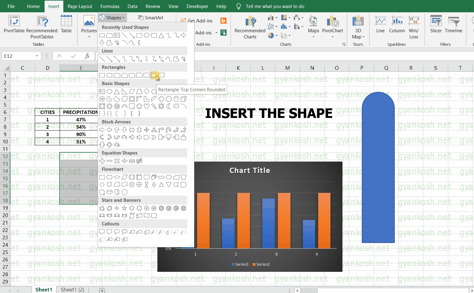
- Go to INSERT TAB.
- Go to SHAPES and insert the shape as shown in the picture.
- Select RECTANGLE with a rounded edge and draw a shape looking like a column as shown in the animation below.
- After drawing this, drag inwards using the controlling circle at the top of the figure drawn.
- The top of the shape will become an absolute circle and it’ll look like a semi-circle on top of the rectangle.
- Right-click the figure and different options will open.
- Choose the fill option and choose the red color.
- Again select the figure that we just drew and press CTRL+C to copy the figure.
- CLICK CTRL+V to paste a copy of the figure.
- Now we’ll have two columns filled with Red color, but we need one column with solid color and one with outline only.
- So select one of the two columns and Right-click it.
- Choose the FILL option and choose NO FILL.
- Again press right-click on the same figure and click OUTLINE and choose the outline of the SAME COLOR.
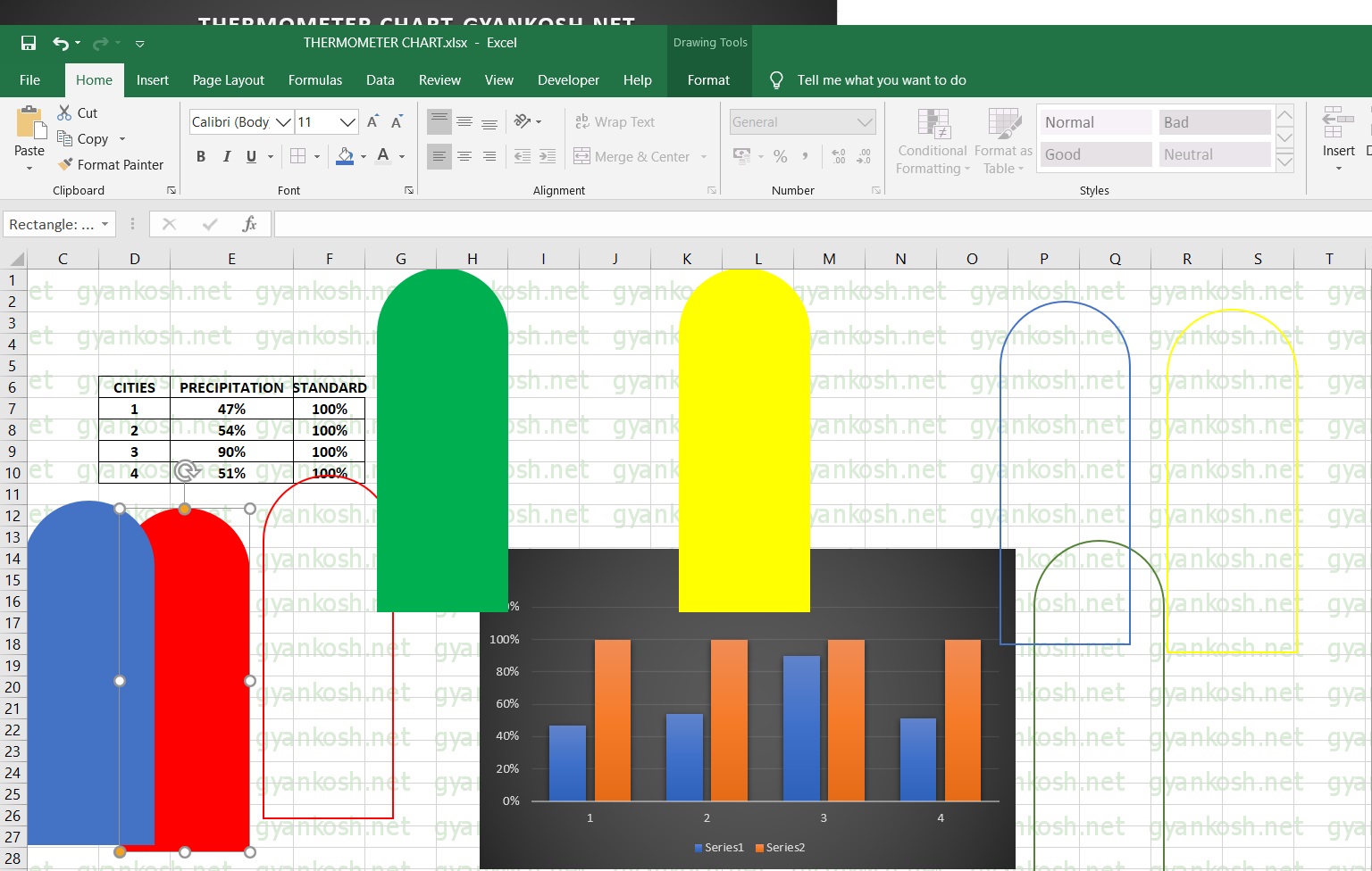
COPYING THE COLUMNS IN EXCEL
After creating these two columns, [ One with color filled and one empty with just outline ],
copy one of the column and paste it six more time so that we have eight column in total.
Now choose the colors as per the design and use the fill options as already told so that we have four columns with solid colors and four with just outlines.
The colors chosen for our example are BLUE, GREEN, RED and YELLOW.
The final picture after copying and treating all the figures is something like the one shown in the picture below.
NOTE: The design shown here can be changed as per your choice. You can choose any customized shape to take place of standard columns.
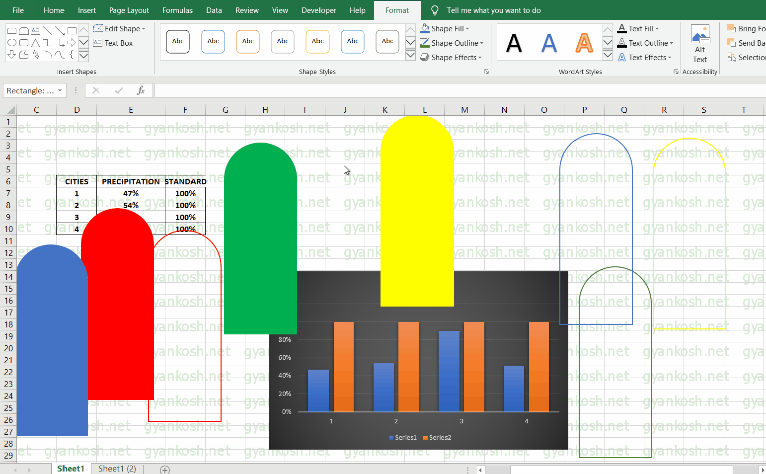
The current status of our task will be like the one shown in the picture below.
A chart, 8 figures out of which four are solid and four are empty.
STEP 3: 3D DESIGNING OF COLUMN SHAPES IN EXCEL
*THIS SECTION IS ONLY APPLICABLE IF YOU WANT SOME 3D EFFECT ON THE COLUMNS.
YOU CAN SKIP IT IF YOU DON’T NEED ANY CHANGES IN THE LOOK OF THE CHART.
This section is optional but as we have seen the first image, there are a few 3D tweaks in the columns.
So let us try those here too. The following animation shows the steps for reference.
- Double click a solid color shape.
- Choose format tab which will temporarily be visible when you double click the shape.
- Go to SHAPE EFFECTS.
- Go to PRESET and choose the one shown in the picture. It calls it PRESET 2.
- After this , go to BEVEL option under the SHAPE EFFECTS and choose CUTOUT.
- At last, choose GLOW and choose the glow of the same color.
- Repeat the process for rest of the columns.
- Let us check our empty columns now.
- Select one of the empty column and go to SHAPE EFFECTS and choose glow .
Choose the color matching the color of the column which will create the effect. - Repeat the process for rest of the empty columns.
STEP 4: MERGING THE COLUMNS AND DELETING EXTRAS IN EXCEL
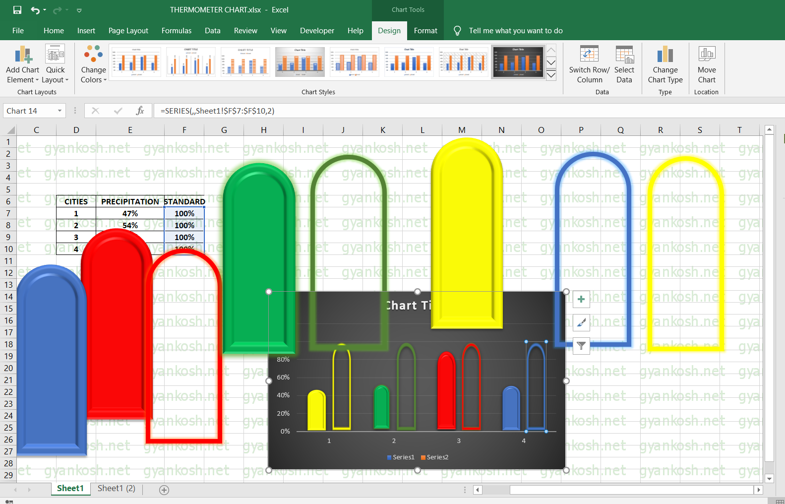
PUTTING NEWLY MADE COLUMNS IN PLACE
After the columns are ready , let us put them place.
- Click one of the pictures and press CTRL+C to copy.
- Now double click one of the column of the chart [kindly take care only the column to be replaced is selected] and click CTRL+V. It’ll replace the column shape with the one we pasted.
- Repeat the process for all. After total replacement , our chart will look like this.
- Delete the rest of the figures which are not needed now. The replacement has already been done.
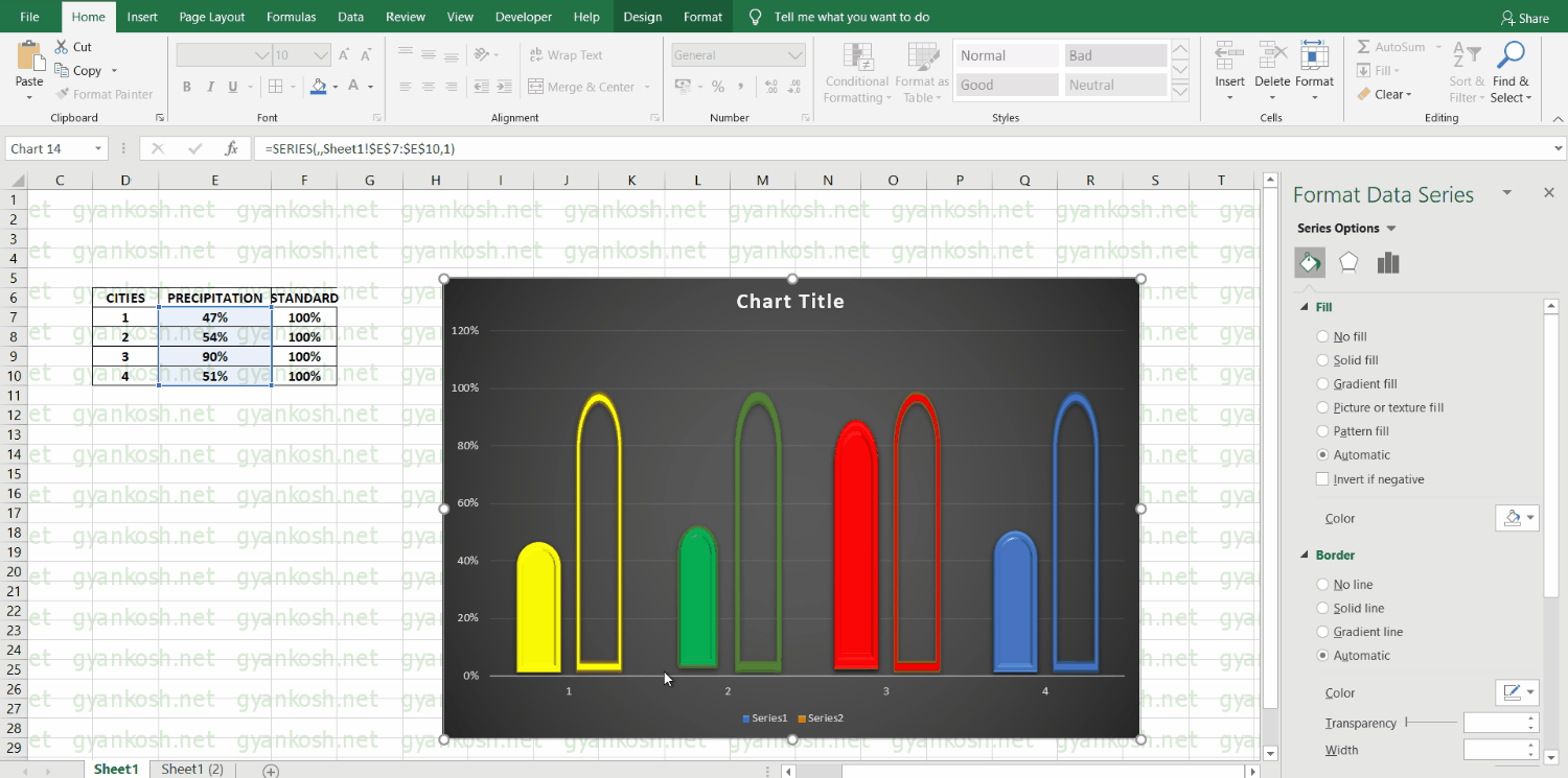
MAKING THE SOLID BARS LOOK LIKE WATER TO CREATE THERMOMETER CHART IN EXCEL
REFER TO THE PICTURE ABOVE. We want our solid bars to look like water or glass, so we need to set the transparency of columns.
- Double click the solid bar.
- FORMAT DATA POINT will open on right side.
- Go to first option of FILL AND LINE.
- Go to transparency and select 63%. (you can choose whatever you want)
- Repeat the process for all the solid columns.
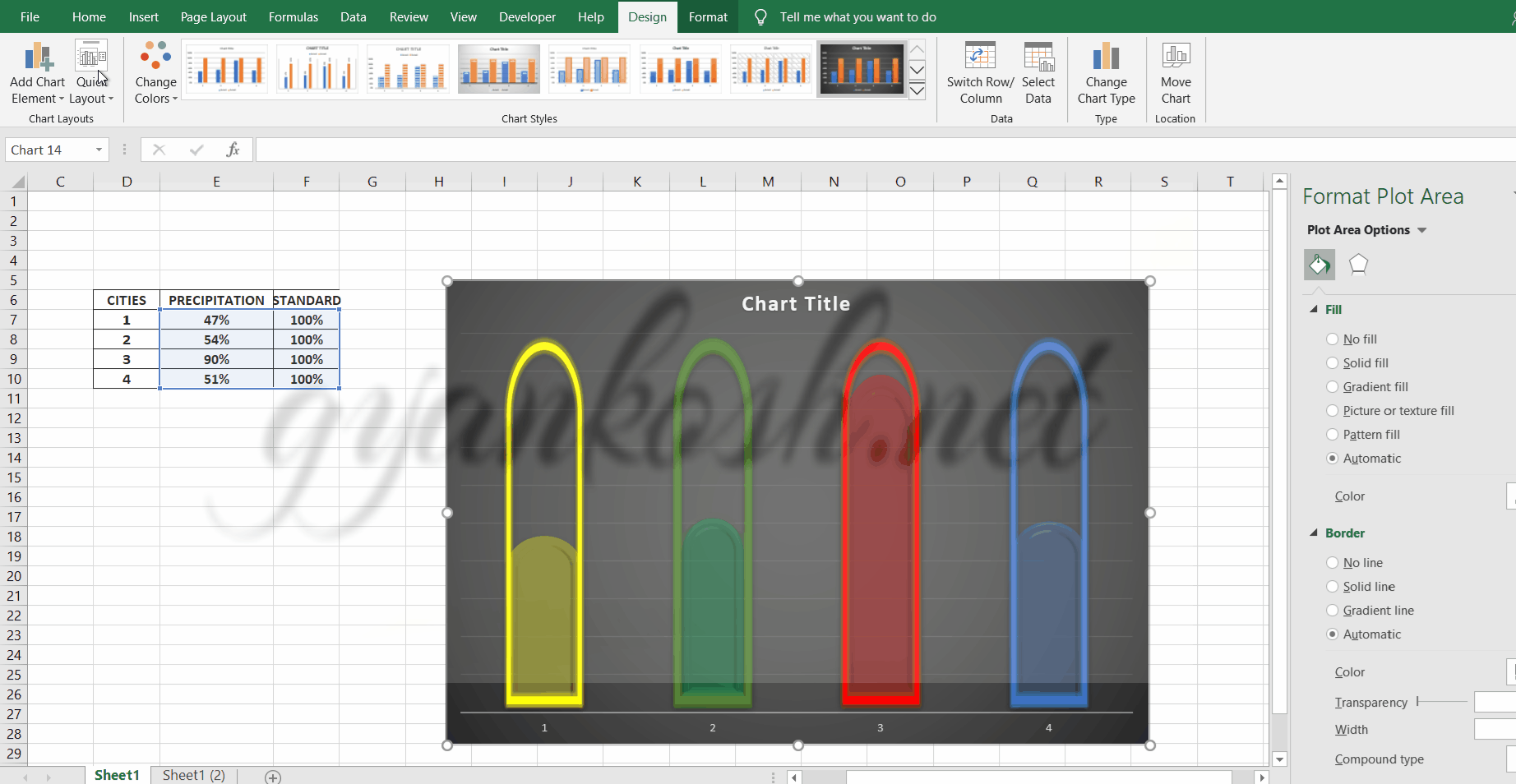
SETTING THE AXIS IN EXCEL
Refer to the picture below.
- Double click the vertical axis. Again the options on the right side will open.
- Go to the Axis options.
- Put the minimum value as 0 and maximum value as 1.
- Press Enter.
MERGING THE BARS IN EXCEL
Refer the picture above.
Now our all the columns are ready so let us overlap them.
For that, double click the solid color column. By one click all the columns will be selected.
Follow the steps below.
- Go to series options.
- Drag the overlap the series to 100% [positive].
- It’ll put both the bars on one of each other and it’ll look like the partial filled tumblers.
- NOW DELETE ALL THE EXTRAS LIKE CHART TITLES, ALL THE AXES MARKERS, BARS BEHIND THE BARS ETC BY CLICKING ON THEM TO SELECT AND PRESSING DELETE BUTTON ON THE KEYBOARD.
- Our chart is ready.
- Let us do a few more tweaks.
STEP 5: INSERTING LABELS IN EXCEL CHARTS
PUTTING THE LABELS ON THE GRAPH
The graph should look like the one without any other labels or axis.
Just the columns and nothing else.
We just kept the horizontal bars for the recognition of the city as 1,2,3 and 4.
LET US PUT A PERCENTAGE LABEL ON ALL THE COLUMNS.
The following animated picture shows the process.
The description is given below.
STEPS:
- Go to INSERT TAB and choose WORDART of your choice.
- A text box will appear.
- Go to the address bar after selecting the text box and type.
- =Address of the cell containing the percentage.
- In our case it is Sheet1!E7 for the first column. Select the word art box and put in the address bar =Sheet1!E7.
- Repeat the process for all the four solid color columns.
- The word art will start showing the percentage of the bar.
- Drag it to the middle of the bar.
- Set the size etc. by the HOME TAB FONT controls.
- Make necessary tweaks using the right side option for modifying the text and picture.
- Do whatever beautifying techniques you want.
- Now as soon as we change the Precipitation, the graph changes and shows the chances according to the precipitation chances of that particular city.
STEP 4: RUNNING THERMOMETER CHART IN EXCEL
The picture shown below is the running of the thermometer chart. We change the field in PRECIPITATION and corresponding change is seen in the thermometer charts.
Select the CHART LABEL and choose your favorite color , font and size etc. going to home bar and word art choices.
Double Click the solid portion of the column and choose from the available options to decorate your chart as per choice.
In this article, we learnt the process of thermometer chart in excel step by step.
There can be an alternative for thermometer chart also known as a progress chart.
OTHER ALTERNATIVES
The thermometer chart is always used in the vertical manner.
But we can use the same process to create a PROGRESS CHART in the same manner.