Table of Contents
- INTRODUCTION
- WHAT IS A PIVOT CHART?
- PURPOSE OF PIVOT CHARTS IN GOOGLE SHEETS
- EXAMPLE 1: CREATE PIVOT CHART OF THE GIVEN DATA
- EDITING THE PIVOT CHART WITH CHANGE IN THE DATA
- FAQs
- HOW TO CREATE CHART FROM PIVOT TABLE ?
INTRODUCTION
PIVOT TABLE is a well known feature of GOOGLE SHEETS which everybody of us might have heard of. But many
times we don’t know how to effectively use the PIVOT TABLE.
PIVOT TABLE is a dynamic table which we can create in GOOGLE SHEETS. We called it dynamic as we can transform it within seconds. The original data remains the same.
CHARTS are the graphic representation of any data .
Analysis of data is the process of deriving the inferences by finding out the trends,totals, subtotals other operations etc. about different parameters.
PIVOT CHARTS ARE SIMPLY THE CHARTS MADE FOR THE PIVOT TABLES.
There is no direct option for PIVOT CHARTS in GOOGLE SHEETS. So we’ll learn to create pivot tables and how we can create visualizations there.
WHAT IS A PIVOT CHART?
A chart is a graphical representation of a data.
If we state simply, pivot chart is the graphical representation of the data in our pivot table.
We create pivot tables as they let us change the data, filter it as per our will and show the results in a few seconds. Similarly, if the pivot tables show the results within seconds, if we create a chart for these, the charts will be as easy to handle as pivot tables are.
So, we create pivot charts.
PURPOSE OF PIVOT CHARTS IN GOOGLE SHEETS
THERE IS NO DIRECT OPTION OF CREATING PIVOT CHARTS IN GOOGLE SHEETS.
But we can create them by first creating a PIVOT TABLE and then creating a chart on the pivot table.
PIVOT CHARTS ARE THE CHARTS MADE FOR THE PIVOT TABLES.
THEY ARE USED AS THEY PROVIDE US WITH THE DYNAMISM OF THE PIVOT TABLES.
We’ll take an example to learn the complete procedure.
For the Detailed Learning you can visit the links here.
For learning pivot tables, PIVOT TABLES IN GOOGLE SHEETS.
For learning the basics of chart creation, CREATING CHARTS IN GOOGLE SHEETS.
EXAMPLE 1: CREATE PIVOT CHART OF THE GIVEN DATA
Let us take an example for creating the pivot chart.
We’ll take the sales data on different days of a month and create pivot table first.
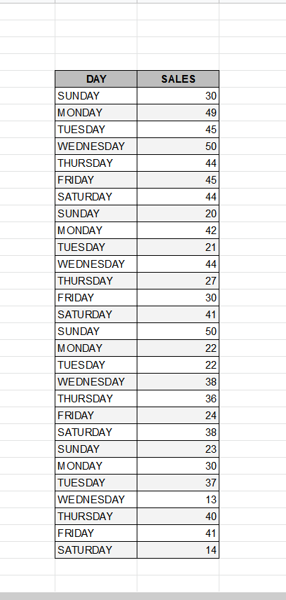
FIND OUT THE DAY WISE SALES OF THE TABLE USING PIVOT TABLES.
| DAY | SALES |
| SUNDAY | 30 |
| MONDAY | 49 |
| TUESDAY | 45 |
| WEDNESDAY | 50 |
| THURSDAY | 44 |
| FRIDAY | 45 |
| SATURDAY | 44 |
| SUNDAY | 20 |
| MONDAY | 42 |
| TUESDAY | 21 |
| WEDNESDAY | 44 |
| THURSDAY | 27 |
| FRIDAY | 30 |
| SATURDAY | 41 |
| SUNDAY | 50 |
| MONDAY | 22 |
| TUESDAY | 22 |
| WEDNESDAY | 38 |
| THURSDAY | 36 |
| FRIDAY | 24 |
| SATURDAY | 38 |
| SUNDAY | 23 |
| MONDAY | 30 |
| TUESDAY | 37 |
| WEDNESDAY | 13 |
| THURSDAY | 40 |
| FRIDAY | 41 |
| SATURDAY | 14 |
STEP 1: CREATE A PIVOT TABLE FOR THE GIVEN DATA
The very first step of creating a pivot chart is to create a pivot table for the given data.
Follow the steps to create the pivot table for the data.
- Select the Complete Table.
- Go to DATA MENU and click PIVOT TABLE.

- A small window will open asking for the location of the PIVOT TABLE.
- Choose a location in the same sheet or if you opt NEW SHEET, it’ll create the pivot table in a new sheet.
- For our example, we have chosen NEW SHEET.
- Click CREATE.
- A new sheet containing the PIVOT TABLE is created. The sheet is shown in the picture below.
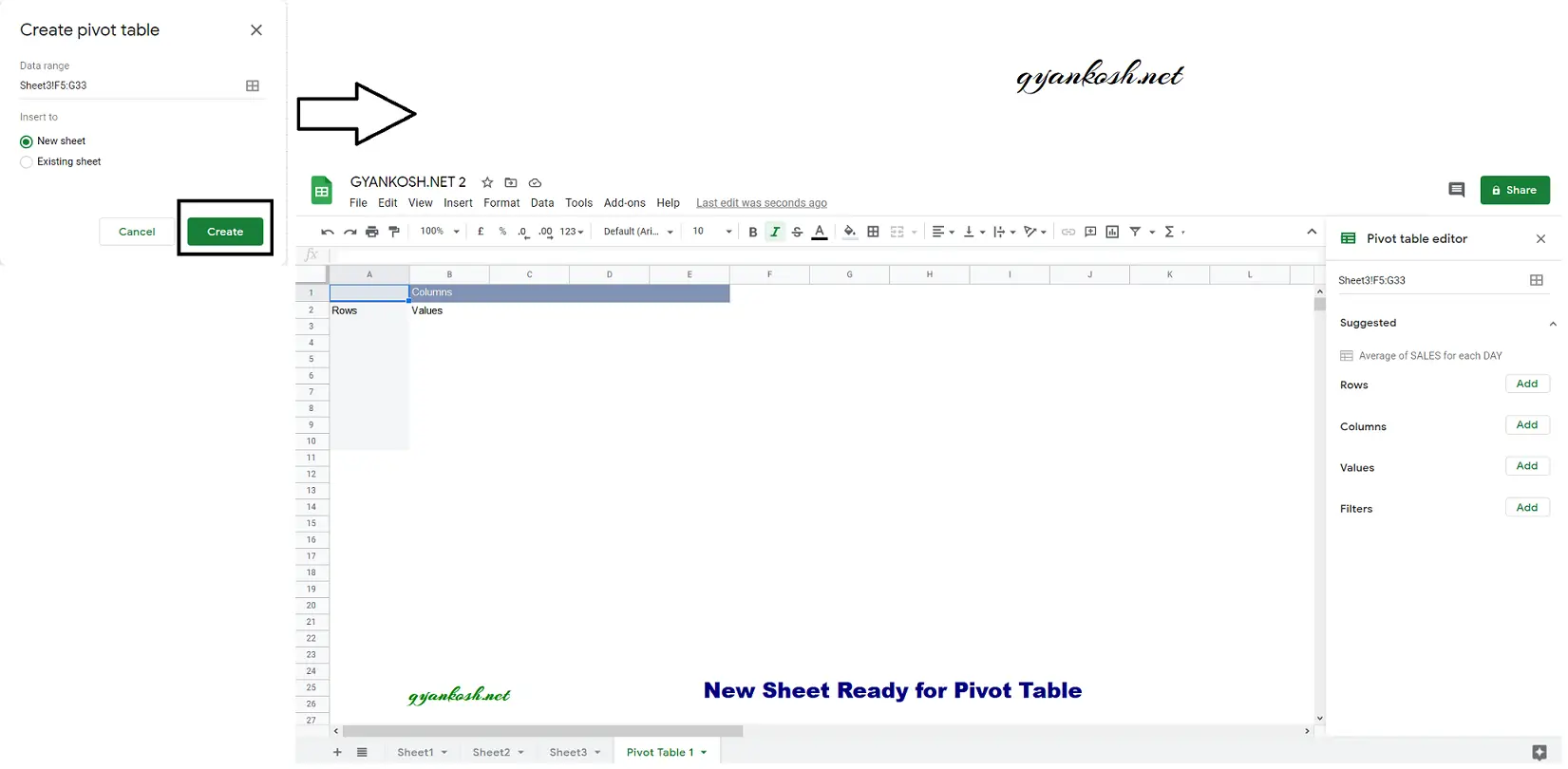
- In the pivot table sheet, we need to add the rows and values to the pivot table.
- REMIND THE OBJECTIVE.
- WE NEED TO CREATE A CHART OF THE TOTAL SALES ON DAYS OF THE WEEK.
- Go to the PIVOT TABLE EDITOR on the right, as shown in the picture.
- Click ADD button in front of ROWS.
- Select DAY column.
- It’ll add the DAY COLUMN in the pivot table.
- Now similarly, click ADD across VALUES and choose the function SUMMARIZE BY as SUM.
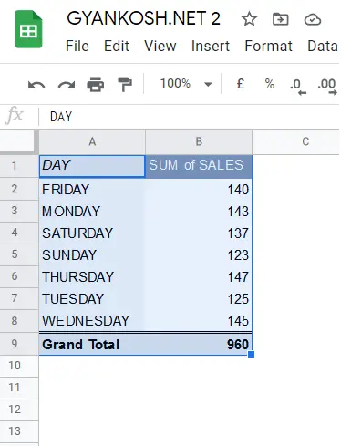
- Our PIVOT TABLE is ready.
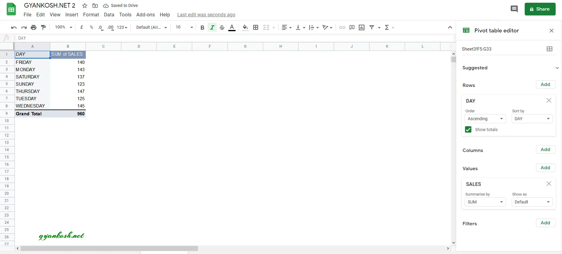
Our PIVOT TABLE is ready after adding the rows and values.
Have a look at the picture below.
They Days shows the total sales in three week.
STEP 2: CREATE PIVOT CHART FROM PIVOT TABLE
Now our pivot table is ready. So, it is time now to create a pivot chart.
FOLLOW THE STEPS TO CREATE PIVOT CHART FROM PIVOT TABLE IN GOOGLE SHEETS
- Select the pivot table, including headers as shown in the picture below.
- Click CHART BUTTON in the toolbar as shown in the picture below.

The following picture shows the PIVOT CHART in Google Sheets.
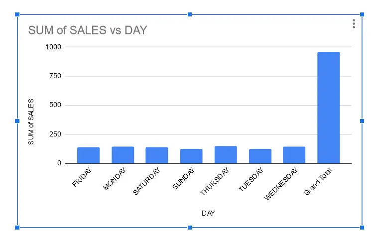
A few things to be noticed here are :
- Any available type of chart can be selected from the Chart Editing. Bar chart was populated automatically with google’s sense of data.
- The chart will change as we make changes in our pivot chart. For example, if we make a change in data, function etc.
- A few lapses are there, such as no change in the Chart titles or axis titles which can be corrected manually as shown in the next section.
In the next section, we’ll check if the chart responds to the change in pivot table data or not.
EDITING THE PIVOT CHART WITH CHANGE IN THE DATA
Let us try to change the pivot charts.
The changes in the pivot charts can be simply done with the help of pivot table which is the data for the pivot chart.
– If we need to make changes in the data or function, edit the pivot table.
– If we want to make changes in the chart, chart titles, chart type etc. , edit the Chart options.
LET US CHANGE THE FUNCTION FROM SUM TO AVERAGE.
FOLLOW THE STEPS TO CHANGE THE FUNCTION.
- Click anywhere in the pivot table.
- The PIVOT TABLE EDITOR will open on the right side.
- Go to VALUES section and choose AVERAGE from the SUMMARIZE BY option as shown in the picture below.

- As we make the selection, the chart will change and start showing the AVERAGE of the Sales.
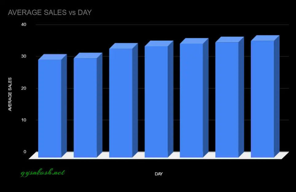
- The following picture shows the PIVOT CHART showing the DAY WISE AVERAGE SALES.
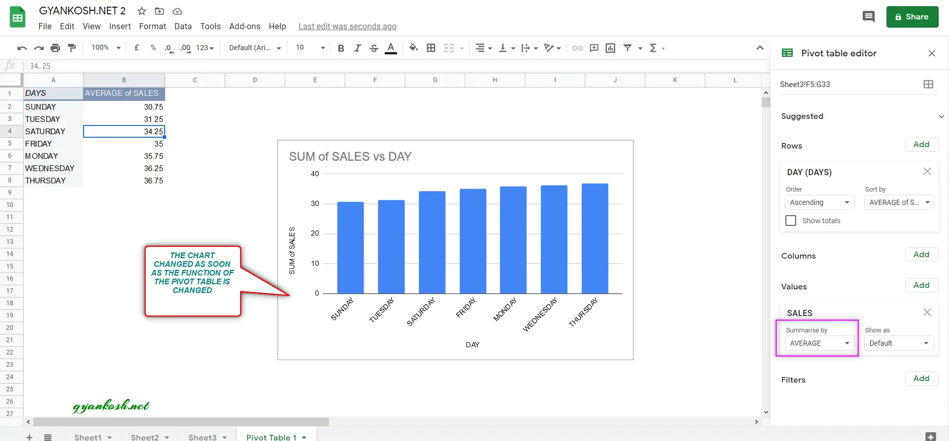
You must have noticed that although we changed the function from SUM to AVERAGE, but the chart titles and axis titles are not changed this time.
So we need to change them manually.
IT IS RECOMMENDED THAT YOU FINISH THE DATA EDITING FOR THE CHART AND EDIT THE CHART AND AXIS TITLES AT THE END.
The following picture shows the error change of titles.
EDITING THE CHART TITLE AND AXIS TITLES OF PIVOT CHARTS IN GOOGLE SHEETS
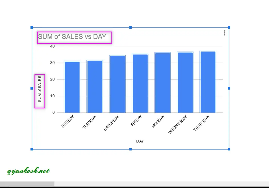
As our titles didn’t change, let us change them manually.
- Click on the chart.
- CHART EDITOR will open on the right portion of the screen.
- Go to CUSTOMIZE TAB.
- Go to Chart and Axis Titles.
- Select CHART TITLE and change it as AVERAGE SALES.
- Now, select VERTICAL AXIS TITLE from the drop down and change the title as AVERAGE SALES.
- The process is shown in a series of pictures below.

Now , our pivot chart is finally ready.
We have changed the titles, Background color, opted for the 3D chart.
The final pivot chart is shown in the picture below .
FAQs
HOW TO CREATE CHART FROM PIVOT TABLE ?
Once we have created the pivot table, we can simply go for the chart creation of any type the same way as we’d done if it was a simple table with data.