Table of Contents
- INTRODUCTION
- WHAT ARE COMBO CHART IN GOOGLE SHEETS ?
- WHERE IS THE OPTION TO CREATE COMBO CHART IN GOOGLE SHEETS ?
- EXAMPLE TO MAKE A COMBO CHART IN GOOGLE SHEETS
- HOW TO CHOOSE THE INDIVIDUAL CHART TYPES IN COMBO CHART IN GOOGLE SHEETS
- NOTE:
- FAQs
- WHAT ARE THE DIFFERENT TYPES OF CHARTS WHICH CAN BE USED IN COMBO CHART IN GOOGLE SHEETS?
- HOW TO SHOW DATA LABELS IN COMBO CHART IN GOOGLE SHEETS?
INTRODUCTION
CHARTS are the graphic representation of any data . Google Sheets provide us a number of visualization options in the form of different charts and graphs etc.
In this article, we would learn to make a combo chart in google sheets and use it in google sheets. We’ll combine more than one chart to create a combination on the different axis presenting multiple information on the same chart.
GOOGLE SHEETS gives us a variety of charts which are beautiful, colorful, more customizable and more powerful.
In this article we are going to discuss COMBO CHART which is a combination of two charts on the same axes.
COMBO CHART IS THE TYPE OF CHART WHICH IS A COMBINATION OF MORE THAN ONE TYPE OF CHARTS IN GOOGLE SHEETS
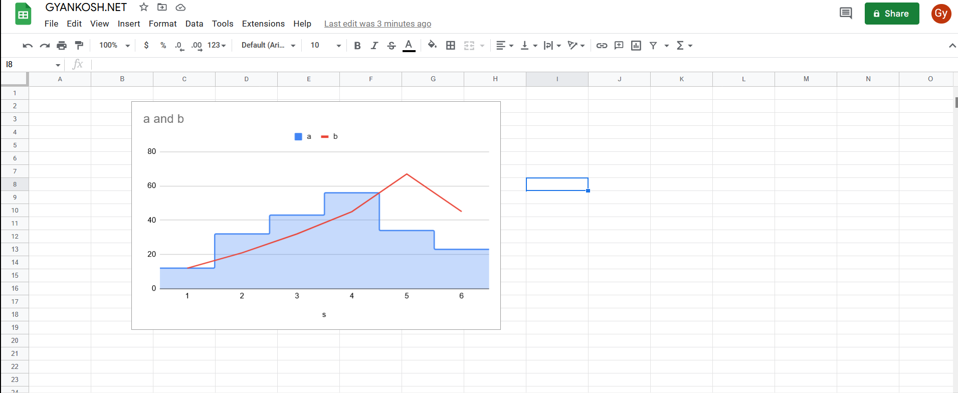
For example, if we have a combination of line chart and a column chart, we can get the following information at the same time.
In a line chart , slope tells the rate of increment or decrement whereas column chart simply marks the values.
WHAT ARE COMBO CHART IN GOOGLE SHEETS ?
THE COMBO CHART [ COMBINED CHARTS] IS A COMBINATION OF TWO OR MORE CHARTS IN GOOGLE SHEETS. WE CAN COMBINE MANY CHARTS TOGETHER SUCH AS LINE, COLUMN , AREA AND SO ON.
We can overlay two different charts or graphs on the same axes and compare the two different parameters.
Combination charts are created by transposing two or more charts on the same area.
WHERE IS THE OPTION TO CREATE COMBO CHART IN GOOGLE SHEETS ?
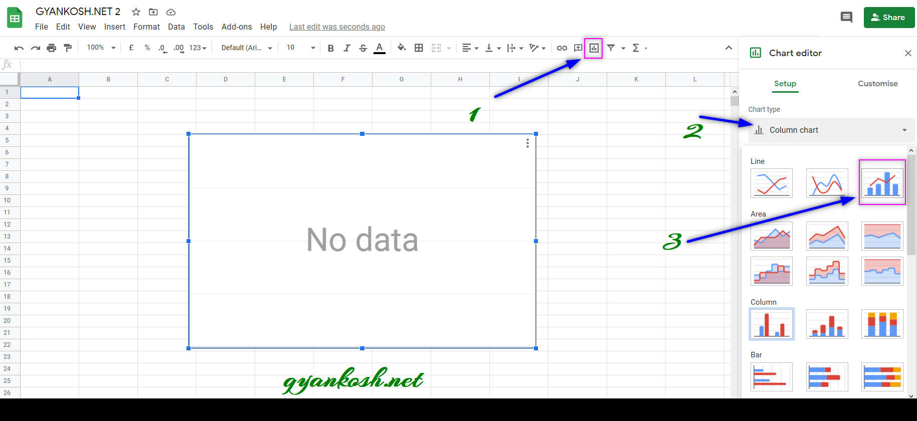
The COMBO chart can be easily inserted by the chart button on the toolbar itself.
The button location is shown in the picture below.
TOOLBAR BUTTON LOCATION FOR CHARTS INSERTION
- Click the CHARTS BUTTON which will open the Chart Editor.
- In the Charts Editor, Select COMBO CHART from the CHART TYPE DROP DOWN LIST as shown in the picture below.
MENU OPTION TO INSERT A COMBO CHART:
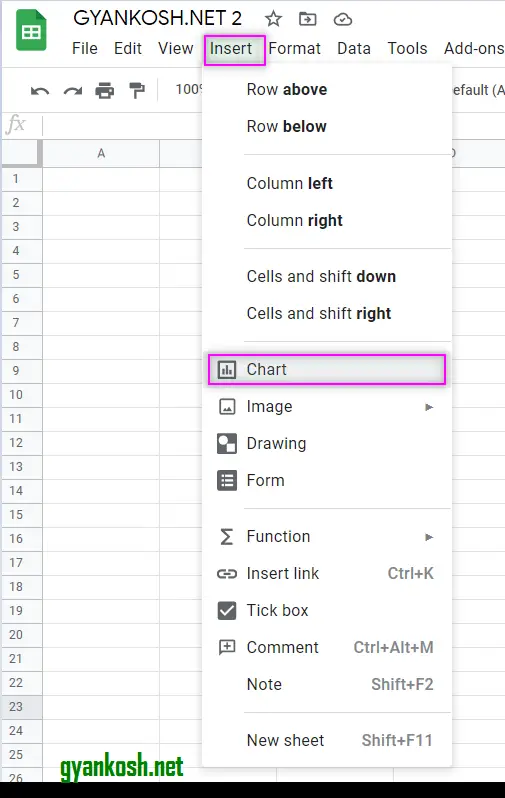
We can insert a chart using the Menu also as chart option is available in the menu too.
- Go to INSERT MENU > CHART.
- After clicking the CHART , CHART option will appear.
- Choose COMBO CHART from the CHART TYPE DROP DOWN.
- Charts Editor is exactly same as shown in the picture above. [ TOOLBAR BUTTON FOR CHARTS INSERTION ]
The location is shown below in the picture.
After clicking the CHARTS OPTION, follow the same procedure as in the TOOLBAR OPTIONS FROM S.NO. 2 onwards to choose from the given charts.
EXAMPLE TO MAKE A COMBO CHART IN GOOGLE SHEETS
EXAMPLE DETAILS
We can demonstrate the creation of chart using an example.
We’ll discuss an example which shows the projected sales vs actual sales vs difference between the projected sales and actual sales.
| YEAR | PROJECTED SALES | ACTUAL SALES | DIFFERENCE |
| 2011 | 12 | 10 | 2 |
| 2012 | 15 | 14 | 1 |
| 2013 | 14 | 15 | -1 |
| 2014 | 20 | 19 | 1 |
| 2015 | 25 | 22 | 3 |
| 2016 | 40 | 38 | 2 |
The procedure to insert a COMBO chart are as follows:
STEPS TO MAKE A COMBO CHART IN GOOGLE SHEETS :
- The first requirement of any chart is data . So create a table containing the data. [ We have already created in the form of table above]
- Refer to our data above, we have SALES DATA FOR 6 YEARS.
- Select the complete table including the HEADER NAMES.
- Go to TOOLBAR > CHARTS .
- CHART EDITOR will open on the right side.
- Click CHART TYPE and choose COMBO CHART from the drop down list.
- The chart will be created as shown in the picture below.
The process is depicted in the picture below.
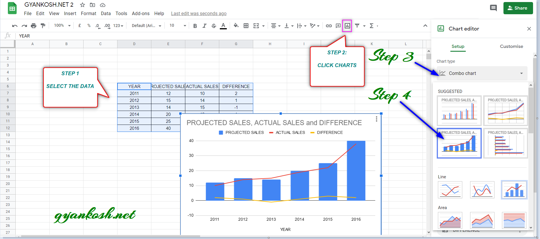
We can see that the three series are shown with the help of a column chart and two line charts in the same space.
After a few tweaks, here is our final combo chart.

HOW TO CHOOSE THE INDIVIDUAL CHART TYPES IN COMBO CHART IN GOOGLE SHEETS
EXAMPLE DETAILS
A need may arise when we want to choose the individual chart type for a particular series.
In our example, we have three series. Let us learn to find out the way to choose the individual chart type.
Currently , we have the following charts in our Combo chart.
Actual Sales and Difference are as a Line Chart and Projected Sales is shown as a column chart.
Let us change the Actual Sales to Column chart .
The procedure to insert a COMBO chart are as follows:
STEPS TO CHANGE INDIVIDUAL CHART TYPE IN COMBO CHART FOR GOOGLE SHEETS :
We have already created a combo chart in the previous section.Let us try to change the chart type of actual sales from LINE CHART to COLUMN CHART in the combo chart we created.
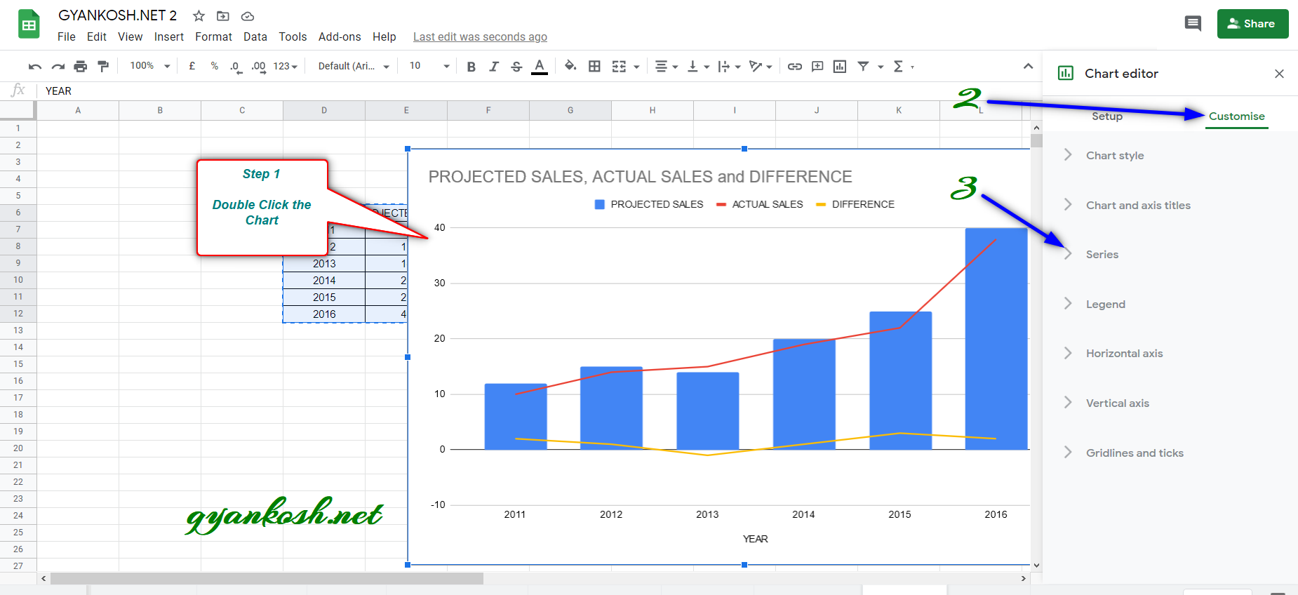
- Double Click the chart to open the CHART EDITOR on the Right portion of screen.
- In the CHART EDITOR, choose CUSTOMIZE TAB.
- Go to SERIES options and click it.
- The process is depicted in the picture below.
- In the SERIES OPTIONS click the SERIES DROP DOWN as shown here and choose ACTUAL SALES.
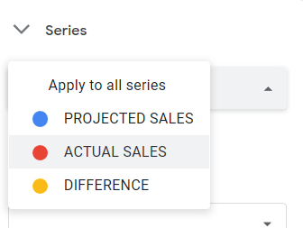
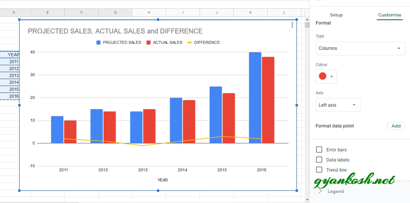
- Now click the TYPE DROPDOWN and choose COLUMNS to choose the COLUMN CHART TYPE.
- The settings are shown in the picture below.

As we make the selections, the chart type of the series ACTUAL SALES will change immediately.
The final chart is shown below.
This way, we can change the chart type of any given series and can change more options too.
NOTE:
FOR ALL OTHER TASKS LIKE CHANGING THE NAME OF THE CHART, CHANGING THE AXIS , CHANGING THE CHART STYLE ETC.
VISIT HERE [HOW TO CREATE A CHART IN GOOGLE SHEETS ].
In this article, we learned about the Combo Chart in google sheets, how to create them, how to change the individual charts with the help of examples.
FAQs
WHAT ARE THE DIFFERENT TYPES OF CHARTS WHICH CAN BE USED IN COMBO CHART IN GOOGLE SHEETS?
We can combine the charts like LINE CHART, STEPPED AREA CHART, COLUMN CHART and AREA CHARTS.
HOW TO SHOW DATA LABELS IN COMBO CHART IN GOOGLE SHEETS?
The data labels [ the value shown with the chart e.g. column value adjacent or above column ] can be made visible easily .
Follow the steps to show data labels in combo charts in google sheets:
- Double click the chart and the CHART EDITOR appears on the right portion of screen.
- Go to CUSTOMIZE TAB.
- Choose SERIES and further options will appear.
- Select ALL SERIES, if you want to show the data labels of all the series or select the series which you want to make data labels visible of.
- Check DATA LABELS checkbox.
- The DATA LABELS will appear.
- The animation below shows the process.