Table of Contents
INTRODUCTION
PIVOT CHART is only the simple chart but of the of the pivot tables.
The pivot tables are made and pivot chart is created on the basis of pivot table.
The chart varies as the table varies.
As we know that PIVOT TABLES give us a plethora of options to change the operations and columns and rows within a second and analyze the data as the way we want it.
Similarly the PIVOT CHART is the graphical representation of that particular PIVOT TABLE.
Every operation is same as the pivot table , additional information is presented in the chart which will change as per the pivot table.
BUTTON LOCATION TO CREATE PIVOT CHART IN EXCEL
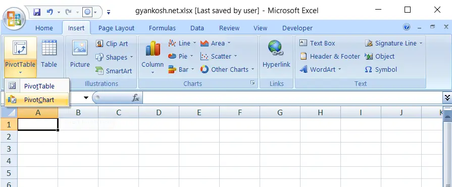
The button location for the creation of a pivot chart is under the INSERT TAB.

STEPS TO USE PIVOT CHARTS IN EXCEL
Just like PIVOT TABLES , pivot charts can also be made by using PIVOT CHART option from the same button drop down menu.
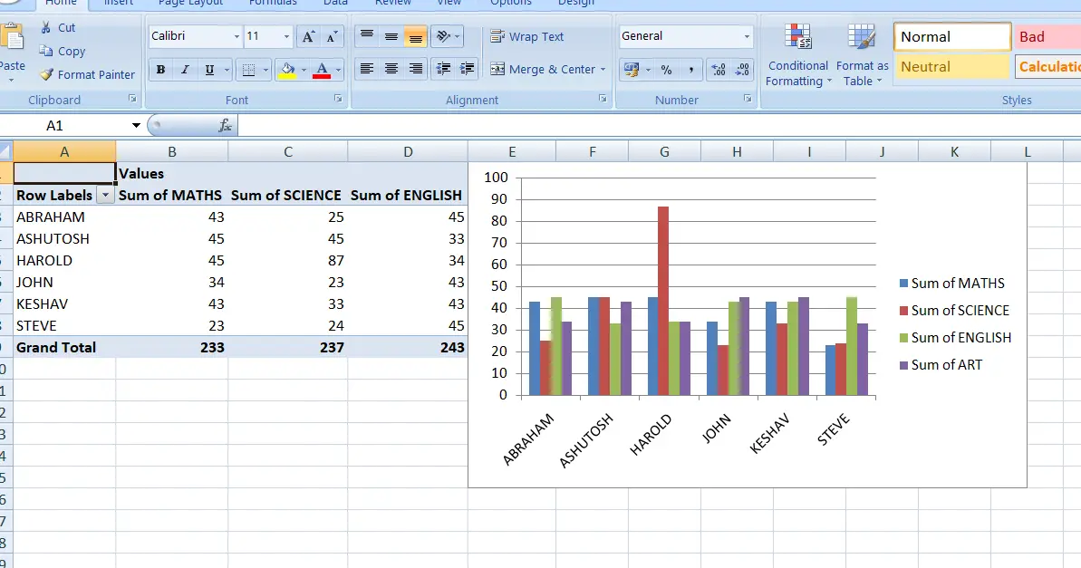
PIVOT CHART option will make the table and draw a chart for you on the same lines as the table. All the options can be used and axes can be set as per the choice.
CLICK HERE TO KNOW
AND
CLICK HERE TO KNOW
With the knowledge of these both posts, you can use pivot charts.

OUTPUT:
It also groups the subtotals, which gives us the option of summarizing the tables easily. We can click the + sign and it’ll look like this.