Table of Contents
- INTRODUCTION
- WHAT IS A RADAR CHART ?
- WHEN DO WE NEED RADAR CHARTS?
- Where is Radar Chart option in Google Sheets?
- How to set up the data to get Radar charts in Google Sheets?
- Example discussing the way to create a Radar Chart in Google Sheets
- CHANGING THE COLUMN CHART INTO RADAR CHART
- How to set the axes of Radar Chart as Smooth or Straight ?
- NOTE:
INTRODUCTION
In this article we’ll learn the ways to create a radar chart in Google Sheets.
CHARTS are the graphic representation of any data . Google Sheets provide us a number of visualization options in the form of different charts and graphs etc.
GOOGLE SHEETS gives us a variety of charts which are beautiful, colorful, more customizable and more powerful.
In this article we are going to discuss one particular type of the charts which are known as RADAR CHART.
A RADAR CHART IS A SPECIAL TYPE OF CHART IN THE SHAPE OF A STAR WITH DIFFERENT VARIABLES OR PARAMETERS REPRESENTED ON THE AXES ARISING FROM THE SAME CENTER AND VALUES ARE PUT ON THE AXES.
In RADAR CHARTS, the values are shown on different axes.
We’ll discuss in detail, the information about the RADAR CHART and the way to create one in google sheets.
WHAT IS A RADAR CHART ?
A RADAR CHART is a chart in the form of a star or a polygon with different parameters plotted on the axes which arise from a center and the values are shown on the axes. The values are then joined to the adjacent axes with the simple lines.
A sample RADAR CHART is shown below.
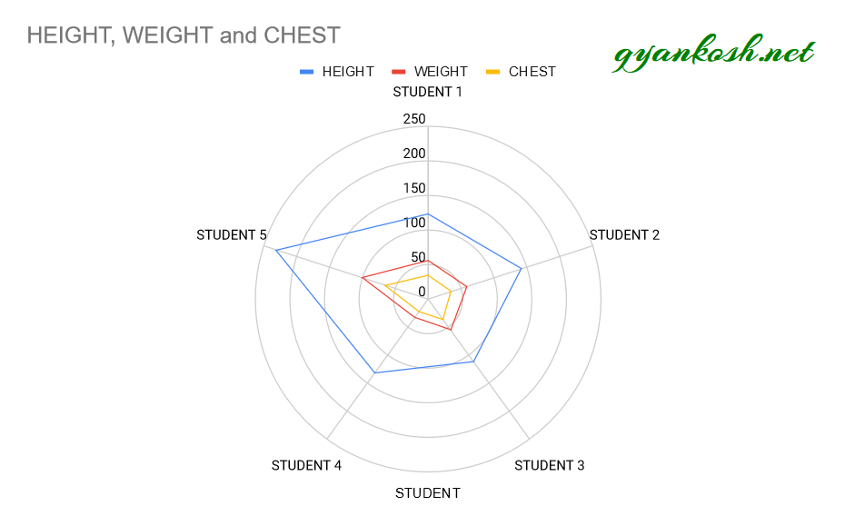
[LOOK AT THE PICTURE ABOVE]
A RADAR CHART has the different axes arising from a single point as it is clear in the chart above, all the axes are arising from 0.
The variable which are the height, weight and chest are marked for each and every student on respective axes.
After marking, all the values are joined together to form a polygon.
The radar chart is known by many other names such as
STAR CHART, STAR PLOT, COBWEB CHART, POLYGON CHART, POLAR CHART AND KIVIAT DIAGRAM ETC.
In the next section, we take a look upon the different apt situations where we can make use of RADAR CHARTS.
One star represent the variation among different series.
WHEN DO WE NEED RADAR CHARTS?
A RADAR CHARTS should be used in the following scenarios.
- Comparing multiple variables: Radar charts are effective when you need to compare several variables across multiple categories. This is common in performance reviews, skill assessments, or product comparisons.
- Visualizing strengths and weaknesses: They help in identifying the strengths and weaknesses of an entity (e.g., a product, team member, or organization) across different dimensions, as the shape of the chart clearly shows where values are higher or lower.
- Displaying multivariate data: When data has more than three variables and you’re trying to assess the relationships and trade-offs between them, radar charts offer an intuitive way to display this complexity.
- Evaluating performance metrics: For example, they are used to visually present performance metrics like customer satisfaction, financial ratios, or sports statistics, where each axis represents a specific category.
- Highlighting outliers: If you’re looking to identify outliers or anomalies within a set of values across different dimensions, the radial structure helps these stand out.
- We want to represent a data with multiple variables. For example , the details of students’ height, weight and chest as shown in the picture above.
- When we want to visually know the contribution of a parameter in a glance for every reading.
- We want to represent the PERFORMANCE METRICS showing the strengths and weaknesses.
- For Quality Control programs.
Where is Radar Chart option in Google Sheets?
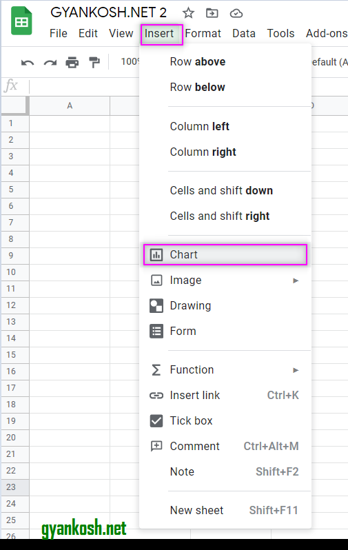
The RADAR CHART can be inserted through the INSERT MENU > CHART and choosing RADAR chart or by directly choosing the CHART BUTTON on the toolbar and then choosing the RADAR chart.
RADAR CHART BUTTON ON TOOLBAR
- The chart button is situated on the right portion.
- Click the button. Chart Editor will open. [1]
- Choose the RADAR CHART from the CHART TYPE DROP DOWN.[2]
- Click the RADAR CHART option.[3]
We can also choose the charts using the menu option.
- Go to INSERT MENU and choose Charts.
- Further the CHART EDITOR BOX will open.
- Choose RADAR CHART from the CHART TYPE DROP DOWN as shown in the picture above.
How to set up the data to get Radar charts in Google Sheets?
It is always easy to create a chart if we lay the data properly.
Similarly, for the RADAR CHARTS, it is important to know the layout of the data for the perfect chart , as we require.
The FIRST COLUMN can be used to provide the LABELS.
The FIRST ROW will contain the CATEGORIES.
OTHER COLUMNS can be used to enter values.
A sample of the table and the radar chart for the table are shown below.
| STUDENT | HEIGHT | WEIGHT | CHEST |
| STUDENT 1 | 123 | 56 | 34 |
| STUDENT 2 | 142 | 58 | 35 |
| STUDENT 3 | 112 | 55 | 36 |
| STUDENT 4 | 132 | 33 | 23 |
| STUDENT 5 | 231 | 100 | 65 |
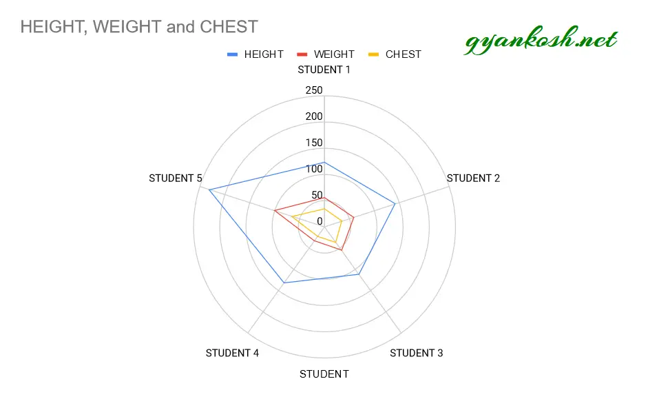
The RADAR CHART for the data is shown below. The steps to create the chart are discussed in the next section.

The radar chart is known by many other names such as
STAR CHART, STAR PLOT, COBWEB CHART, POLYGON CHART, POLAR CHART AND KIVIAT DIAGRAM ETC.
In the next section, we take a look upon the different apt situations where we can make use of RADAR CHARTS.
Example discussing the way to create a Radar Chart in Google Sheets
EXAMPLE DETAILS
We can demonstrate the chart using an example.
We are taking the example of a student class where we analyze the variation of height, weight and chest of students.
[ The example is just for the learning purpose]
Refer to the section WHEN DO WE NEED RADAR CHARTS for learning the situations where we can use RADAR CHARTS.
| STUDENT | HEIGHT | WEIGHT | CHEST |
| STUDENT 1 | 123 | 56 | 34 |
| STUDENT 2 | 142 | 58 | 35 |
| STUDENT 3 | 112 | 55 | 36 |
| STUDENT 4 | 132 | 33 | 23 |
| STUDENT 5 | 231 | 100 | 65 |
The procedure to insert a RADAR chart are as follows:
STEPS TO INSERT A RADAR CHART IN GOOGLE SHEETS:
The first requirement of any chart is data . So create a table containing the data. [ We have already created in the form of table above]
Refer to our data above, where we have mentioned the weight, height and chest size of five students.
- Select the complete table including the HEADER NAMES.
- Go to TOOLBAR > CHARTS .
- At first, Google Sheets will create a chart on its own. [ As per data it would try to suggest us the chart ].
- The chart will be created and shown to you as the following picture
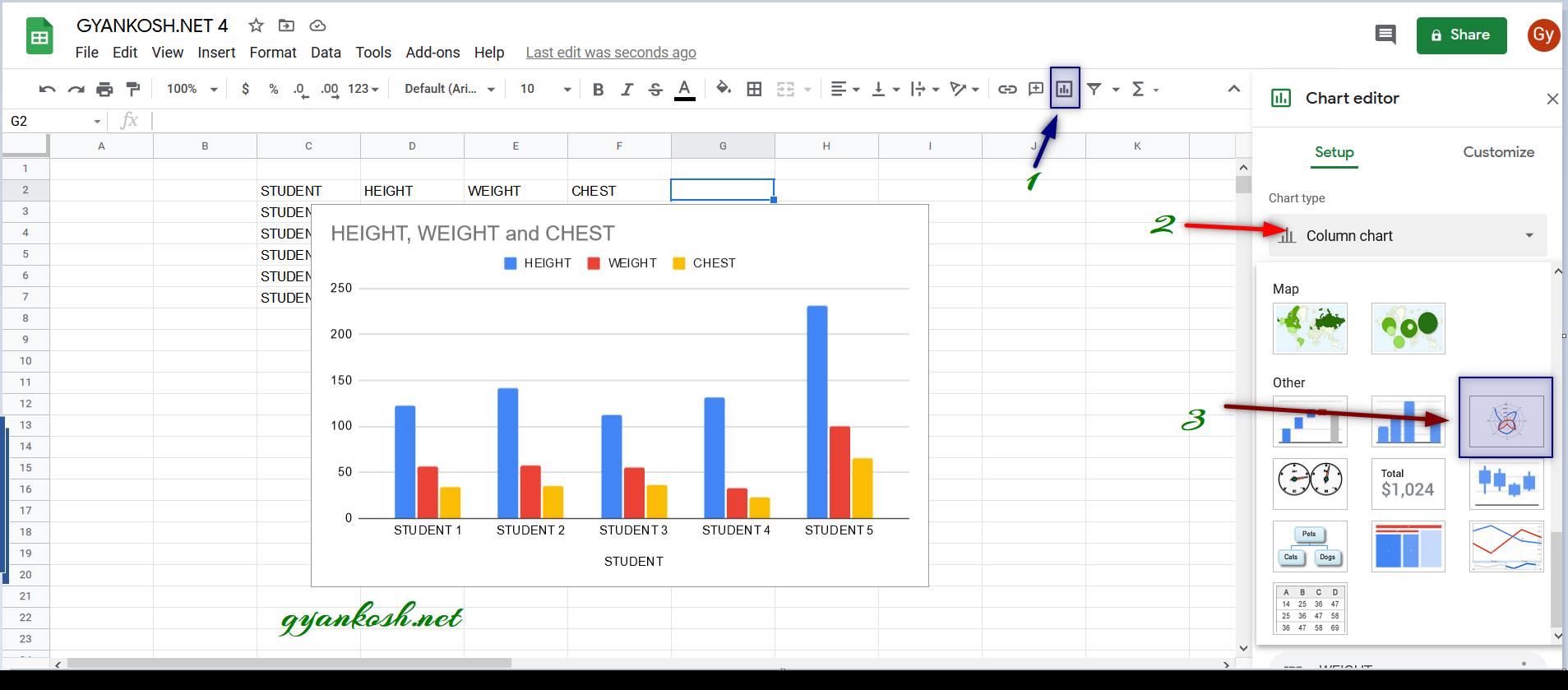
In our example, Google Sheets itself opted for the COLUMN CHART and created one for us.

CHANGING THE COLUMN CHART INTO RADAR CHART
GOOGLE SHEETS itself created a column chart for us, but we need to create a RADAR CHART.
So follow the process to create the radar chart from the create column chart.
- Double Click the COLUMN CHART [ if chart editor is not opened ] to open the chart editor.
- The chart editor will open.
- Click the CHART TYPE and choose RADAR CHARTS from the drop down as shown in the picture below.
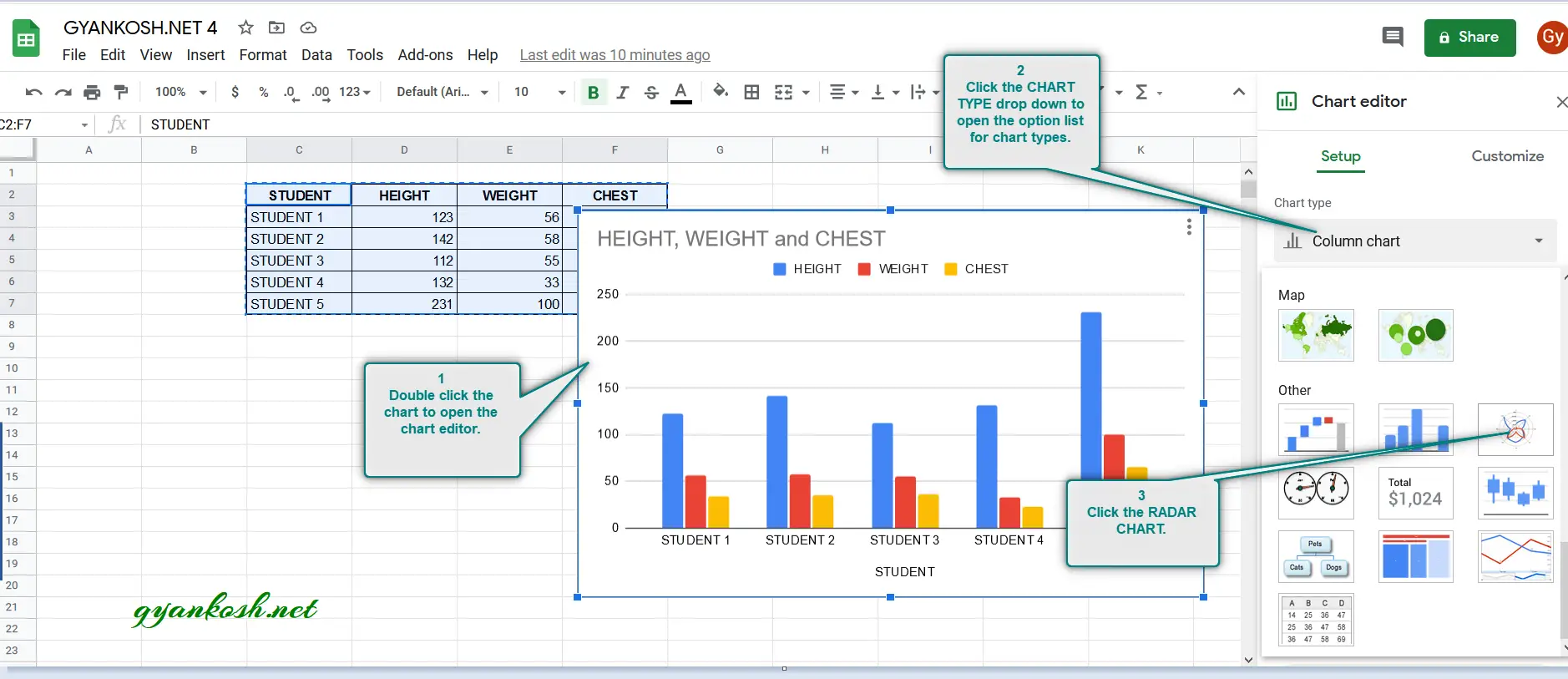
Click the RADAR CHARTS option and the chart will be converted to a RADAR CHART.
The following picture shows the RADAR CHART created. [Except the

How to set the axes of Radar Chart as Smooth or Straight ?
The RADAR CHART created by the google sheets by default has the smooth (curved) lines joining the axes.
We can make them straight if we want.
The following picture shows the CURVED CONNECTING LINES and STRAIGHT CONNECTING LINES.

You can see that the ONLY DIFFERENCE is VISUAL and it is up to the user only which one to choose.
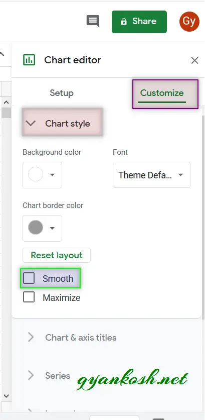
FOLLOW THE STEPS TO CHOOSE SMOOTH OR STRAIGHT CONNECTING LINES IN A RADAR CHART
- Double Click the chart to open the chart editor. [ If the chart editor is not open]
- Go to Chart Editor.
- Click on CUSTOMIZE TAB.
- Open the CHART STYLE drop down.
- In the lower portion, CLICK ON THE SMOOTH CHECKBOX to smooth the connecting lines.
- If you want straight lines, uncheck the SMOOTH CHECKBOX.
The process is shown below in the picture.
NOTE:
FOR ALL OTHER TASKS LIKE CHANGING THE NAME OF THE CHART, CHANGING THE AXIS , CHANGING THE CHART STYLE ETC. VISIT HERE [HOW TO CREATE A CHART IN GOOGLE SHEETS ].