INTRODUCTION
CHARTS are the graphic representation of any data . Google Sheets provide us a number of visualization options in the form of different charts and graphs etc.
Excel gives us a variety of charts which are beautiful, colorful, more customizable and more powerful.
In this article we are going to discuss ORG OR ORGANIZATIONAL CHARTS IN GOOGLE SHEETS.
ORG OR ORGANISATIONAL CHARTS ARE USED TO REPRESENT THE HIERARCHY OR RELATIONSHIP BETWEEN EMPLOYEES, COLLEAGUES, FAMILY ETC.
In ORGANISATIONAL CHARTS the higher place represents HIGHER POSITION in HIERARCHY. For example, in a family, father would come at the top, followed by children and then grand children and so on.
Let us discuss purpose, syntax formula and examples of using org chart in google sheets.
WHEN TO USE ORGANIZATIONAL CHART IN GOOGLE SHEETS
ORGANIZATIONAL CHARTS are the solution to the following situations.
If you want to –
- present hierarchy of the office.
- create a family tree.
- create any relationship diagram consisting of a parent and child relationship.
- Any process consisting of main process and sub processes.
WHERE IS THE OPTION FOR ORGANIZATIONAL CHARTS IN GOOGLE SHEETS
The pie chart can be easily inserted by the chart button on the toolbar itself.
The button location is shown in the picture below.
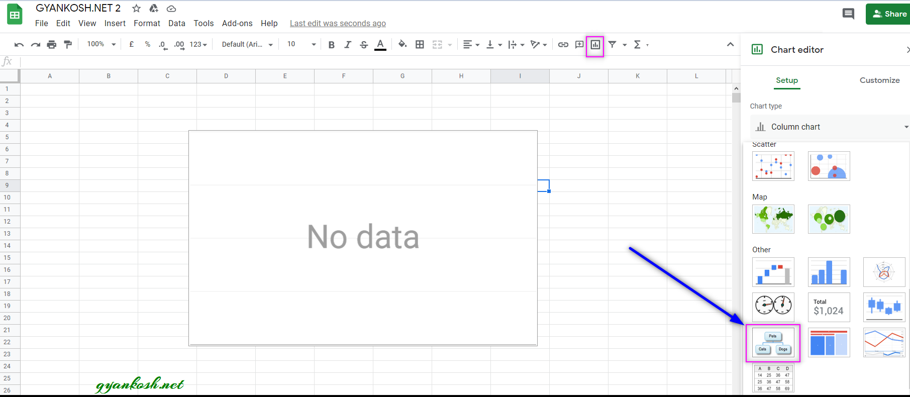
- Click the CHARTS BUTTON which will open the Chart Editor.
- In the Charts Editor, Select PIE CHART from the CHART TYPE DROP DOWN as shown in the picture below.
MENU OPTION TO INSERT ORGANIZATIONAL CHART:We can insert a chart using the Menu also as chart option is available in the menu too.
- Go to INSERT MENU > CHART.
- After clicking the CHART , CHART option will appear.
- Choose ORGANIZATIONAL CHART from the CHART TYPE DROP DOWN.
FORMAT OF DATA TO REPRESENT AS AN ORGANIZATION CHART
There is a specific format for the creation of organization chart.
THREE COLUMNS ARE NEEDED FOR ORGANIZATIONAL CHARTS.
COLUMN 1: ALL THE CHILDREN OR SUB PROCESSES.
COLUMN 2: FATHER OF THE CHILD WHICH WAS DECLARED IN COLUMN 1.
COLUMN 3: COMMENTS OR NOTES OR ALT TEXT WHICH WILL BE SEEN WHEN YOU HOVER THE MOUSE OVER IT.
STEPS TO INSERT A PIE CHART IN GOOGLE SHEETS
EXAMPLE DETAILS
We can demonstrate the chart using an example.For the basic understanding
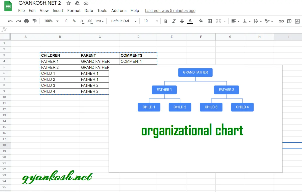
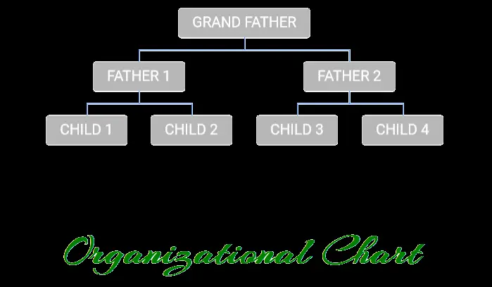
We are taking the example of a family consisting of GRAND FATHER , TWO FATHERS AND FOUR CHILDREN.
Grand Father has Two children as Father 1 and Father 2. Father 1 has two children , Child 1 and Child 2.Father 2 has two children, Child 3 and Child 4.
For representing this chart, we need to format the table as follows.
| CHILDREN | PARENT | COMMENTS |
| FATHER 1 | GRAND FATHER | COMMENT1 |
| FATHER 2 | GRAND FATHER | COMMENT2 |
| CHILD 1 | FATHER 1 | COMMENT3 |
| CHILD 2 | FATHER 1 | COMMENT4 |
| CHILD 3 | FATHER 2 | COMMENT5 |
| CHILD 4 | FATHER 2 | COMMENT6 |
The procedure to insert a organizational chart are as follows:
STEPS TO INSERT AN ORGANIZATIONAL CHART IN EXCEL:
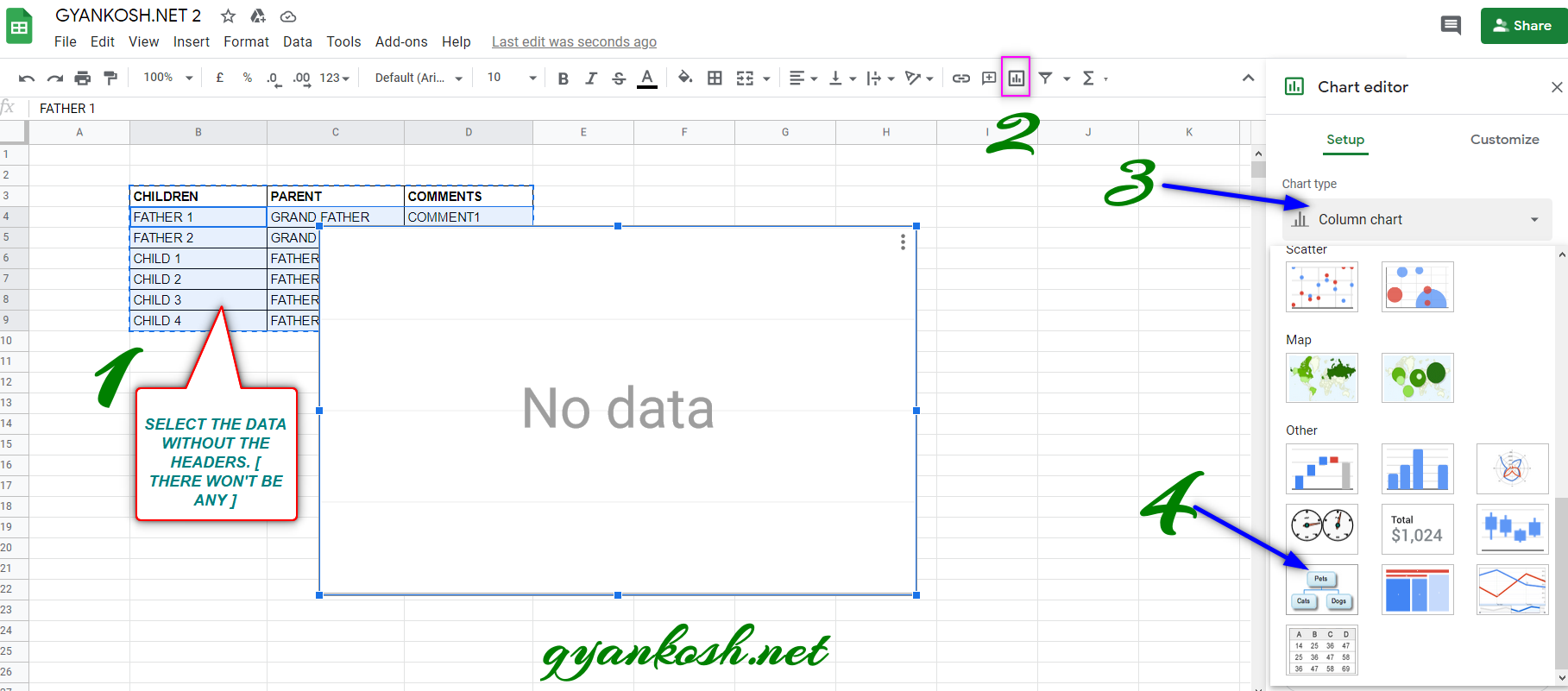
- The first requirement of any chart is an organized data. FOR ORGANIZATIONAL CHART THE LAYOUT OF THE CHART IS VERY IMPORTANT. KINDLY REFER TO PREVIOUS SECTION TO LEARN IT , IF THERE IS ANY DOUBT.
- Refer to the data above, the data is representing a family.
- Select the complete table excluding the HEADER NAMES.
- Go to TOOLBAR > CHARTS .
- Click the dropdown and select ORGANIZATIONAL CHART.
After we choose the ORGANIZATIONAL CHART, as shown in the picture above, a chart will appear as shown in the picture below.
After making a few tweaks , our final organizational chart looks like the following one.
NOTE:
FOR ALL OTHER TASKS LIKE CHANGING THE NAME OF THE CHART, CHANGING THE AXIS , CHANGING THE CHART STYLE ETC.