INTRODUCTION
Charts are a graphic representation of any tabular data which helps us to look over the trend, values , comparison and many other aspects easily.
The tables contain a lot of information but we need to study them closely and have to look at the figures repetitively. But after we have made its graphical representation which is known as a GRAPH or CHART, we can find out the comparison without looking over the data.
Charts or Graphs are used a lot in data analysis which is why it is one of the very important parts of the MICROSOFT EXCEL which is the top software for data analysis.
In addition to this, this gives nice visual feel to our reports or presentation.
In this article we’d see how to create a chart using VBA in excel.
If you want to learn the basics of the charts, KINDLY CLICK HERE.
TYPES OF CHARTS IN EXCEL
No, we are not talking about the chart types like line chart , pie or others ; but we are talking about the CHART TYPES based on the location.
The charts can be used at two different locations in EXCEL.
1. The embedded chart- which is a simple chart which is placed just near the data inside a worksheet only. Mostly by default we use this type of chart.
2. The next type of chart is, a chart on the CHART SHEET. There are two types of sheets in excel.
- WORKSHEET
- CHARTSHEET
Chartsheet contain a single chart usually and is a complete sheet just like we have worksheets.
CREATING FIRST EMBEDDED CHART USING VBA
Charts are a part of the SHAPES OBJECT so we can use the ADDCHART2 method of the SHAPES object to create an embedded chart.
Let us check out the different parameters of this method.
AddChart2 can take upto seven arguments.
AddChart2 (Style, XlChartType, Left, Top, Width, Height, NewLayout)
expression A variable that represents a Shapes object.
Parameters
| Name | Required/Optional | Data type | Description |
|---|---|---|---|
| Style | Optional | Variant | A number is used. Use -1 for default. Type of Chart, the one which we choose after we have chosen the major type. |
| XlChartType | Optional | Variant | The type of chart.( Line, Pie, Column etc.) |
| Left | Optional | Variant | The position, in points, of the left edge of the chart, relative to the anchor. (Distance from left screen) |
| Top | Optional | Variant | The position, in points, of the top edge of the chart, relative to the anchor. (Distance from the top of worksheet) |
| Width | Optional | Variant | The width, in points, of the chart. |
| Height | Optional | Variant | The height, in points, of the chart. |
| NewLayout | Optional | Variant | If NewLayout is True, the chart is inserted by using the new dynamic formatting rules (Title is on, and Legend is on only if there are multiple series). |
xlChart has the following values. We can use the name as well as value. Kindly read them once.
Specifies the chart type.
| Name | Value | Description |
| xl3DArea | -4098 | 3D Area. |
| xl3DAreaStacked | 78 | 3D Stacked Area. |
| xl3DAreaStacked100 | 79 | 100% Stacked Area. |
| xl3DBarClustered | 60 | 3D Clustered Bar. |
| xl3DBarStacked | 61 | 3D Stacked Bar. |
| xl3DBarStacked100 | 62 | 3D 100% Stacked Bar. |
| xl3DColumn | -4100 | 3D Column. |
| xl3DColumnClustered | 54 | 3D Clustered Column. |
| xl3DColumnStacked | 55 | 3D Stacked Column. |
| xl3DColumnStacked100 | 56 | 3D 100% Stacked Column. |
| xl3DLine | -4101 | 3D Line. |
| xl3DPie | -4102 | 3D Pie. |
| xl3DPieExploded | 70 | Exploded 3D Pie. |
| xlArea | 1 | Area |
| xlAreaStacked | 76 | Stacked Area. |
| xlAreaStacked100 | 77 | 100% Stacked Area. |
| xlBarClustered | 57 | Clustered Bar. |
| xlBarOfPie | 71 | Bar of Pie. |
| xlBarStacked | 58 | Stacked Bar. |
| xlBarStacked100 | 59 | 100% Stacked Bar. |
| xlBubble | 15 | Bubble. |
| xlBubble3DEffect | 87 | Bubble with 3D effects. |
| xlColumnClustered | 51 | Clustered Column. |
| xlColumnStacked | 52 | Stacked Column. |
| xlColumnStacked100 | 53 | 100% Stacked Column. |
| xlConeBarClustered | 102 | Clustered Cone Bar. |
| xlConeBarStacked | 103 | Stacked Cone Bar. |
| xlConeBarStacked100 | 104 | 100% Stacked Cone Bar. |
| xlConeCol | 105 | 3D Cone Column. |
| xlConeColClustered | 99 | Clustered Cone Column. |
| xlConeColStacked | 100 | Stacked Cone Column. |
| xlConeColStacked100 | 101 | 100% Stacked Cone Column. |
| xlCylinderBarClustered | 95 | Clustered Cylinder Bar. |
| xlCylinderBarStacked | 96 | Stacked Cylinder Bar. |
| xlCylinderBarStacked100 | 97 | 100% Stacked Cylinder Bar. |
| xlCylinderCol | 98 | 3D Cylinder Column. |
| xlCylinderColClustered | 92 | Clustered Cone Column. |
| xlCylinderColStacked | 93 | Stacked Cone Column. |
| xlCylinderColStacked100 | 94 | 100% Stacked Cylinder Column. |
| xlDoughnut | -4120 | Doughnut. |
| xlDoughnutExploded | 80 | Exploded Doughnut. |
| xlLine | 4 | Line. |
| xlLineMarkers | 65 | Line with Markers. |
| xlLineMarkersStacked | 66 | Stacked Line with Markers. |
| xlLineMarkersStacked100 | 67 | 100% Stacked Line with Markers. |
| xlLineStacked | 63 | Stacked Line. |
| xlLineStacked100 | 64 | 100% Stacked Line. |
| xlPie | 5 | Pie. |
| xlPieExploded | 69 | Exploded Pie. |
| xlPieOfPie | 68 | Pie of Pie. |
| xlPyramidBarClustered | 109 | Clustered Pyramid Bar. |
| xlPyramidBarStacked | 110 | Stacked Pyramid Bar. |
| xlPyramidBarStacked100 | 111 | 100% Stacked Pyramid Bar. |
| xlPyramidCol | 112 | 3D Pyramid Column. |
| xlPyramidColClustered | 106 | Clustered Pyramid Column. |
| xlPyramidColStacked | 107 | Stacked Pyramid Column. |
| xlPyramidColStacked100 | 108 | 100% Stacked Pyramid Column. |
| xlRadar | -4151 | Radar. |
| xlRadarFilled | 82 | Filled Radar. |
| xlRadarMarkers | 81 | Radar with Data Markers. |
| xlRegionMap | 140 | Map chart. |
| xlStockHLC | 88 | High-Low-Close. |
| xlStockOHLC | 89 | Open-High-Low-Close. |
| xlStockVHLC | 90 | Volume-High-Low-Close. |
| xlStockVOHLC | 91 | Volume-Open-High-Low-Close. |
| xlSurface | 83 | 3D Surface. |
| xlSurfaceTopView | 85 | Surface (Top View). |
| xlSurfaceTopViewWireframe | 86 | Surface (Top View wireframe). |
| xlSurfaceWireframe | 84 | 3D Surface (wireframe). |
| xlXYScatter | -4169 | Scatter. |
| xlXYScatterLines | 74 | Scatter with Lines. |
| xlXYScatterLinesNoMarkers | 75 | Scatter with Lines and No Data Markers. |
| xlXYScatterSmooth | 72 | Scatter with Smoothed Lines. |
| xlXYScatterSmoothNoMarkers | 73 | Scatter with Smoothed Lines and No Data Markers. |
Let us create our first embedded chart using VBA but without the data. The statement goes like thisActiveSheet.Shapes.AddChart2 201, xlColumnClustered, 50, 60, 300, 200, 5 )
OBJECTIVE
CREATE A SIMPLE COLUMN CLUSTERED CHART FOR THE GIVEN DATA USING VBA
Let us create an embedded chart using the above mentioned function.
The given data is
| DAY | PEOPLE |
| 1 | 5 |
| 2 | 6 |
| 3 | 7 |
| 4 | 8 |
PLANNING THE SOLUTION
We’ll select the data and create the chart on the active sheet.The code is given below.
CODE
'GYANKOSH.NET
'CREATING SIMPLE CHART USING VBA

Sub createsimpleChart()

Dim MyChart As Chart 'DEFINING THE CHART

Range("d2", "e6").Select 'SELECTING THE DATA

Set MyChart = ActiveSheet.Shapes.AddChart2( _
201, xlclusteredcolumn, 100, 100, 500, 500, True).Chart 'Setting the chart

End Sub
EXPLANATION
The process is pretty simple.
We declare a chart variable.
Range is selected as per the data availability and it is selected by .SELECT method.
The next line, creates the chart . We use all the parameters but it is not necessary. We can
choose any number of options and rest will go to default.
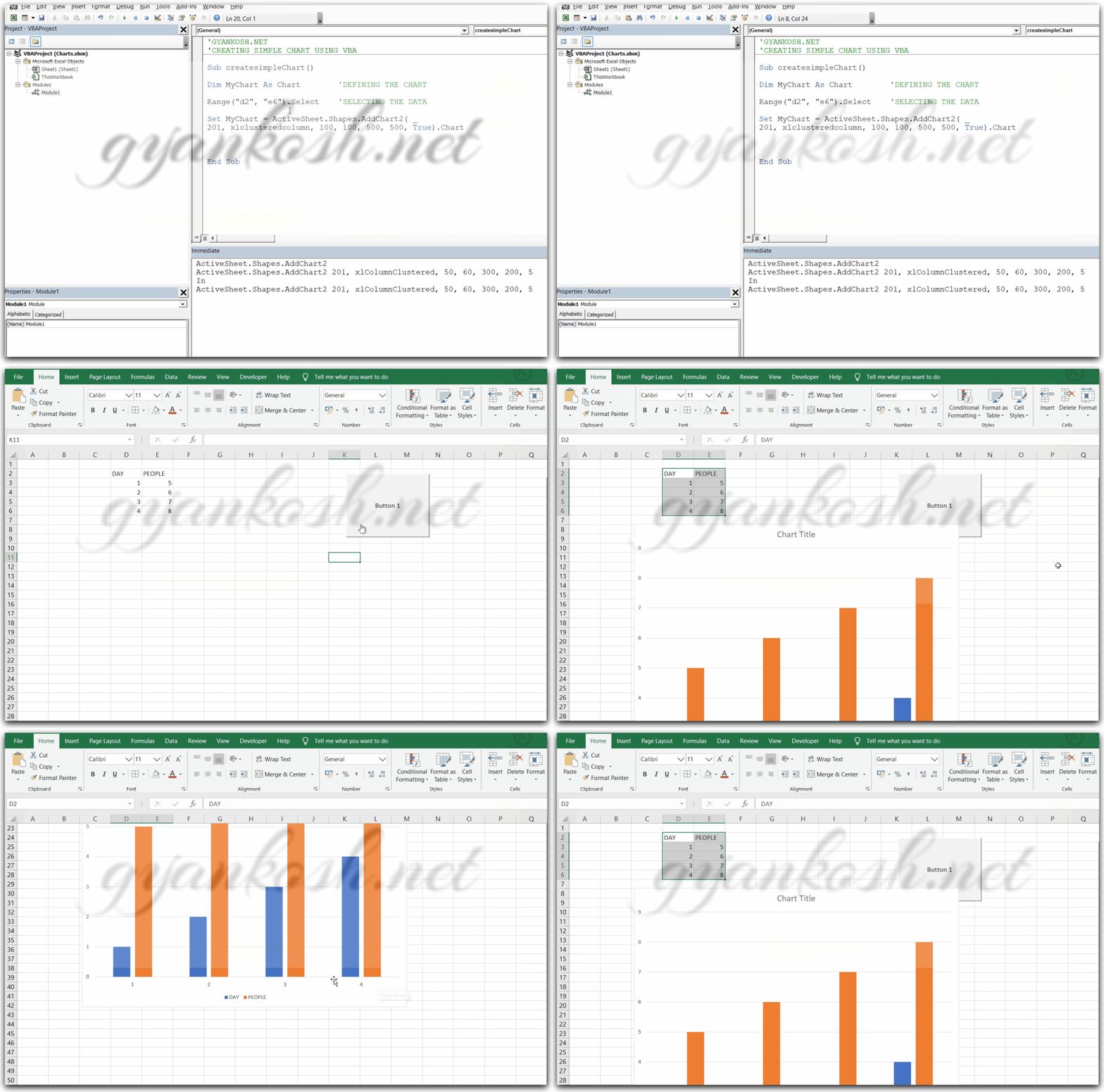
The output is shown below.
RUNNING THE CODE AND OUTPUT
The code is shown which is already discussed above.
- A button has been placed in the sheet. Click right and assign macro to the button . The macro is named by the name of the sub procedure.
- Click the button and the chart is created.
- The style is defined by first argument i.e. 201.
- The next type of chart is because of the second argument clustered column.
- The chart title and series names are given because of the last argument which is true or 1.
- The size and distances from the screen are as per in the formula
CREATE CHART ON A CHARTSHEET USING VBA
CREATE A CLUSTERED COLUMN CYLINDER CHART ON A CHARTSHEET The chartsheet is just like a worksheet. A standalone sheet which will hold one chart.We’ll use the CHART OBJECT for creating this chart.Let us try to create cylinder chart on a chartsheet.
CODE
'GYANKOSH.NET
'CREATING A NEW CHART ON CHARTSHEET

Sub CreateChartSheet()

    Dim MyChart As Chart

    Dim DataRange As Range

    Set DataRange = ActiveSheet.Range("D4:E8") 'Setting the data range.

    Set MyChart = Charts.Add2                  'Adding the chart

    MyChart.SetSourceData Source:=DataRange    'Attaching the data to the chart.

    ActiveChart.ChartType = 92                 'Refer to the code list for cylindrical

                                             'we can also use xlCylinderColClustered
End Sub
We start by defining the CHART VARIABLE and RANGE DATARANGE.
We set the datarange as D4:E8.
We can use the range in the same way as previous example too.
It is just another way of passing the range.
The chart is added by CHARTS.ADD2
The source is passed to the chart by setSourceData
The type is set by Charttype=92(92 is the code of type of chart needed).
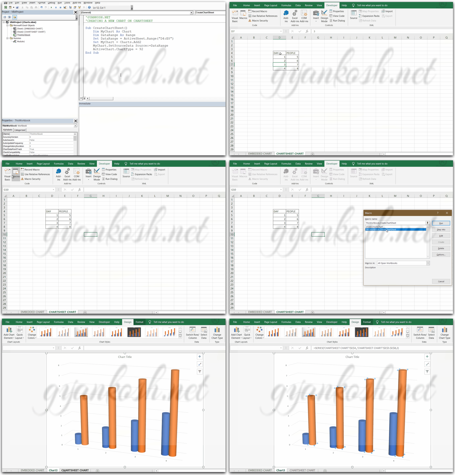
The following picture shows the creation and running of chart.
We run the code by using the macro option list by going to developer tab and
clicking on macro.
Select the macro and click run.
We can see that a new sheet has been created and the desired chart is present there.

