Table of Contents
- INTRODUCTION
- WHAT IS A PIE CHART?
- WHEN DO WE USE PIE CHARTS ?
- BUTTON LOCATION FOR PIE CHARTS
- STEPS TO CREATE A PIE CHART IN EXCEL
- TYPES OF PIE CHARTS IN EXCEL
- CREATE 3D PIE CHART IN EXCEL
- FQAs ABOUT PIE CHARTS
- HOW TO ROTATE A PIE CHART?
- HOW CAN I COPY PIE CHART FROM EXCEL TO WORD?
- NOTE:
INTRODUCTION
CHARTS are the graphic representation of any data . As we know that EXCEL is a super analytical tool.
Analysis of data is the process of deriving the inferences by finding out the trends, averages etc. about different parameters.
Data is everywhere. There is no work, where we don’t deal with the data. Sales data in business, employee data, patient data in hospitals, students data in school etc. Maximum data is presented in the tables but we all know that visual representation is easier to interpret. That is the reason that as the Excel developed, so the charts options in Excel.
Excel gives us a variety of charts which are beautiful, colorful, more customizable and more powerful.
In this article we are going to discuss one particular type of the charts which are known as PIE CHART.
In PIE CHARTS, the area shown by a portion shows the percentage or value of particular category.
We’ll discuss in detail, the different processes to create PIE CHARTS.
WHAT IS A PIE CHART?
A Pie chart is a graphical representation of the data on a circle or say PIE, where each sector represents the contribution of every value as a percentage of the whole.
It means , if we have six categories each having the value as 6, the pie chart will contain 6 sectors , each making an angle of 60 degrees at the center.
WHEN DO WE USE PIE CHARTS ?
PIE CHARTS are specially used when the total numbers mentioned in the table comprises of 100% of any data.
The pie chart is represented by a circle , in which different sectors make certain angles on the basis of the values of that particular category.
Suppose, we have a class of students having 100 students. We’ll use the pie chart when we are categorizing all the students by different classifications, but all 100 students are included.
The marks of all the students in a particular subject are given. Now , if we want to check what percentage of the class got what grade, can be easily found by the use of a pie chart.
This information can be displayed using the other charts also. But the pie chart has a special benefit of the visual impression on the brain. We can very easily interpret by just having a look about the different status in the class.
BUTTON LOCATION FOR PIE CHARTS
Let us find out the option location for the insertion of the PIE CHART.
The button for column chart is found under the INSERT TAB under the CHARTS SECTION.

STEPS TO CREATE A PIE CHART IN EXCEL
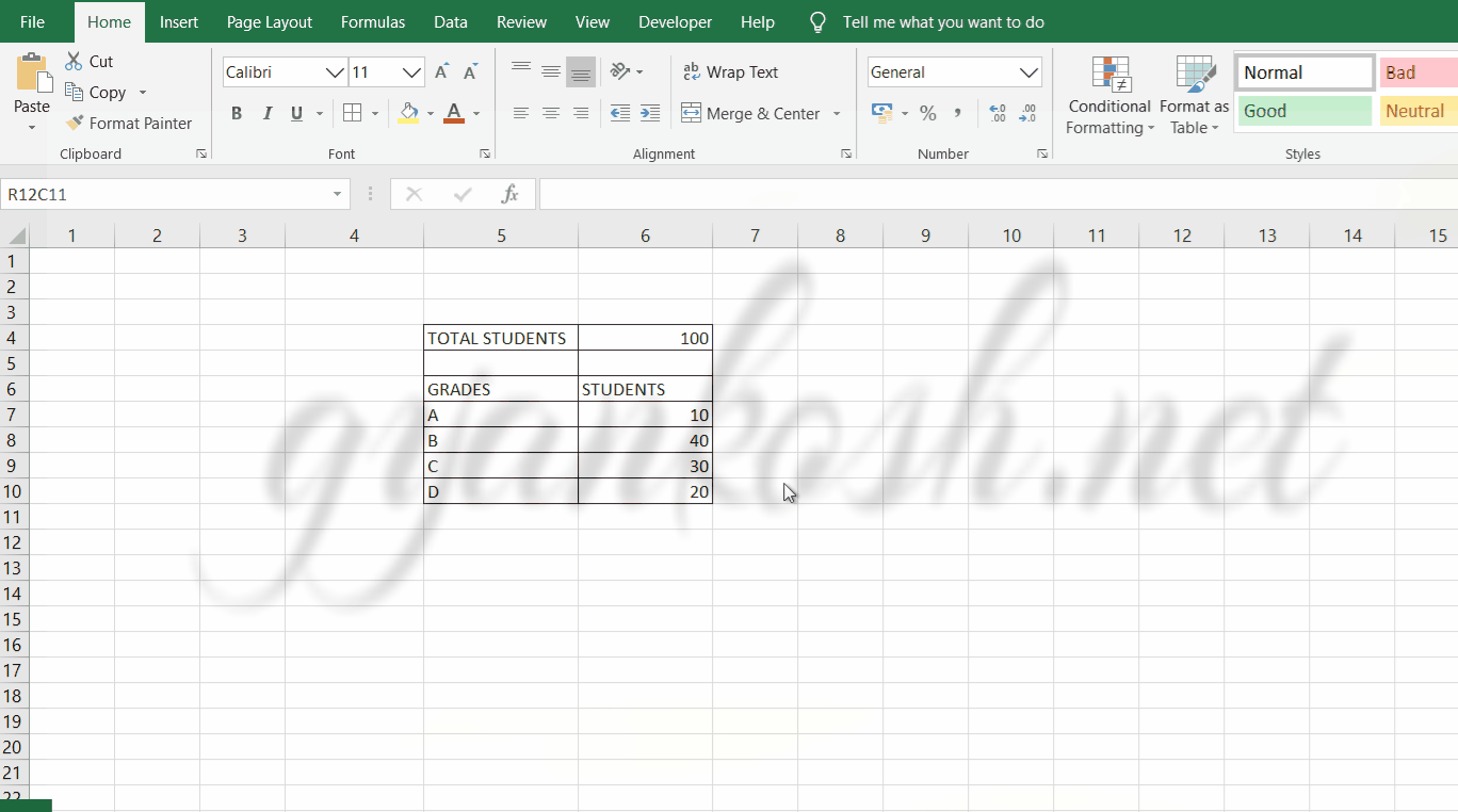
EXAMPLE DETAILS
We can demonstrate the chart using an example.
We are taking the example of a class.
The total students are 100 and grades of the students in MATHEMATICS are given below in the table.
| TOTAL STUDENTS | 100 |
| GRADES | STUDENTS |
| A | 10 |
| B | 40 |
| C | 30 |
| D | 20 |
The procedure to insert a pie chart are as follows:
STEPS TO INSERT A PIE CHART IN EXCEL:
- The first requirement of any chart is data. So create a table containing the data.[We have already created in the form of table above]
- Refer to our data above, we have grades of 100 students.
- Select the complete table including the HEADER NAMES.
- Go to INSERT TAB> CHARTS> and click the PIE button under 2D PIE as shown in the BUTTON LOCATION above and in the following picture for reference.
- The chart will be created and shown to you as the following figure.
The complete process is shown in the animated picture below.
So , we have successfully inserted a pie chart. We have inserted a 2D pie chart this time.
The chart shows four sectors in a circle each representing the portion of the class getting the respective grades.
Now we can infer from the above problem , how difficult it would be find out the percentages of the students getting a particular grade manually in a table and how easy it becomes when we use a pie chart.
Now, let us check a few more variants of the pie chart available with us.
TYPES OF PIE CHARTS IN EXCEL
There are a few more variants of PIE CHARTS.The names are following:
- PIE – ALREADY DISCUSSED
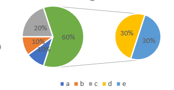
- PIE OF PIE– A PIE CHART in which a portion is again segregated and shown as a pie chart. It is useful when we have few low percentages and many categories. We can understand this problem as , when many categories are there the sector angle becomes so small, that it won’t be visible.
- BAR OF PIE– A PIE CHART in which a portion is again shown as a stacked bar. It is useful to be used when we have small percentages for a few categories. If we show these in the same pie, the sector size will be too small to identify.
| TOTAL STUDENTS | 100 |
| GRADES | STUDENTS |
| A | 10 |
| B | 40 |
| C | 30 |
| D | 20 |
We’ll check how to create and use these charts for the above table.
PIE OF PIE CHART
A pie chart is simply the visual arrangement of different categories on a circle.
A PIE OF PIE Chart is a type of PIE CHART where a portion of the PIE CHART is created in another smaller PIE CHART. Something like this.
STEPS TO CREATE PIE OF PIE CHART IN EXCEL
The procedure to insert a PIE OF PIE chart are as follows:
STEPS TO INSERT A PIE OF PIE CHART IN EXCEL:
- The first requirement of any chart is data. So create a table containing the data.[We have already created in the form of table above]
- Refer to our data above, we have grades of 100 students.
- Select the complete table including the HEADER NAMES.
- Go to INSERT TAB> CHARTS> and click the PIE OF PIE CHART button under 2D PIE as shown in the BUTTON LOCATION above and in the following picture for reference.
- The chart will be created and shown to you as the following figure.
The output is shown below.
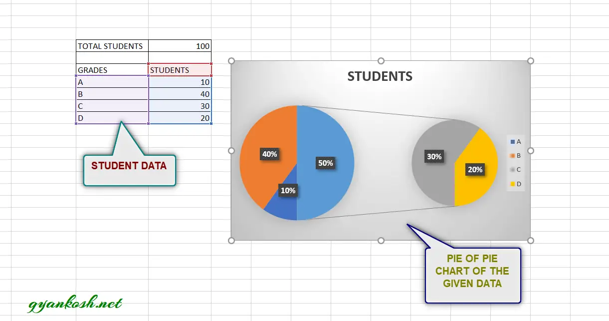
In the above chart we can see that category C and D are shown in another pie chart.
We use PIE OF PIE CHART where we have many categories and a single pie chart becomes too messy to show the details. Another smaller pie chart helps to handle few of the categories and make our task easier.
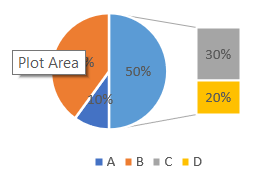
BAR OF PIE CHART
A pie chart is simply the visual arrangement of different categories on a circle.
A BAR OF PIE Chart is a type of PIE CHART where a portion of the PIE CHART is created in another smaller BAR CHART. Something like this.
STEPS TO CREATE BAR OF PIE CHART IN EXCEL
The procedure to insert a BAR OF PIE chart are as follows:
STEPS TO INSERT A BAR OF PIE CHART IN EXCEL:
- The first requirement of any chart is data. So create a table containing the data.[We have already created in the form of table above]
- Refer to our data above, we have grades of 100 students.
- Select the complete table including the HEADER NAMES.
- Go to INSERT TAB> CHARTS> and click the BAR OF PIE CHART button under 2D PIE as shown in the BUTTON LOCATION above and in the following picture for reference.
- The chart will be created and shown to you as the following figure.
The output is shown below.

In the above chart we can see that category C and D are shown in another BAR chart.
We use BAR OF PIE CHART in the cases where we have too many categories to be accommodated in a single pie chart. Few of the categories are shifted to the BAR CHART to make the data visible.
CREATE 3D PIE CHART IN EXCEL
This is another choice of the charts which is a 3D PIE CHART.
This is simply like a PIE CHART . The difference is in the looks only.
STEPS TO CREATE A 3D PIE CHART IN EXCEL
The procedure to insert a 3D PIE chart are as follows:
STEPS TO INSERT A 3D PIE CHART IN EXCEL:
- The first requirement of any chart is data. So create a table containing the data. [We have already created in the form of table above]
- Refer to our data above, we have grades of 100 students.
- Select the complete table including the HEADER NAMES.
- Go to INSERT TAB> CHARTS> and click the 3D PIE CHART button under 3-D PIE as shown in the BUTTON LOCATION above and in the following picture for reference.
- The chart will be created and shown to you as the following figure.
The output is shown below.

The chart is in the 3d look.
It is exactly same as the simple PIE CHART but in 3d look.
We can use this in place of normal PIE CHARTS for the representation of data where we have to show the participation of sub categories in their respective performance in the form of a complete circle.
FQAs ABOUT PIE CHARTS
We have discussed many points about the PIE CHARTS. This section contains the questions and answers in the common man’s language regarding the PIE CHARTS.
HOW TO ROTATE A PIE CHART?
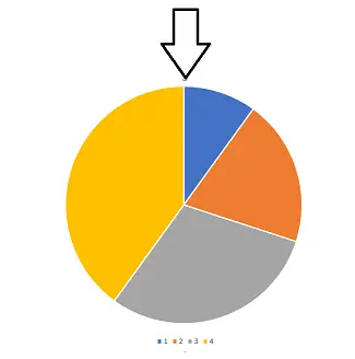
Rotating a pie chart is a common problem. Rotating a pie chart means to set the initial angle of the pie chart. The angle count of the pie chart starts from the top as shown in the picture below.
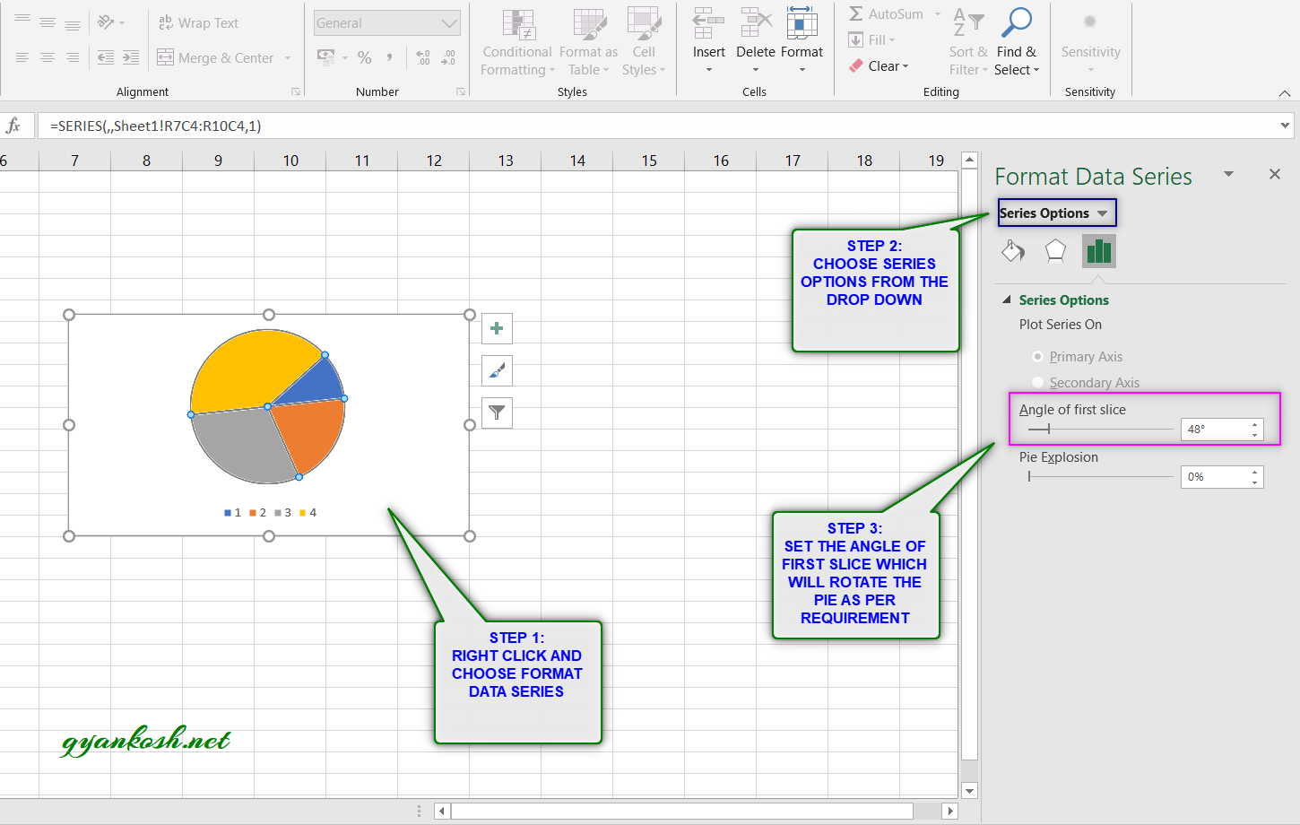
Follow the steps to rotate the pie chart to a certain angle.
- Right Click the chart and choose FORMAT DATA SERIES
- It’ll open the dialog box in the right side of the window.
- Choose SERIES OPTIONS from the drop down if not selected.[Shown in the picture below]
- Go to ANGLE OF FIRST SLICE and change the angle by moving the slider as per requirement.
- The PIE CHART will rotate as per the requirement.
Following picture shows the process.
HOW TO CALCULATE PERCENTAGES FROM THE PIE CHART?
Normally, you can hover over the pie slice , you can see its percentage.
If you don’t have access to the PIE CHART in EXCEL but any printout, you need to guess or measure the angle of the sector.
Percentage represented by any slice = Angle made by the slice / 360
Value represented by any slice= Angle made by the slice x total value / 360
HOW CAN I COPY PIE CHART FROM EXCEL TO WORD?
You can simply select the chart, right click and copy.
Paste it on your word document.
NOTE:
FOR ALL OTHER TASKS LIKE CHANGING THE NAME OF THE CHART, CHANGING THE AXIS , CHANGING THE CHART STYLE ETC.