Table of Contents
- INTRODUCTION
- WHEN TO USE HISTOGRAM CHARTS
- BUTTON LOCATION FOR HISTOGRAM CHARTS
- STEPS TO INSERT A HISTOGRAM CHART IN EXCEL
- CONFIGURING THE BIN IN HISTOGRAM CHART
- NOTE:CHANGING THE NAME OF THE CHART, CHANGING THE AXIS , CHANGING THE CHART STYLE ETC.
INTRODUCTION
CHARTS are the graphic representation of any data . As we know that EXCEL is a super analytical tool.
Analysis of data is the process of deriving the inferences by finding out the trends, averages etc. about different parameters.
Excel provides us with a variety of charts and graphs to make our life easier. Although any chart can be used for any type of data, even then there are certain types which are apt for a particular type of data.
This is a standard excerpt for the charts.
Now, in this article , we will discuss about the HISTOGRAM CHART which are specifically designed to show the frequency of the data in certain bins.[Intervals]. Histogram is a statistical chart useful in statistics.
The histogram chart shows the bars showing the frequency in a particular interval.
Every interval is represented by a column and the area of column represents its frequency.
It simply shows the data pattern of a data.
WHEN TO USE HISTOGRAM CHARTS
HISTOGRAMS are used at many places.
HISTOGRAMS shows the data distribution. It shows the frequency of any particular value.
Histograms are most helpful in random surveys. For example, if we want to know the random temperatures of a group of human beings.
Histograms are also used in photography. It shows the tonal distribution of the image.
So, when we have a study in which we need to find out the most frequent data or least frequent data, we can make use of histograms.
BUTTON LOCATION FOR HISTOGRAM CHARTS
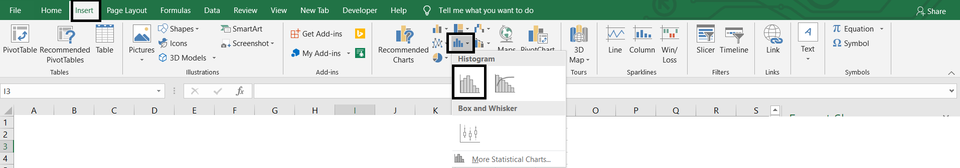
The button for column chart is found under the INSERT TAB >CHARTS SECTION under the button INSERT STATISTICAL CHARTS >HISTOGRAM CHART. The location is shown in the picture below.
STEPS TO INSERT A HISTOGRAM CHART IN EXCEL
EXAMPLE DETAILS
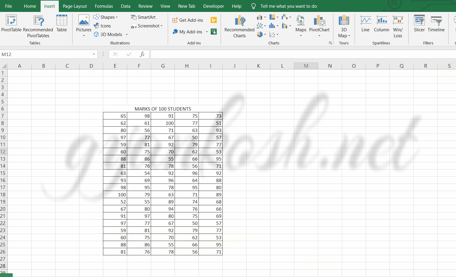
We can demonstrate the chart using an example.We are taking the example of a class of 100 students. Let us find out the distribution of the marks of the class, which can give us a wider view of the performance.The chart shows the data.
| MARKS OF 100 STUDENTS | ||||
| 65 | 98 | 91 | 75 | 73 |
| 62 | 61 | 100 | 77 | 51 |
| 80 | 56 | 71 | 63 | 93 |
| 97 | 77 | 67 | 50 | 57 |
| 59 | 81 | 92 | 79 | 77 |
| 60 | 75 | 70 | 62 | 53 |
| 88 | 86 | 55 | 66 | 95 |
| 81 | 76 | 78 | 56 | 71 |
| 63 | 54 | 92 | 96 | 92 |
| 93 | 69 | 96 | 64 | 88 |
| 98 | 95 | 78 | 95 | 80 |
| 100 | 79 | 63 | 71 | 89 |
| 52 | 55 | 89 | 74 | 68 |
| 67 | 80 | 94 | 76 | 66 |
| 91 | 97 | 80 | 75 | 69 |
| 97 | 77 | 67 | 50 | 57 |
| 59 | 81 | 92 | 79 | 77 |
| 60 | 75 | 70 | 62 | 53 |
| 88 | 86 | 55 | 66 | 95 |
| 81 | 76 | 78 | 56 | 71 |
The procedure to insert a HISTOGRAM chart are as follows:
STEPS TO INSERT A HISTOGRAM CHART IN EXCEL:
- The first requirement of any chart is data. So create a table containing the data.[We have already created in the form of table above]
- Refer to our data above, we have the marks of 100 students for a class.
- Select the complete table.
- Go to INSERT TAB> CHARTS> and click the HISTOGRAM CHART under INSERT STATISTICAL CHARTS BUTTON as shown in the BUTTON LOCATION above and in the following picture for reference.
- The chart will be created and shown to you as the following figure.
The complete process is shown in the animated picture below.
So , we have successfully created a HISTOGRAM CHART.
We can see that a histogram has been created automatically. It is showing the data in the three columns which we can call as the bins. So these columns tells about the frequency of the numbers falling inside the given bins.
Let us change the bin size and check the chart after setting the bins.
CONFIGURING THE BIN IN HISTOGRAM CHART
The BIN is the interval which we use in statistics. The interval is like a class such as 16-20 it means all the data inputs between the range 16-20 will fall in this class.We saw that the chart created took the bin size automatically but it is quite possible that we need different bin size.We want the bin size of 10.
Follow the steps to configure the bin size.
- Right Click on the horizontal axis >FORMAT AXIS>AXIS OPTIONS [ON THE RIGHT]
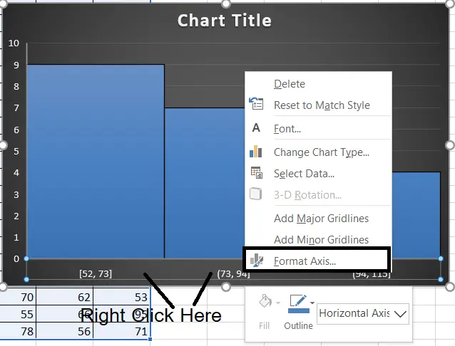
- The FORMAT AXIS BOX will open on the right.
- Go to the AXIS OPTIONS.
- Go to BINS.
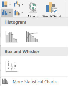
- Choose the type of bin as per requirement.
Bins can be adjusted by many ways. For example,
by
- CATEGORY [ DEFAULT AS SHOWN ABOVE]
- BY WIDTH [WIDTH AS VALUE]
- NUMBER
OF BINS[ THE VALUES WILL BE DIVIDED IN A SPECIAL PATTERN AND BINS WILL
BE FORMED. THE NUMBER WILL BE INCLUDING OVERFLOW BIN AND UNDERFLOW BIN] - OVERFLOW BIN [ ALL ABOVE VALUES WILL BE PUT IN THAT]
- UNDERFLOW BIN[ ALL LOWER VALUES WILL BE PUT IN THAT]
For our example ,we will use the fixed width of the bins as 10.
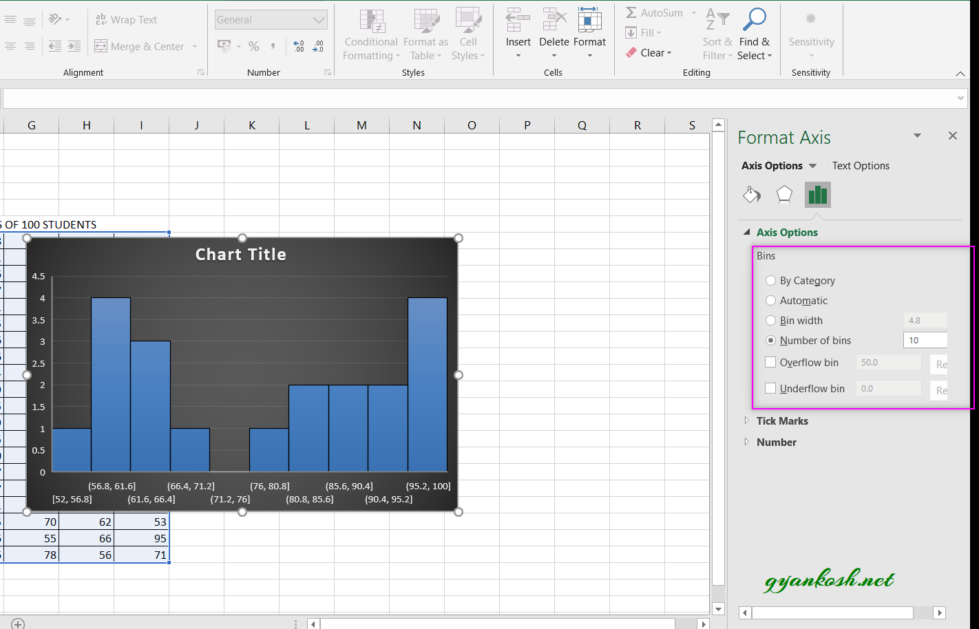
So, we have created a histogram. Now look at the histogram , it has created 10 bins. The bins started from around 50 as there is no value less than 50. The bins which has no values are empty.Similarly we can customize the histogram as per our requirement.
NOTE:CHANGING THE NAME OF THE CHART, CHANGING THE AXIS , CHANGING THE CHART STYLE ETC.
FOR ALL OTHER TASKS LIKE CHANGING THE NAME OF THE CHART, CHANGING THE AXIS , CHANGING THE CHART STYLE ETC. VISIT HERE [HOW TO CREATE A CHART IN EXCEL].