Table of Contents
INTRODUCTION
GANTT CHART is a special kind of chart which was made for assessing the progress of any task or project. It is extensively used in PROJECT MANAGEMENT.
The GANTT CHART is a kind of bar chart which has a timeline on the top and list of activities on the left
. For every activity, a bar is created for the time it took to complete.
It helps to track the performance of the project. All the activities have a start date and planned duration. It shows the delay any activity took to begin and how much delay it took after the given time.
HISTORY OF GANTT CHARTS
The first kind of GANTT CHART was developed by an engineer from the POLAND, Karol Adamiecki. But his work was not published and got known worldwide and was limited to Polish, because of which he could not gain much recognition. The chart he created was called a harmonogram by him.
After this , Hermann Schurch also created something like Gantt charts for his projects. But it also couldn’t get much recognition.
Henry Gantt, an American engineer,designed his version of the chart around 1910 to 1915. His version became very popular in the western countries and was adopted by various projects. So Henry Gantt gained the recognition from these and hence the name GANTT CHARTS. Although the version made by them was very basic, now a days there have been many improvements making them much beneficial now. Just for an exciting information, when these were initially used, they were drawn on paper and if there was any change, the drawing was needed again. After that some started using the blocks over the chart to show the timelines and progress which was a bit easier.
We are very lucky to have computers which does this without causing any trouble and within seconds.
GANTT CHART IN EXCEL
We can create a GANTT CHART in Excel too.
Let us check what are our requirements to create a GANTT CHART in Excel.
Here are the requirements
- The chart should be horizontal with activities names on the left. – BAR CHART SATISFIES OUR NEED.
- We’ll show the planned date and actual start date with the length equal to the total duration of task. -STACKED BAR CHART can help us in that.
- We need dates on the timeline which will be horizontal. It can be managed in the Bar chart.
So , we can create a bar chart for our GANTT CHART.
STEPS TO CREATE A GANTT CHART IN EXCEL
THE DATA TABLE
We’ll take the following fields into consideration.For each Activity-
- Planned starting date
- Actual starting date.
- Planned end date
- Actual end date
- Work completion
Here are the specifications which we have finalized.
- We’ll make two types of charts- Preplanning chart and Running Chart
- Preplanning chart will have a planned start date, end date, duration of the task.
- Running chart will have a planned start date, actual start date, planned end date , actual end date, duration, percentage of work completion.
We are taking an example of a GANTT CHART for the planning of a project before the project has started.The following table provides us the data.
| ACTIVITY | PLANNED START | PLANNED END DATE | DURATION |
| MILESTONE 1 | 30-12-2019 | 10-01-2020 | 11.00 |
| MILESTONE 2 | 05-01-2020 | 15-01-2020 | 10.00 |
| MILESTONE 3 | 13-01-2020 | 20-01-2020 | 7.00 |
| MILESTONE 4 | 21-01-2020 | 28-01-2020 | 7.00 |
| END | 25-01-2020 | 30-01-2020 | 5.00 |
STEP 1: CREATING THE EMPTY BAR CHART
Here are the steps to insert the basic bar chart first.
- Copy the table into your sheet or create it, whatever suits you.
- Normally its easy and fast to select the table and then create the chart but this time, we’ll have to put the ranges into horizontal and vertical axis smartly.
- So we’ll insert an empty chart.
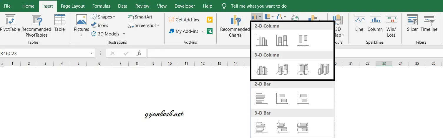
- Go to INSERT>CHARTS>COLUMN CHARTS>2D STACKED BARS
- An empty chart will be visible in the sheet as in the following picture.
The empty inserted chart is shown in the picture below.
The next step is to add data to this chart.
STEP 2: ADD DATA TO THE EMPTY CHART
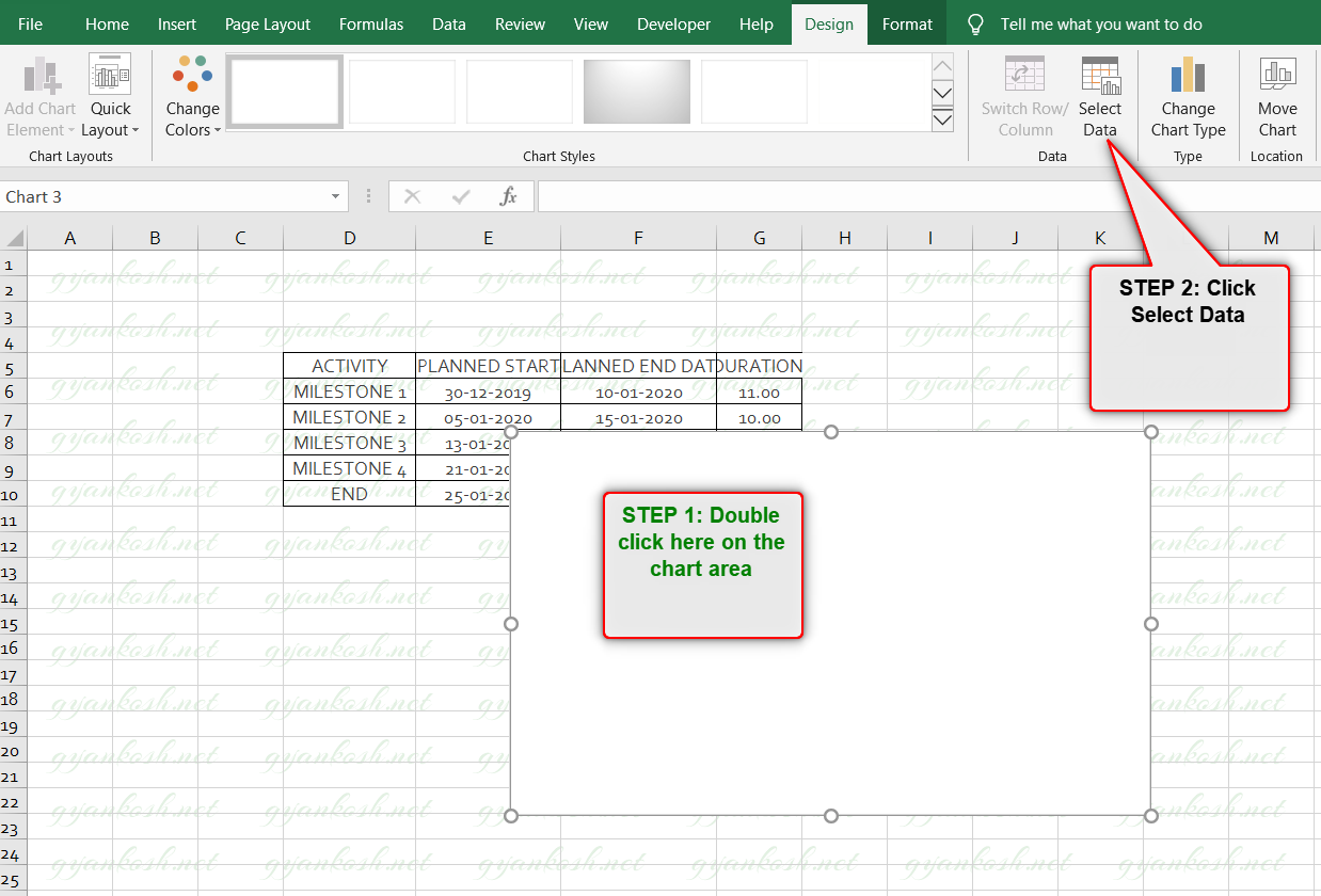
After the insertion of the chart, we need to add data to this chart. Adding the data to the chart needs the following steps.
- Double click the chart area. It’ll open the DESIGN TAB.
- Click Select Data as shown in the picture.
Select data would open a dialog box to enter the series.Look at the box below. It has many fields.Click the ADD on the left pane of the dialog box. It’ll open up a small dialog box, asking for the SERIES NAME and SERIES VALUES.
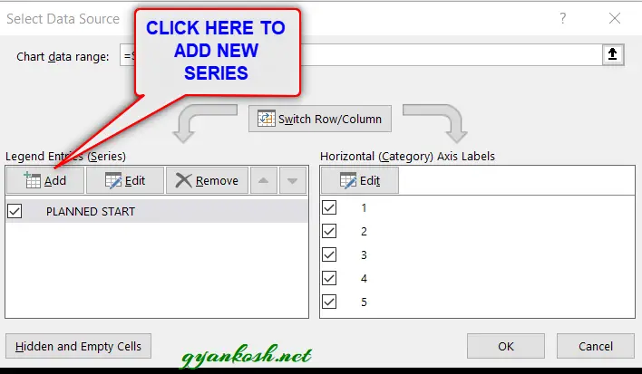
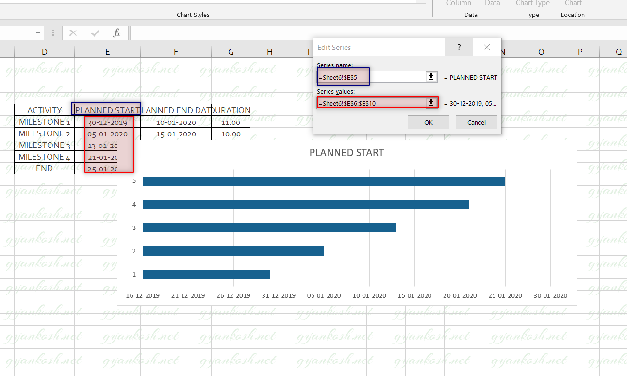
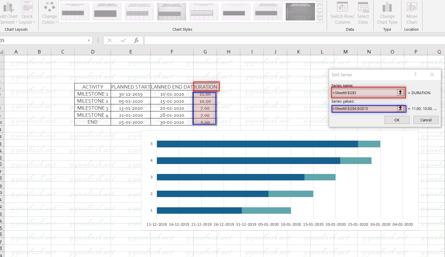
After CLICKING THE ADD, a small dialog box named EDIT SERIES will open. We will put the Series name as the PLANNED START [ by selecting the cell] and Series value as the dates in the ” planned start column.”
This process will create a chart as shown in picture below. The bars against the dates on the horizontal axis.
Now , we need to find out the duration and stack it on the chart. So we’ll insert the DURATION SERIES next.
After inserting the first series, we’ll again reach the SELECT DATA dialog box. Click ADD to insert one more series of data.

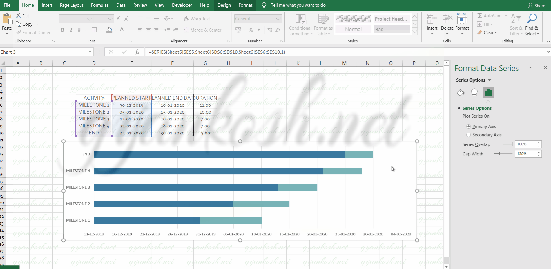
After clicking ADD, Edit series dialog box will open. Add the series name as DURATION [ by the cell address] and range of the values in the column DURATION.
Check the picture below, the duration of the activity has stacked on the bar with the dates.
Now look at the picture above. Our chart is complete. But there are a few final fixes which we need.
We don’t need the dark blue portion of the chart.
The dates should preferably be on the top of the chart.
The process names are yet to be changed.
So let us try to perform these fixes.
STEP 3: INSERT THE NAME OF PROCESSES
We need the name of the processes on the left vertical column. Follow the steps
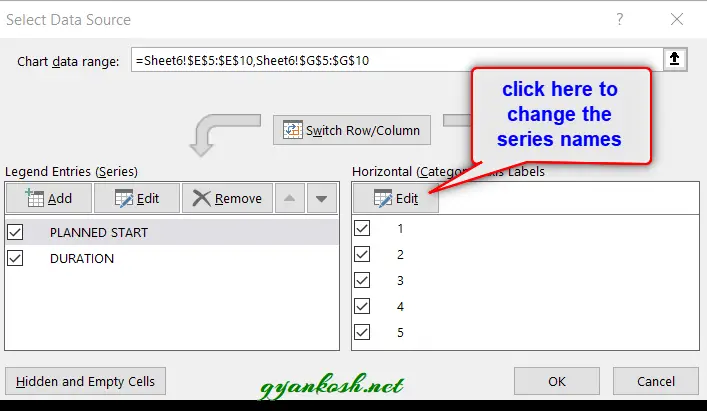
- Double Click the chart to open the design tab.
- Click on the SELECT DATA.
- The dialog box will open.
- Check on the right pane, click edit.
- Select the processes names from the column.
- Click OK.
- The names would start appearing , the way we want.
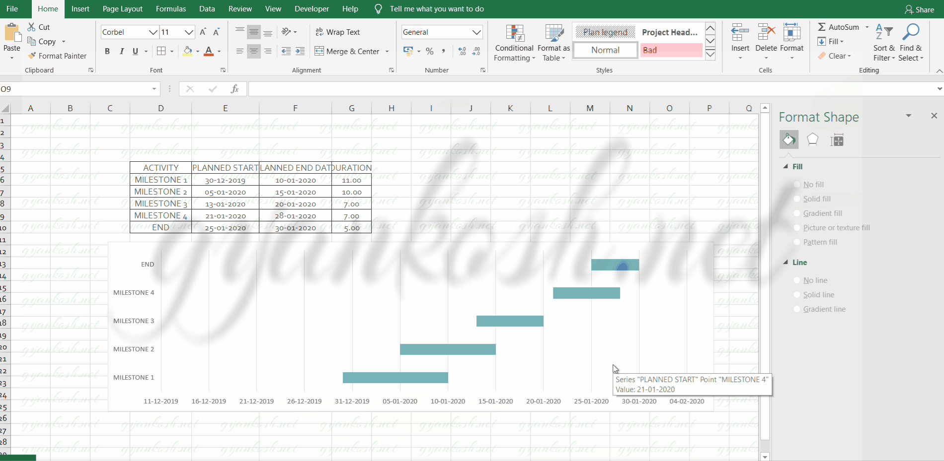
STEP 4: HIDING THE BARS FROM FIRST SERIES
We don’t need the blue bars showing the planned start column.
To hide it, follow the steps.Click the blue bar. It’ll select all the bars of the series. If all are not selected, try again.
Right click the bars, Choose the fill option.Choose No fill. It’ll remove the color of the bar and it’ll become invisible.
If , by chance, the outline is visible, again select, and right click.Choose OUTLINE> NO OUTLINE.
Now our bars are completely invisible.Check out the picture below for reference.
STEP 5: SENDING THE HORIZONTAL DATE BAR TO THE TOP
Now , we will send the horizontal date axis to the top of the chart. Follow the steps.
- Select the horizontal axis. An optionbox with name FORMAT AXIS would open on the right.
- Go to the TEXT OPTIONS.
- Go to LABELS > LABEL POSITION
- Select HIGH.
- It’ll send the horizontal axis values to top of the chart.
NOTE: THIS OPTION SETS THE VALUE AXIS POSITION.
STEP 6: FINALIZING
Now , our chart is almost ready.
We have a few things left.
The bars are in opposite direction i.e. the activity which start first should show first. For this we will reverse the values.
Follow the steps:
- Select the VERTICAL VALUE AXIS.
- The FORMAT AXIS OPTION BOX will open on the right.
- Go to TEXT OPTIONS[ fourth option icon].
- Go to Axis Options >Axis Position and check CATEGORIES IN REVERSE ORDER.
- This will immediately reverse out categories and put the bars , the way we want. But it’ll also
- change the location of the HORIZONTAL VALUES AXIS.
So, again select the HORIZONTAL VALUE AXIS>FORMAT AXIS OPTION BOX.
- Go to TEXT OPTIONS>LABELS.
- Select LOW and the values will again go to the top of the chart. It happened because of the reversal of the values.
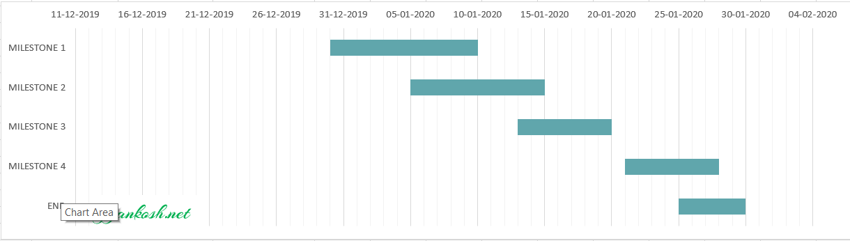
Refer the picture below for reference.
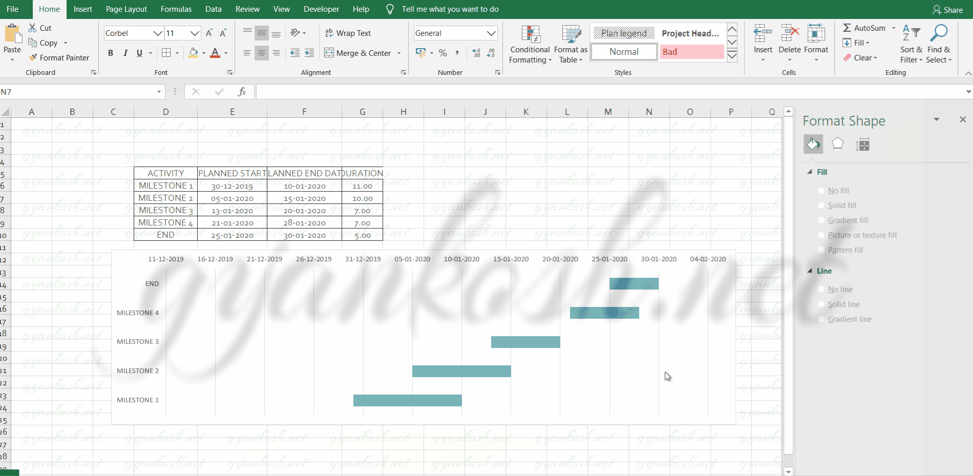
Our GANTT CHART IN EXCEL is ready.Now double click the chart and choose the design of your choice. I chose this one. So below picture shows the final GANTT CHART.
OTHER WAYS TO REACH THIS ARTICLE