Table of Contents
- INTRODUCTION
- WHEN TO USE BOX AND WHISKER CHARTS
- BUTTON LOCATION FOR BOX AND WHISKER CHARTS
- KNOW THE STRUCTURE OF BOX AND WHISKER CHART
- STEPS TO INSERT A BOX AND WHISKER CHART IN EXCEL
- INTERPRETATION OF A BOX AND WHISKER CHART OR BOX PLOT
- NOTE:CHANGING THE NAME OF THE CHART, CHANGING THE AXIS , CHANGING THE CHART STYLE ETC.
INTRODUCTION
CHARTS are the graphic representation of any data . As we know that EXCEL is a super analytical tool.
Analysis of data is the process of deriving the inferences by finding out the trends, averages etc. about different parameters.
Excel provides us with a variety of charts and graphs to make our life easier. Although any chart can be used for any type of data, even then there are certain types which are apt for a particular type of data.
This is a standard excerpt for the charts.
Now, in this article , we will discuss about the BOX AND WHISKER CHARTS which are specifically designed to present many statistical values at once which are very helpful in comparison of the data.
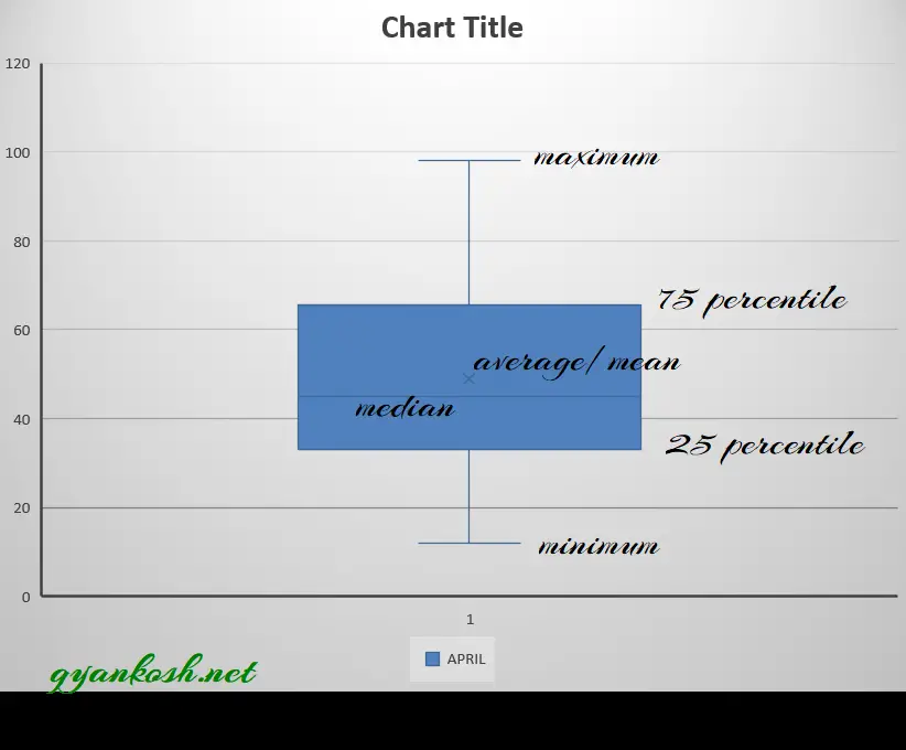
The BOX AND WHISKER has been given such name as it contains a BOX and the two lines are behaving like WHISKERS which gives some more information about the chart.
The upper end of the whisker gives the highest value in the series.
The lower end of the whisker gives the lowest value in the series.
A horizontal line shows the median of the data and a symbol X shows the average of the data.
The portion above the horizontal line is UPPER QUARTILE and lower of the line is LOWER QUARTILE.
So, we can see that this type of chart gave us FIVE DIFFERENT STATISTICAL INFORMATION at once.
Let us get more information about BOX AND WHISKER chart in excel.
WHEN TO USE BOX AND WHISKER CHARTS
BOX AND WHISKER CHART provide us a few statistical information like maximum, minimum, median , upper quartile, lower quartile of the data. We can use this type of chart if we need to compare this data for different sets of information or series.It is really very easy to create and use this kind of chart .
BUTTON LOCATION FOR BOX AND WHISKER CHARTS
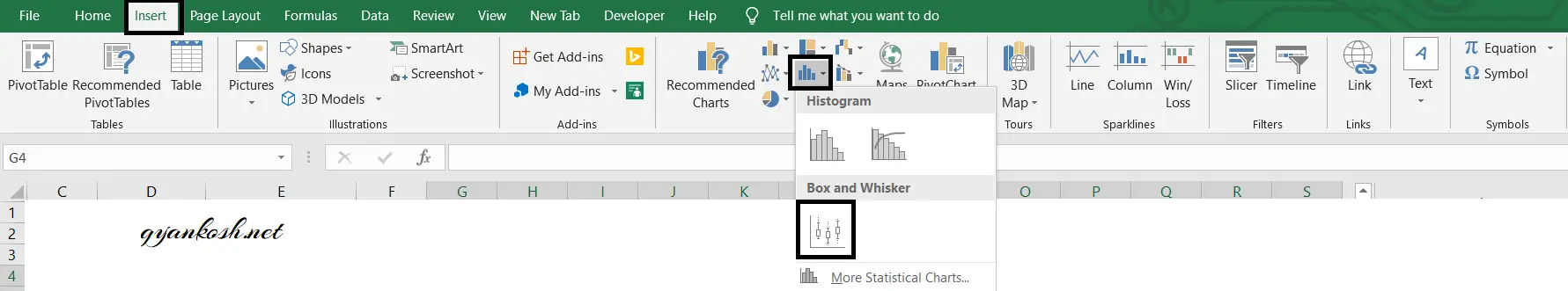
The button for BOX AND WHISKER chart is found under the INSERT TAB >CHARTS SECTION under the button INSERT STATISTICAL CHARTS >BOX AND WHISKER CHART. The location is shown in the picture below.
KNOW THE STRUCTURE OF BOX AND WHISKER CHART
Before we start the example of the box and whisker chart, let us understand its structure.
DIFFERENT PARTS OF A BOX AND WHISKER CHART IN EXCEL:
- MAXIMUM- Highest value in the data set.
- MINIMUM- Lowest value in the data set.
- MEDIAN- median of the data
- MEAN- Average of the data
- 75TH AND 25TH PERCENTILE- Values at 25th percentile of the data and 75th percentile of the data which are shown as the box in the box and whisker chart.
STEPS TO INSERT A BOX AND WHISKER CHART IN EXCEL
EXAMPLE DETAILS
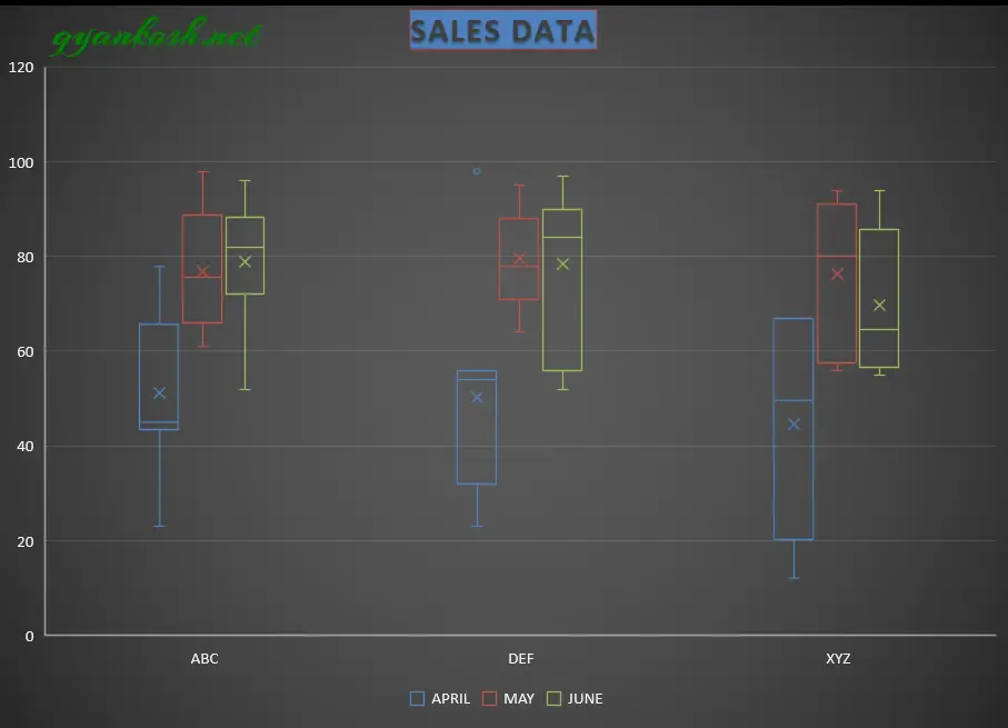
We can demonstrate the chart using an example.We are taking the example of a CAR AGENCY which shows the sales details of three months.The chart shows the data.
| VEHICLE SALE DATA | |||
| TEAM | APRIL | MAY | JUNE |
| ABC | 43 | 77 | 85 |
| DEF | 32 | 95 | 84 |
| XYZ | 12 | 90 | 62 |
| DEF | 54 | 76 | 86 |
| ABC | 66 | 65 | 86 |
| XYZ | 65 | 87 | 67 |
| DEF | 54 | 71 | 97 |
| XYZ | 34 | 58 | 94 |
| ABC | 23 | 61 | 89 |
| ABC | 45 | 79 | 52 |
| ABC | 65 | 98 | 96 |
| XYZ | 67 | 94 | 83 |
| DEF | 98 | 64 | 84 |
| ABC | 78 | 69 | 79 |
| XYZ | 67 | 73 | 57 |
| DEF | 56 | 78 | 90 |
| ABC | 45 | 92 | 72 |
| DEF | 34 | 85 | 52 |
| XYZ | 23 | 56 | 55 |
| DEF | 23 | 88 | 56 |
| ABC | 45 | 74 | 72 |
The procedure to insert a BOX AND WHISKER chart are as follows:
STEPS TO INSERT A BOX AND WHISKER CHART IN EXCEL:
- The first requirement of any chart is data. So create a table containing the data.[We have already created in the form of table above]
- Refer to our data above, we have the sales numbers of three teams ABC, DEF and XYZ in a car agency.
- Select the complete table including the HEADER NAMES.
- Go to INSERT TAB> CHARTS> and click the BOX AND WHISKER CHART under INSERT STATISTICAL CHARTS BUTTON as shown in the BUTTON LOCATION above and in the following picture for reference.
- The chart will be created and shown to you as the following figure.
The complete process is shown in the animated picture below.
So , we have successfully created a BOX AND WHISKER CHART.
We can see that the data of all the teams for all the months has been plotted. The data is really easy to interpret and to compare. The highest and lowest values can be checked up easily.
The data can be compared easily too. The number is shown by the size of the box which can also be checked easily.
After applying styles and different layouts, here is our final chart.The final chart is shown below.
INTERPRETATION OF A BOX AND WHISKER CHART OR BOX PLOT
The BOX PLOT or BOX AND WHISKER CHART is easy to interpret.
The whiskers simply tell the maximum and minimum values.The HORIZONTAL LINE represents the median of the data.
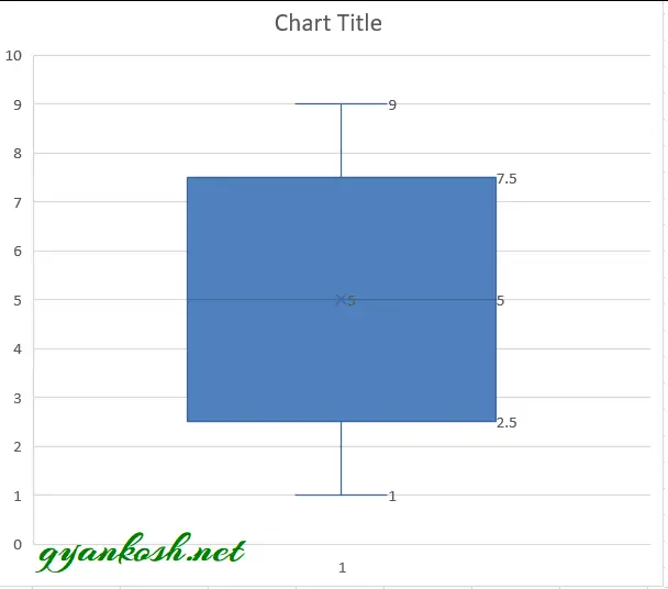
Let us take an example and solve it manually as well as with Excel.Suppose we have a series as1 2 3 4 5 6 7 8 9.
We know that median of n number of series is nth number or nth+1 number.We have 9 terms so median is the (9+1)/2 5th term which is 5. Now we need to find out the 25th percentile.
PERCENTILE CAN BE FOUND WITH THE FOLLOWING FORMULA.nth percentile =n/100 x (number of terms +1)25th percentile=0.25×10=2.5
EXCEL would take it as exact 2.5 although the term number 2.5 is not possible so we can take it as 2 or 3. Let us take it as 2.
Similarly 75th percentile = 7.5 , We take it as 7.
Now we can see that 25 percent of the values are less than the value for lower quartile and 75 percent values are less than value shown in higher quartile. The maximum and minimum are simple to identify which are 9 and 1 in our case. Let us try this with Excel.
NOTE:CHANGING THE NAME OF THE CHART, CHANGING THE AXIS , CHANGING THE CHART STYLE ETC.
FOR ALL OTHER TASKS LIKE CHANGING THE NAME OF THE CHART, CHANGING THE AXIS , CHANGING THE CHART STYLE ETC. VISIT HERE [HOW TO CREATE A CHART IN EXCEL].