Table of Contents
- INTRODUCTION
- WHEN TO USE DOUGHNUT CHARTS
- BUTTON LOCATION FOR DOUGHNUT CHARTS
- STEPS TO INSERT A DOUGHNUT CHART IN EXCEL
- DIFFERENCE BETWEEN DOUGHNUT CHART AND PIE CHARTS IN EXCEL
- CHANGE THE ANGLE OF FIRST SLICE IN DOUGHNUT CHART
- CHANGE THE ANGLE OF FIRST SLICE IN DOUGHNUT CHART
- SEPARATE THE PIECES OF DOUGHNUT AND SET THE HOLE SIZE OF DOUGHNUT CHART IN EXCEL
- FQAs
- NOTE:
INTRODUCTION
CHARTS are the graphic representation of any data . As we know that EXCEL is a super analytical tool.
Analysis of data is the process of deriving the inferences by finding out the trends, averages etc. about different parameters.
Excel provides us with a variety of charts and graphs to make our life easier. Although any chart can be used for any type of data, even then there are certain types which are apt for a particular type of data.
For example, if we want to compare, column charts are best, if we want to know the transition in any parameter, line charts are best.
Similarly if we want to know the percentage contribution of a particular contributing factor among all.
WHEN TO USE DOUGHNUT CHARTS
We can make use of Doughnut Charts under the following circumstances.
- We have many data series to plot . Every series will be plotted as a single ring.
- We want to show the percentage comparison between the same data at different time frames.
- There should be no negative values or zero values.
- We don’t have a large number of categories as doughnut chart shows the data in percentages, so it’ll make the chart very compressed and complicated .
- The categories represent parts of whole in each ring of the doughnut chart.
BUTTON LOCATION FOR DOUGHNUT CHARTS
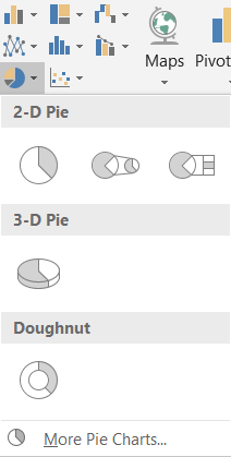
The button for column chart is found under the INSERT TAB under the CHARTS SECTION.
STEPS TO INSERT A DOUGHNUT CHART IN EXCEL
EXAMPLE DETAILS
We can demonstrate the chart using an example.
We are taking the example of a class.We will create a doughnut for the harvest of the two years for a city. The details are as given.
| TOTAL HARVEST IN 2019 AND 2020 | ||
| 2019 | 2020 | |
| WHEAT | 2500 | 3000 |
| RICE | 2200 | 2500 |
| BARLEY | 2000 | 2100 |
The procedure to insert a doughnut chart are as follows:
STEPS TO INSERT A DOUGHNUT CHART IN EXCEL:
- The first requirement of any chart is data. So create a table containing the data.[We have already created in the form of table above]
- Refer to our data above, we have the harvest for two years of the three cereals.
- Select the complete table including the HEADER NAMES.
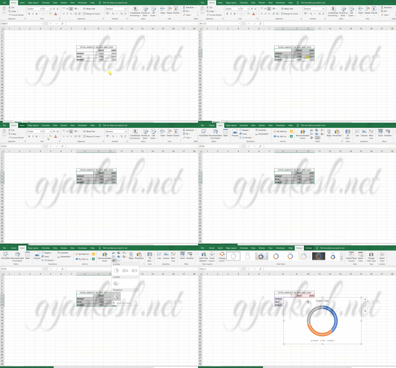
- Go to INSERT TAB> CHARTS> and click the DOUGHNUT CHART under PIE CHART SECTION as shown in the BUTTON LOCATION above and in the following picture for reference.
- The chart will be created and shown to you as the following figure.
The complete process is shown in the animated picture below.
dough
So , we have successfully created a doughnut chart.
The first series is denoted by the innermost circle containing the percentages of the different values in the series. As the series increases, the outer circle is made to show its data.
The chart shows the percentage of a value to the complete sum of that particular series.
We can choose different styles of the doughnut chart.
There are a few which shows the percentage value too, if we find it difficult to get the information from the above chart.
One more benefit is that it fixes the pieces of the doughnut together so that we can compare too between the different years. [Although it may be tough sometimes]
DIFFERENCE BETWEEN DOUGHNUT CHART AND PIE CHARTS IN EXCEL
The concept of DOUGHNUT CHART and a PIE CHART is almost same. Both work on the same pattern but even then there are some differences between the two.
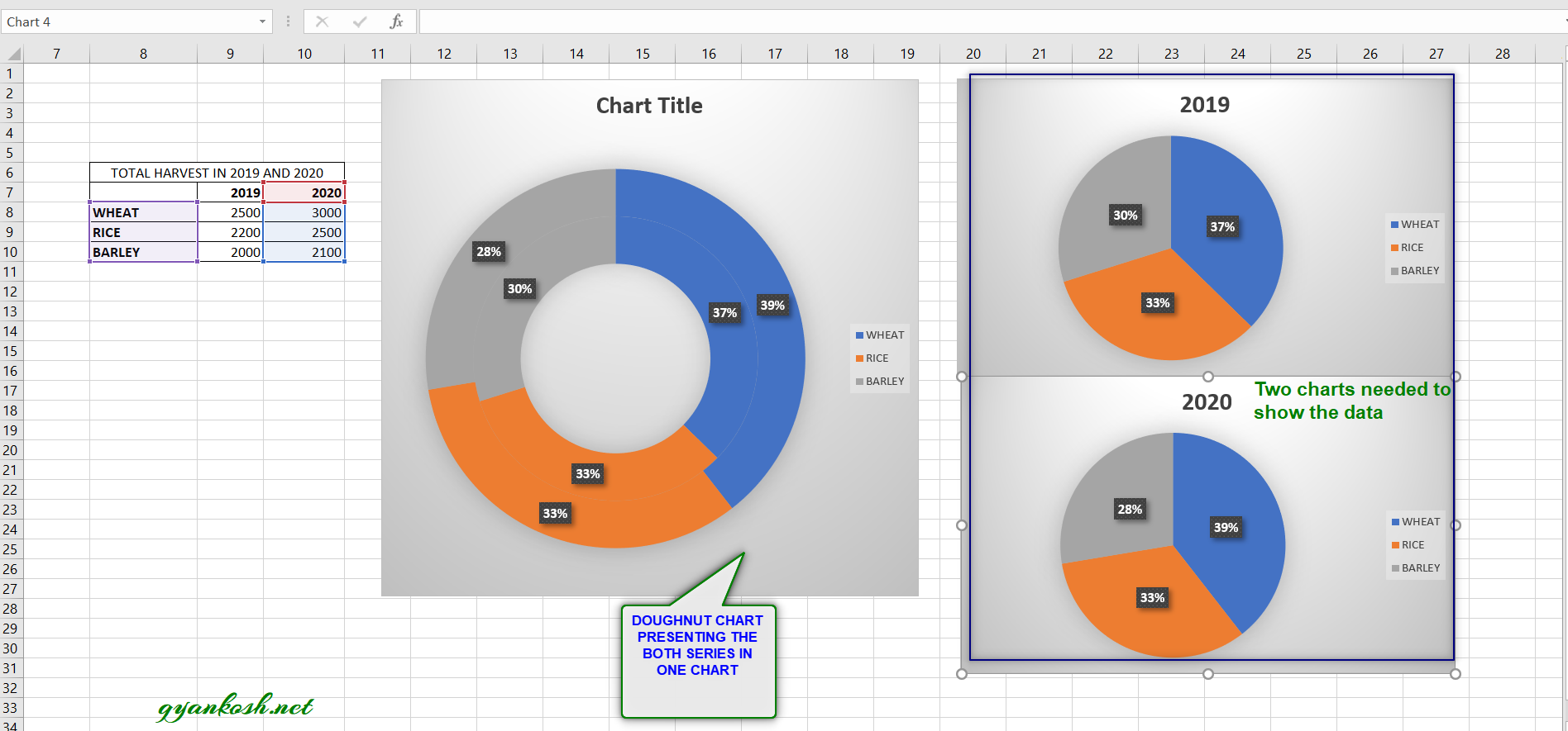
The major difference in doughnut chart and a pie chart is that a single pie chart is hard to be made for more than one series of data whereas we can create a single doughnut chart for more than one series of data.
We need the same number of pie charts for the comparison as we have the number of series whereas we can accommodate many series in one single doughnut chart.
And it is easier to compare percentages in a single chart rather than looking over a number of charts.
CHANGE THE ANGLE OF FIRST SLICE IN DOUGHNUT CHART

This requirement may arise sometimes to set the angle of the first slice in a dough nut chart. Suppose we have the following doughnut chart. [The doughnut chart shown is random and doesn’t relate to the example discussed above.]

The angle of the slice is measured from the spot which is shown by an arrow in the picture above. If we want to change the starting angle of the doughnut chart, follow the steps.
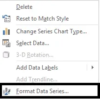
- Right Click the chart and choose FORMAT DATA SERIES
- It’ll open the dialog box in the right side of the window.
- Choose SERIES OPTIONS from the drop down if not selected.[Shown in the picture below]
- Go to ANGLE OF FIRST SLICE and change the angle by moving the slider as per requirement.
Following picture shows the process.
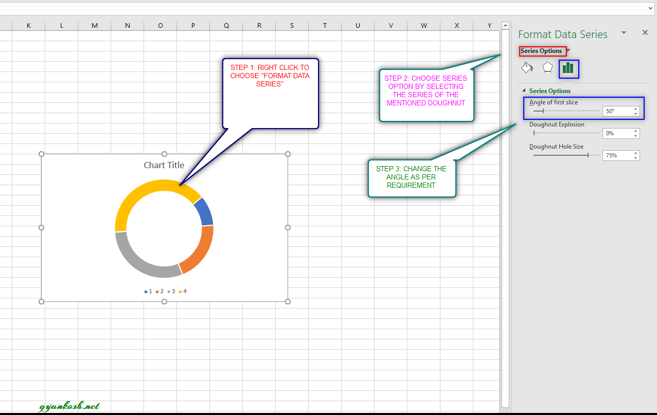
So the steps are given visually too in the above picture.Follow the steps to change the angle of the first slice.
It can be done to set the angle of the different doughnuts by selecting the series and changing the angle of the particular chart. A sample picture is shown below.
CHANGE THE ANGLE OF FIRST SLICE IN DOUGHNUT CHART

This requirement may arise sometimes to set the angle of the first slice in a dough nut chart. Suppose we have the following doughnut chart. [The doughnut chart shown is random and doesn’t relate to the example discussed above.]
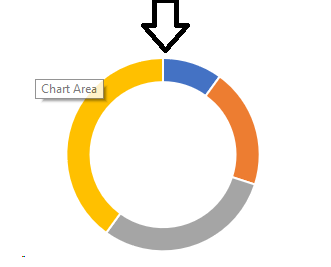
The angle of the slice is measured from the spot which is shown by an arrow in the picture above. If we want to change the starting angle of the doughnut chart, follow the steps.
- Right Click the chart and choose FORMAT DATA SERIES
- It’ll open the dialog box in the right side of the window.
- Choose SERIES OPTIONS from the drop down if not selected.[Shown in the picture below]
- Go to ANGLE OF FIRST SLICE and change the angle by moving the slider as per requirement.
Following picture shows the process.
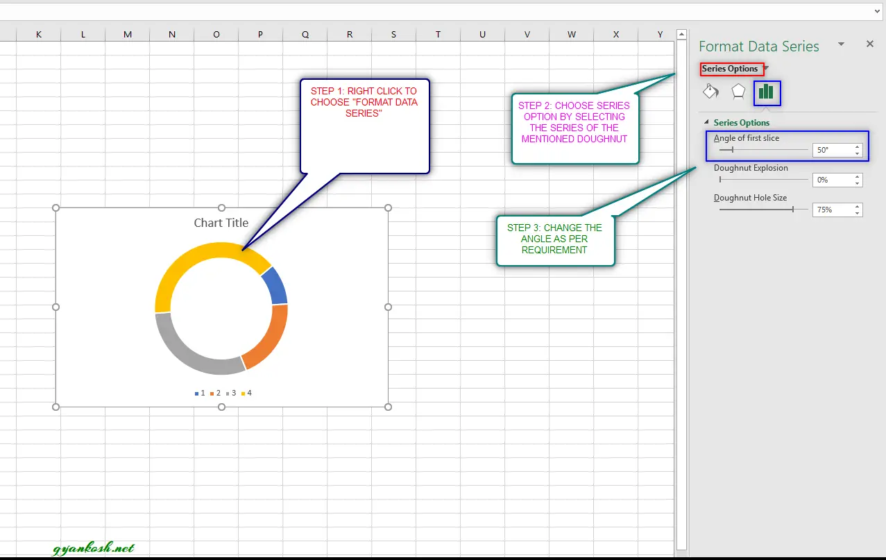
In the above chart we an see the angle of the first slice of the chart has been changed.
If we have more than one series and overlapping doughnuts, the angle for the doughnut will be same for both and the first entry would start at the same point. There is no provision of selecting the different angle for different series.
SEPARATE THE PIECES OF DOUGHNUT AND SET THE HOLE SIZE OF DOUGHNUT CHART IN EXCEL
Now two of more important properties , which can be required will be discussed here.Separating the pieces of the doughnut which we call as DOUGHNUT EXPLOSION and the hole at the center of the doughnut , can also be controlled.We’ll discuss the steps for both the processes simultaneously as the options are available together.
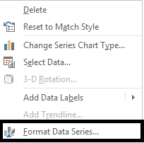
STEPS TO SEPARATE THE PIECES [DOUGHNUT EXPLOSION] AND HOLE SIZE OF DOUGHNUT CHART IN EXCEL:
- Right Click the chart and choose FORMAT DATA SERIES
- It’ll open the dialog box in the right side of the window.
- Choose SERIES OPTIONS from the drop down if not selected.[Shown in the picture below]
- Look at the picture below. Change the DOUGHNUT EXPLOSION as per the choice.
- Below the option of doughnut explosion, is the option of doughnut hole size.
- Change the DOUGHNUT HOLE SIZE as per requirement.
Following picture shows the process.
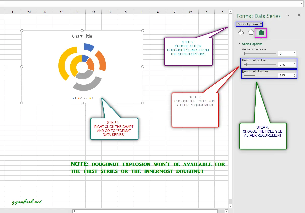
So we saw how a few more properties can be changed in the DOUGHNUT CHARTS. There are numerous other options which can always be tried by hit and trial.
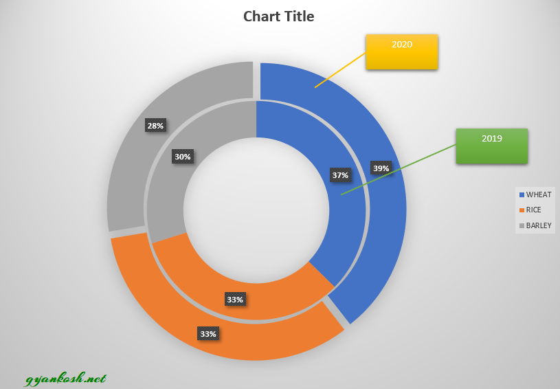
Play with colors, 3d formats, fills , no fills, borders etc. and you’ll create a great chart.
So after applying various function , here is our final doughnut chart.
FQAs
We have discussed many points about the DOUGHNUT CHARTS. This section contains the questions and answers in the common man’s language regarding the DOUGHNUT CHARTS.
QUESTION 1: HOW TO SET THICKNESS OF THE DOUGHNUT CHART?
The thickness of the doughnut chart is decided with the size of the hole.
If we increase the hole size, the thickness will reduce and if we decrease the hole size, thickness will increase.
Checkout the topic above “Setting the hole size of the doughnut chart” to find out how to set the hole size.
QUESTION 2: HOW CAN WE CREATE A PROGRESS DOUGHNUT CHART IN EXCEL?
A progress doughnut chart is like a progress bar, but it is in the shape of the doughnut.
We can make it easily.
The concept is to create two doughnuts and place them on one another by setting the secondary axis.
One will have a constant value and other would change. There is another post to create one. Kindly follow the link.
QUESTION 3: HOW CAN WE CHANGE THE STYLE OF THE DOUGHNUT CHART?
- Double Click the chart.
- The design tab will open. If not opened click it on the RIBBON.
- Choose the style of your choice.
- We can also set our own style by choosing the color, style, 3d options etc for the pieces by selecting them one by one and changing the options.
QUESTION 4: HOW CAN WE NAME THE RINGS OF THE DOUGHNUT CHART?
There is no direct option of putting the names to the rings of the doughnut chart as the slices can vary in sizes.
But we can insert different shapes to show the labels in the style we want.
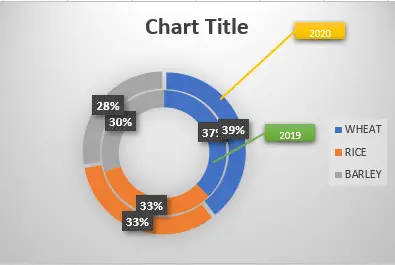
Follow the steps:
- Insert the shape of your choice and place it anywhere.
- Double click the shape so that the cursor appear and type the label.
- For the connectors use other shapes.
- Give the favorite color of your choice.
NOTE:
FOR ALL OTHER TASKS LIKE CHANGING THE NAME OF THE CHART, CHANGING THE AXIS , CHANGING THE CHART STYLE ETC. VISIT HERE [HOW TO CREATE A CHART IN EXCEL].

