Table of Contents
- INTRODUCTION
- WHEN TO USE LINE CHARTS
- BUTTON LOCATION FOR LINE CHARTS
- STEPS TO INSERT A LINE GRAPH OR LINE CHART IN GOOGLE SHEETS
- CHANGING ANY CHART TO LINE GRAPH IN GOOGLE SHEETS
- NOTE:CHANGING THE NAME OF THE CHART, CHANGING THE AXIS , CHANGING THE CHART STYLE ETC.
INTRODUCTION
CHARTS are the graphic representation of any data . As we know that GOOGLE SHEETS is an emerging analytical tool.
Analysis of data is the process of deriving the inferences by finding out the trends, averages etc. about different parameters.
GOOGLE SHEETS gives us a variety of charts which are beautiful, colorful, more customizable and more powerful.
In this article we are going to discuss one particular type of the charts which are known as LINE CHART OR LINE GRAPH.
A LINE CHART IS USEFUL WHEN WE HAVE A LARGE NUMBER OF DATA POINTS OR WHEN WE WANT TO CHECK ANY TREND WITH RESPECT TO TIME.
WE CAN ALSO USE LINE GRAPH OR LINE CHART WHEN WE HAVE A BIG NUMBER OF CATEGORIES.
In this article, we’ll take a closer look about the LINE GRAPH or LINE CHART in GOOGLE SHEETS, how to create line chart, purpose of line chart and setting the different properties of line chart in GOOGLE SHEETS.
WHEN TO USE LINE CHARTS
LINE CHARTS are specifically used when you have a large number of data.It is very useful in the following situations
- When the sample data is very large. [ A large number of values].
- When we want to get the knowledge about the trend over a period of time.
BUTTON LOCATION FOR LINE CHARTS
There is no direct button for the line chart in google sheets but a button for inserting chart is there which will allow us to choose the LINE CHART.
INSERTING CHART USING THE TOOLBAR
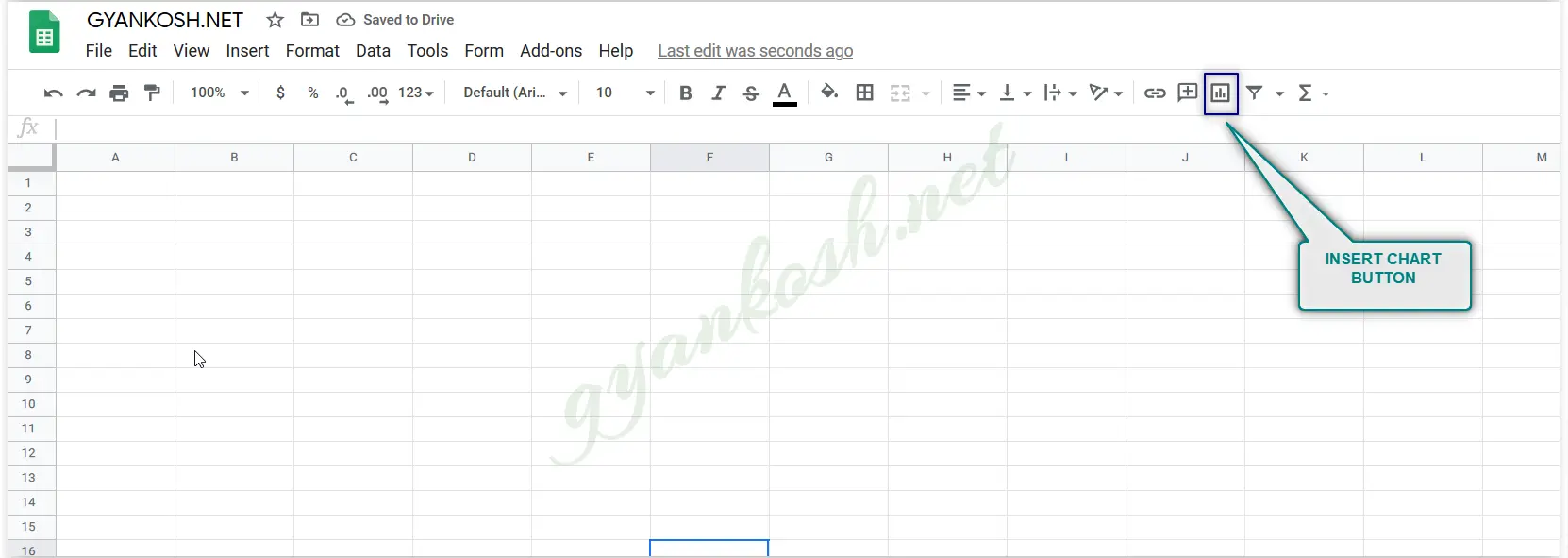
We can choose INSERT CHART option from the standard tool bar as shown in the picture below.
INSERTING CHART THROUGH MENU:
We can insert Chart through the menu options too.
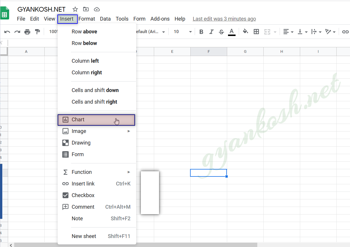
Go to INSERT MENU> CHART as shown in the picture below .
STEPS TO INSERT A LINE GRAPH OR LINE CHART IN GOOGLE SHEETS
EXAMPLE DETAILS
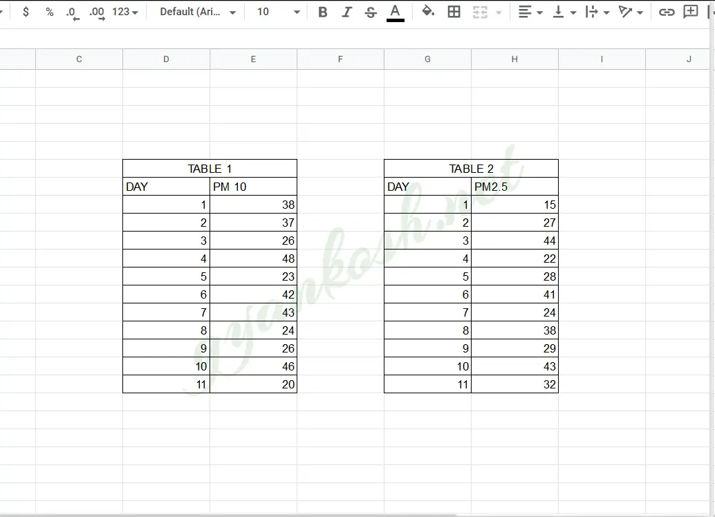
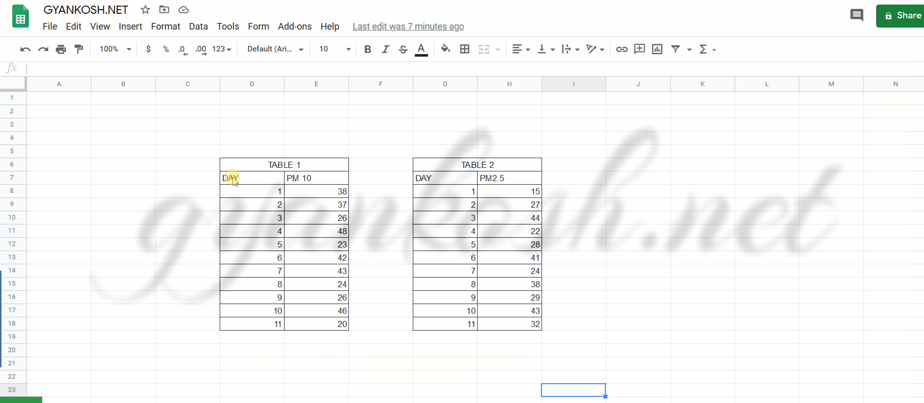
We will demonstrate the chart using a sample data. The data will be taken of the pollution data of a certain city on 11 days. The two data taken are PM10 and PM2.5We’ll create a line graph to check the trend of PM10 first and then add the PM2.5 data into the same graph.The data is given below.
| DAY | PM 10 | PM2.5 |
| 1 | 38 | 15 |
| 2 | 37 | 27 |
| 3 | 26 | 44 |
| 4 | 48 | 22 |
| 5 | 23 | 28 |
| 6 | 42 | 41 |
| 7 | 43 | 24 |
| 8 | 24 | 38 |
| 9 | 26 | 29 |
| 10 | 46 | 43 |
| 11 | 20 | 32 |
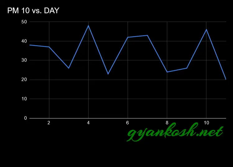
At first, we’ll create a line chart for the PM10 data and check its trend over the given 11 days.
STEPS TO INSERT A LINE CHART IN GOOGLE SHEETS:
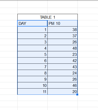
- The first requirement of any chart is data. So create a table containing the data.[We have already created in the form of table above which contains three columns. The first column have the days, followed by PM10 data and PM2.5 data in column 2 and column 3.] For better understanding, we have separated the two tables as shown in the picture below.
- Refer to our data above, we have the PM10 and PM2.5 data for City A for a day.
- Select the complete table 1 [pm10] including the HEADER NAMES.
- Go to INSERT MENU> CHARTS or directly click the INSERT CHART button on the toolbar.

- The chart will be created and shown to you as the following figure. [Google Sheets gave us an auto option which was the LINE CHART itself this time.
- A window will open on the right portion of the screen where all the controlling options for the charts will be displayed.
- If GOOGLE SHEETS created another type of chart, we can easily select the type of chart from the opened customization window from the right side. Pictorial representation in next section.
The complete process is shown in the animated picture below.
So , we have successfully created a LINE CHART in google sheets.
Let us now see the basic customization which we can perform on the chart or graph.
But there are few options which we can insert in the chart to make it better.
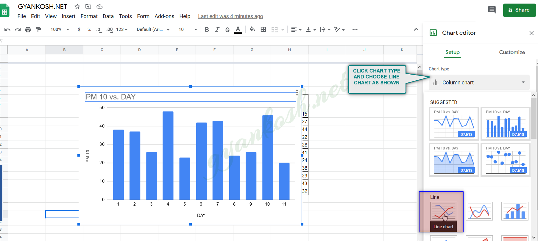
CHANGING ANY CHART TO LINE GRAPH IN GOOGLE SHEETS
- If, by chance, the suggested chart is not as per our requirement [ which is a LINE GRAPH] in our case, we can do so easily following the given steps below.
- Double Click anywhere on the chart to open the CHART EDITOR option box on the right side of the screen as shown in the picture below.
- Simply click the CHART TYPE which will provide the list of all the available charts.
- Select the LINE CHART and we are done.
After editing the axis titles, chart names etc. , here is our final LINE CHART.
NOTE:CHANGING THE NAME OF THE CHART, CHANGING THE AXIS , CHANGING THE CHART STYLE ETC.
FOR ALL OTHER TASKS LIKE CHANGING THE NAME OF THE CHART, CHANGING THE AXIS , CHANGING THE CHART STYLE ETC. VISIT HERE [HOW TO CREATE A CHART IN GOOGLE SHEETS].