INTRODUCTION
GANTT CHART is a special kind of chart which was made for assessing the progress of any task or project. It is extensively used in PROJECT MANAGEMENT.
The GANTT CHART is a kind of bar chart which has a timeline on the top and list of activities on the left. For every activity, a bar is created for the time it took to complete.
It helps to track the performance of the project. All the activities have a start date and planned duration. It shows the delay any activity took to begin and how much delay it took after the given time.
HISTORY OF GANTT CHARTS
The first kind of GANTT CHART was developed by an engineer from the POLAND, Karol Adamiecki.
But his work was not published and got known worldwide and was limited to Polish, because of which he could not gain much recognition. The chart he created was called a harmonogram by him.
After this , Hermann Schurch also created something like Gantt charts for his projects. But it also couldn’t get much recognition.
Henry Gantt, an American engineer,designed his version of the chart around 1910 to 1915.
His version became very popular in the western countries and was adopted by various projects. So Henry Gantt gained the recognition from these and hence the name GANTT CHARTS.
Although the version made by them was very basic, now a days there have been many improvements making them much beneficial now. Just for an exciting information, when these were initially used, they were drawn on paper and if there was any change, the drawing was needed again. After that some started using the blocks over the chart to show the timelines and progress which was a bit easier.
We are very lucky to have computers which does this without causing any trouble and within seconds.
GANTT CHART IN GOOGLE SHEETS
We can create a GANTT CHART in GOOGLE SHEETS too.
Let us check what are our requirements to create a GANTT CHART in GOOGLE SHEETS .
Here are the requirements
- The understanding of CONDITIONAL FORMATTING as we’ll be using it extensively.
- The understanding about the DATES in GOOGLE SHEETS.
SPECIFICATIONS OF THE GANTT CHART:
- The chart will comprise of the ACTIVITIES, PROGRESS OF THE ACTIVITY, PERSON , WHO HAS BEEN ASSIGNED THE ACTIVITY, ACTIVITY START DATE, DURATION, ACTIVITY END DATE and a few more.
- The following picture shows our GANTT CHART.
So , we can create a bar chart for our GANTT CHART.

STEPS TO CREATE A GANTT CHART IN GOOGLE SHEETS
We’ll take the following fields into consideration.For each Activity-
- ACTIVITY NAME
- START DATE
- DURATION OF ACTIVITY
- PROJECT END DATE
- PROGRESS PERCENTAGE
- ASSIGNED PERSON
- THE GRAPH REPRESENTING THE PROGRESS
Let us start the preparation of Gantt Chart step wise step.
This is representation of a simple gantt chart. The steps are elaborated and you can make the changes as per your requirement.
STEP 1: CREATING THE BASIC STRUCTURE OF THE GANTT CHART
The first step is to create a basic structure of the GANTT CHART.
- For the creation purpose, we can use some rough data.
- There are a few fields in the chart which needs to be entered itself.
The empty inserted chart is shown in the picture below.
The next step is to add data to this chart.
The data can be added simply and the markings are made in the picture below.
The description follows the picture.
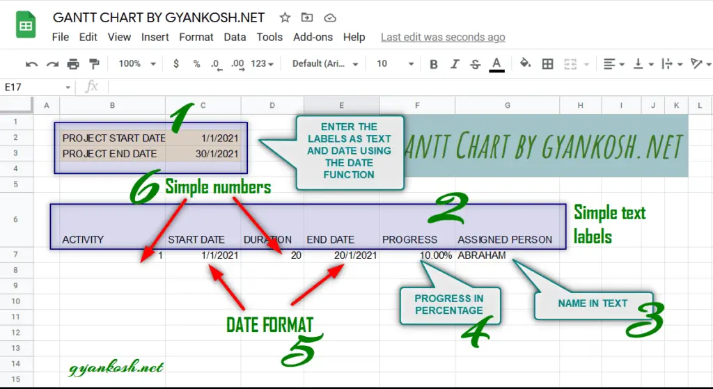
The different sections are marked with simple numbers. The description is given below.
| NUMBER MENTIONED | DESCRIPTION |
| 1 | The project start date and end date are given with the help of TEXT LABELS whereas the dates are put in the DATE FORMAT. For avoiding any confusion use DATE FUNCTION with the format =DATE(MONTH, DATE, YEAR). If the format doesn’t go well, all the calculations will malfunction. |
| 2 | Under heading 2, all the headings are simple Texts which can be entered using keyboard. |
| 3 | The name of the person responsible given in simple text. |
| 4 | The percentage of the work done. It can be done by setting the format of the cell to percentage. The format can be set by going to FORMAT MENU >NUMBER > PERCENT. |
| 5 | WORK START DATE AND END DATE , the DATE FORMAT is used to show the dates. The best way is to use the DATE FORMAT by going to FORMAT MENU > NUMBER > DATE. If some confusion occurs, use the DATE FUNCTION in the way discussed in heading 1 description. |
| 6 | Activity and Duration are given in simple numbers |
DESCRIPTION OF THE PREVIOUS PICTURE
NOTES:
In the example, we haven’t entered the end date and taken the end date by adding the duration to the starting date. For example, If start date is 1.1.2021 and duration is 2 days, the end date has been calculated as = start date + duration -1.
The 1 is subtracted to make both the start date and end date count.
STEP 2: SETTING UP THE CHART AREA
After we have created the basic structure for our gantt chart, its time now to create the chart area.
We are going to make the use of CONDITIONAL FORMATTING for the creation of our gantt chart.
We can make use of charts too, but conditional formatting has its own benefits such as the hidden formulas, less interference while making use of the chart and so on.
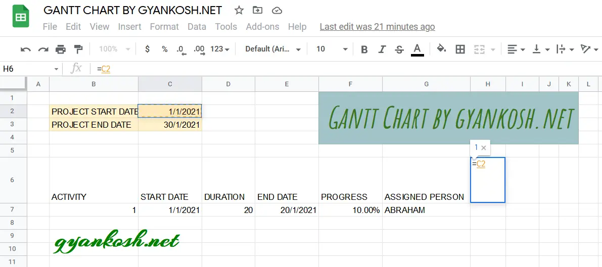
Against the first activity, we need to enter the project starting date [ or any other date from where we want to the statistics ].
For our example, we have got the cell H6 , as shown in the picture below.
Use the formula =C2 [ where C2 contains the PROJECT START DATE.
The DATE is necessary as we’ll be putting the conditions on the basis of the DATES.
The picture below shows the process.
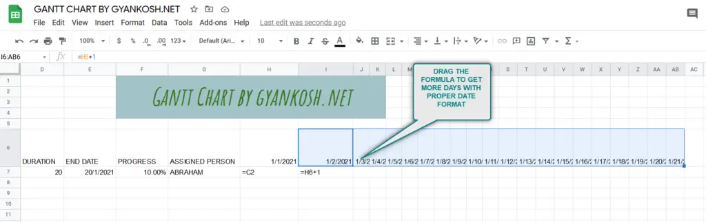
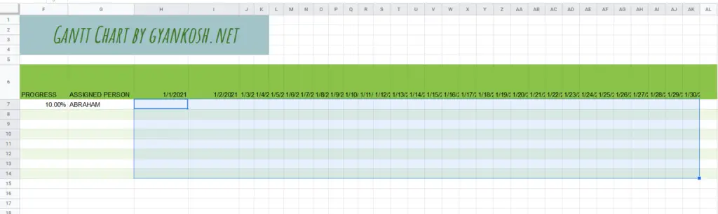
After we have inserted the first date in the starting cell, we can extend it simply by dragging the formula by holding and dragging the small + sign on the lower right corner of cursor up to the dates you need.
We have created the chart for 31 days, so we have dragged the dates up to 31 days as shown in the picture below.
All the cells have been filled with the dates.
STEP 3: GIVING A BETTER LOOK TO YOUR CHART
After we have set a few of the structural elements, it is now time to give a bit of the look to our chart.
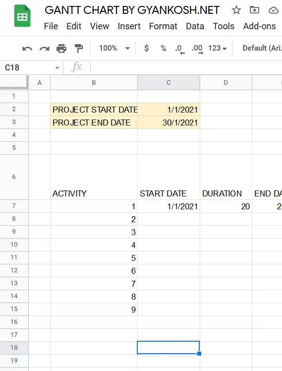
We are going to give our chart a few alternating colors and entering the activity sequence.
As we are using simple numbers to represent the activity, we are going to enter the activity number from 1 ,2 ….. 9.
YOU CAN GIVE ANY NAME AND THE NUMBER OF ACTIVITIES AS PER YOUR REQUIREMENT.
The following picture shows the activities entry.
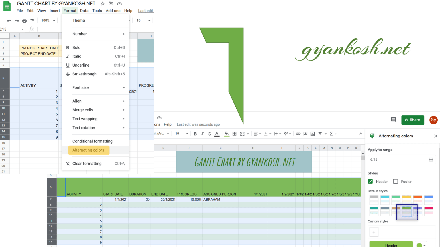
GIVING THE ALTERNATING COLORS TO THE TABLE
We can give a nice look to our table using the Alternating Colors.
Follow the steps to add ALTERNATING COLORS to your table in google sheets:
- Simply select the table including the activity names , through all the headers , dates and the number of activities.
- Go to FORMAT MENU.
- Click on the ALTERNATING COLORS option as shown in the picture below.
- As, we click the ALTERNATING COLORS option box will open up on the right.
- Choose the color of your choice and the colors will appear.
- We have chosen a green color.
STEP 4: MAKING THE RULES FOR GANTT CHART
After creating the basic structure, the outline of the chart, beautifying our chart a bit, its now time to learn the conditions which we’ll put so that our chart behaves the way we want.
PLANNING:
As discussed, we need two parameters to be shown in the chart area.
- DISPLAYING THE BAR SHOWING THE CURRENT PROGRESS OF THE TASK.
- DISPLAYING THE BAR SHOWING THE COMPLETE DURATION OF THE TASK.
CREATING A BAR TO SHOW THE CURRENT PROGRESS OF THE TASK:
Follow the steps to put the condition for showing the current progress.
- Select all the cells where we want to apply the condition. For our example, select the cell for the first activity and first date up to last date and last activity i.e. H7 to AL14
- Go to FORMAT MENU and choose CONDITIONAL FORMATTING as shown in the picture below.
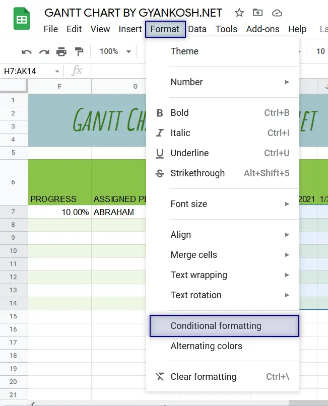
- As we click CONDITIONAL FORMATTING, the CONDITIONAL FORMATTING RULES option box will open on the right.
- Set the rules as shown in the picture below which shows three steps in a picture.
- THE NUMBERS IN [ ] SHOW THE OPERATION SHOWN IN THE PICTURE BELOW.
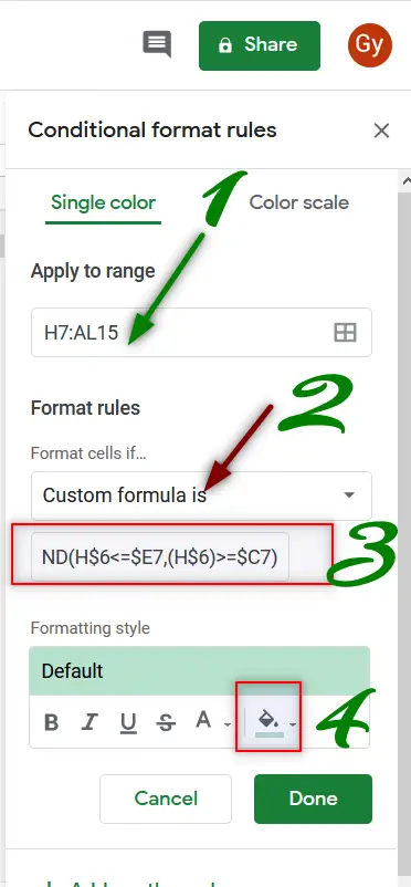
- Edit the APPLY TO RANGE [ 3 ] in the first or third step to H7:AL15 which contains the days from 1 to 31 and all the 9 activities.
- After editing the range, go to FORMAT CELLS IF [ 1 ] drop down and click it.
- Choose CUSTOM FORMULA IS [ 2 ] , which is the last option.
- Enter the formula as =AND(H$6>=$C7,(H$6)<$C7+( $F7*($E7-$C7+1))) [4 ] where H6 is the cell containing the first date in the chart portion C7 containing the START DATE , E7 containing the END DATE and F7 containing the percentage of work done. Kindly change the cell address as per your version. [ THE EXPLANATION OF THE FORMULA FOLLOWS ]
- After entering the formula, go to FORMATTING STYLE [ 5 ]section and choose the formatting for the cells which satisfy the condition i.e. which return true for our conditions. We have chosen a blue color for our example.
EXPLANATION OF THE FORMULA:
The formula used is
=AND(H$6>=$C7,(H$6)<$C7+( $F7*($E7-$C7+1)))
We have used AND as the main function which will help us to determine the validity of the two statements we need. If both the statements are true, the result will be true and false if either of the statements is false.
The first condition checks if the DATE is prior to the PROJECT START DATE which is put in the C7. The first condition is H$6>=$C7.
The $ sign blocks the relative change in the row for the first i.e. H6 will move in a row like E6, F6 and so on… whereas C7 will move in the column as C8, C9 and so on.
$ makes the reference absolute. There won’t be any relative change in the address.
The other half of the expression is (H$6)<$C7+( $F7*($E7-$C7+1).
This expression again checks if the current date [The dates in the top row containing 31 days ] is less than the DATE + THE NUMBER OF DAYS AS PER THE PERCENTAGE OF WORK DONE which means, if the total duration needed is 10 days and 20 percent work is done then it means two days work is already completed.
The expression contains the same variables except $F7 which is containing the PERCENTAGE OF WORK DONE multiplied with the difference of the dates.
THE DIFFERENCE OF THE DATES DOESN’T GIVE US THE WORKING DAYS AS WE TAKE BOTH DAYS INCLUDED WHEN TAKEN FOR WORK. E.G. IF A TASK STARTS FROM 1ST OF THE MONTH AND ENDS ON THE 2ND. THE NUMBER OF DAYS CAN’T BE FOUND BY THE SIMPLE DIFFERENCE BUT NEED TO ADD 1. THE SAME HAS BEEN DONE IN THE FORMULA.
CREATING A BAR TO SHOW THE DURATION LEFT :
After we have put the formula for the first condition, we need to put another formula to show the bars depicting the total duration projected.
FOLLOW THE STEPS TO CREATE A BAR SHOWING THE PROJECTED DURATION
- Go to FORMAT MENU and choose CONDITIONAL FORMATTING if CONDITIONAL FORMAT RULES are not open.
- Click ADD ANOTHER RULE as shown in the picture below.
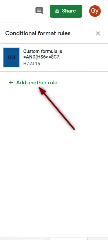
- It’ll open up the new CONDITIONAL FORMATTING RULES box for another rule.
- Follow the same steps as in the previous section for creating the first rule showing the bar representing the work progress.
- The following picture shows the steps to put another rule.
The description of the steps is below.
- Enter the APPLY TO RANGE same as the previous rule. For example, H7 to AL15 which contains all the cells for activities and the dates.
- Choose FORMAT CELL IF drop down .
- Choose CUSTOM FORMULA IS and put the formula as =AND(H$6<=$E7,(H$6)>=$C7)
- Choose the FORMATTING OF THE CELLS which satisfy the condition or return the TRUE for the rules we applied. We have chosen a light green color.
STEP 5: FINALIZING THE CHART
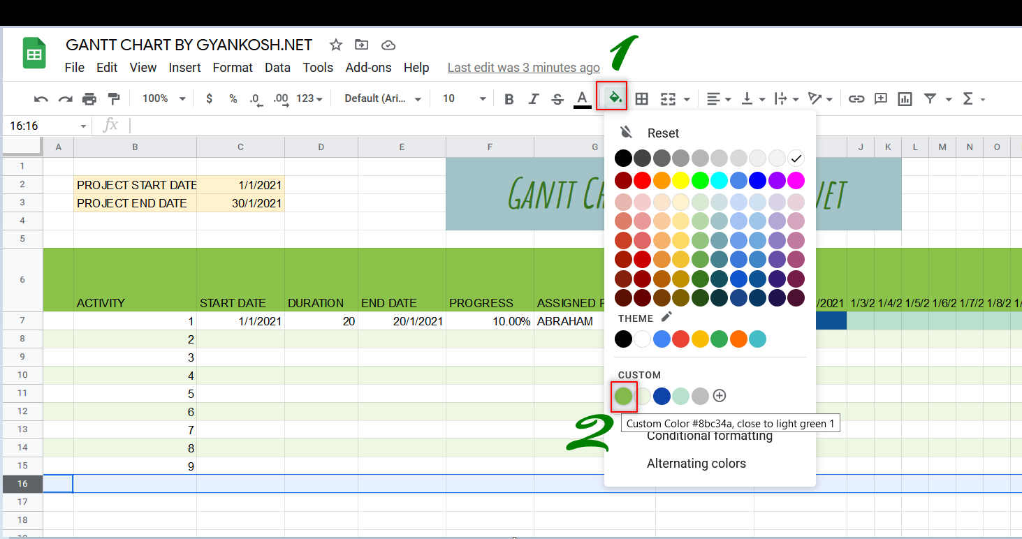
We’ll now add a decorative bar at the bottom simply by selecting the complete row and going to the toolbar , clicking the FILL COLOR icon and choose the color you want.
We chose the same color as the HEADER.
The process is shown below.
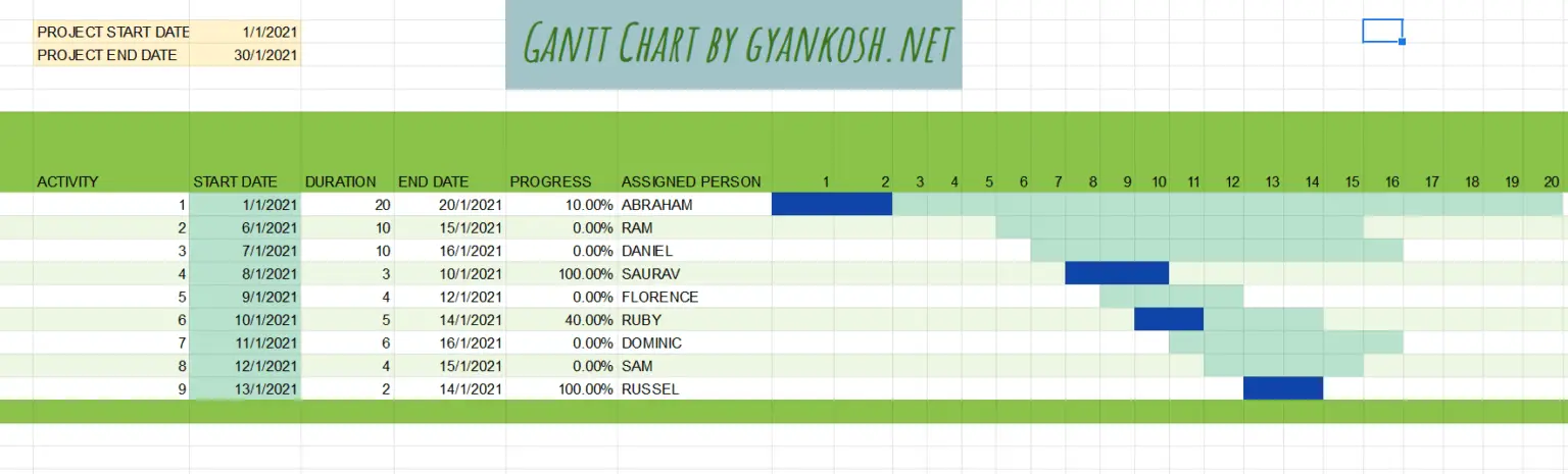
The final chart is shown below.
TEMPLATE
Simply download the template and open with your account.