Table of Contents
- INTRODUCTION
- WHAT IS A PEOPLE CHART?
- WHEN DO WE USE PEOPLE GRAPHS ?
- WHERE IS BUTTON LOCATION FOR PEOPLE GRAPH IN EXCEL?
- CREATE PEOPLE GRAPH IN EXCEL
- HOW TO CHANGE THE COLOR OF THE PEOPLE GRAPH IN EXCEL ?
- HOW TO CHANGE THE SHAPE IN PEOPLE GRAPH IN EXCEL ?
- HOW TO CHANGE THE TYPE/STYLE OF PEOPLE GRAPH?
- HOW TO DELETE PEOPLE GRAPH OR PEOPLE CHART?
INTRODUCTION
CHARTS are the graphic representation of any data . As we know that EXCEL is a super analytical tool , it gives us access to a big number of ready to use chart options.
Analysis of data is the process of deriving the inferences by finding out the trends, averages etc. about different parameters.
Data is everywhere. There is no work, where we don’t deal with the data.
Sales data in business, employee data, patient data in hospitals, students data in school etc. Maximum data is presented in the tables but we all know that visual representation is easier to interpret. That is the reason that as the Excel developed, so the charts options in Excel.
Excel gives us a variety of charts which are beautiful, colorful, more customizable, and more powerful.
In this article, we are going to discuss one particular type of chart which is known as PEOPLE CHART.
PEOPLE CHART is a special chart where any data related to the number of people with the small human figures.
Few call it Chart with People too.
WHAT IS A PEOPLE CHART?
PEOPLE CHART is a chart where the data is represented with the small human shape units.
The following picture represents a people chart.
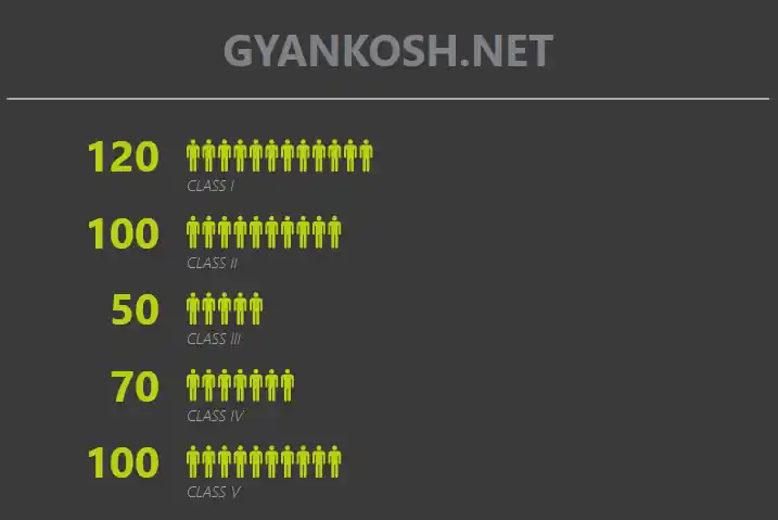
You can see that the people graph or people chart shown above simply represent the number of students in the different classes.
WHEN DO WE USE PEOPLE GRAPHS ?
Any chart or graph can be used for any visual representation and many of them can be used for showing the similar kind of data but even then , there are certain charts which are very apt for a specific type of data.
For example, PIE CHART is best when we want to show the percentages, or a column chart is good when we need to show the individual comparison.
People Graph is specifically used to show the data concerned with the human beings such as
- POPULATION
- TEAM SIZE
- DEMOGRAPHICS DATA
- GROUP SIZE
- NUMBER OF STUDENTS IN ANY CLASS OR GROUP
In addition to this WHEREVER YOU NEED TO SHOW ANY DATA INVOLVING THE PEOPLE, WE CAN MAKE USE OF PEOPLE GRAPH.
- In addition to the human pattern, more patterns are also available such as Hearts, Stars, House, Diamond, watches and more.
- We can make use of the appropriate shape to use in the data.
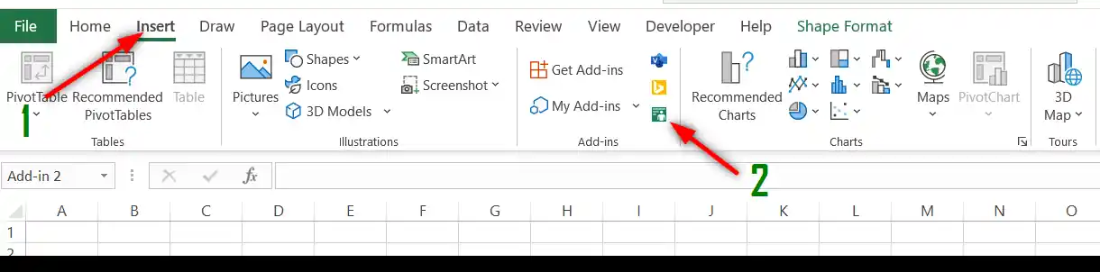
WHERE IS BUTTON LOCATION FOR PEOPLE GRAPH IN EXCEL?
You can find the option for PEOPLE GRAPH under the INSERT TAB under ADD-INs section.
The icon and location are shown in the picture below.
CREATE PEOPLE GRAPH IN EXCEL
Let us find out the way to create a PEOPLE GRAPH.
EXAMPLE:
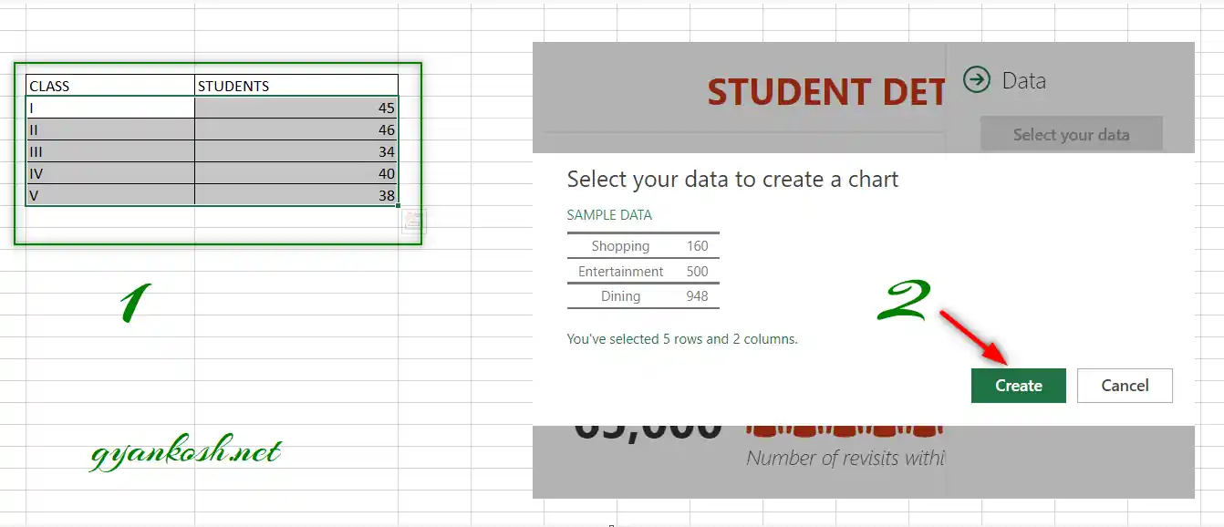
We’ll create a PEOPLE GRAPH of the students in various classes as given in the table below.
| CLASS | STUDENTS |
| I | 45 |
| II | 46 |
| III | 34 |
| IV | 40 |
| V | 38 |
Follow the steps to create a PEOPLE GRAPH in Excel
Normally , we select the data before opting for the charts in Excel, but here it is opposite.
- Go to INSERT TAB and click PEOPLE GRAPH option found under the ADD-IN section.
- The people graph template will open.
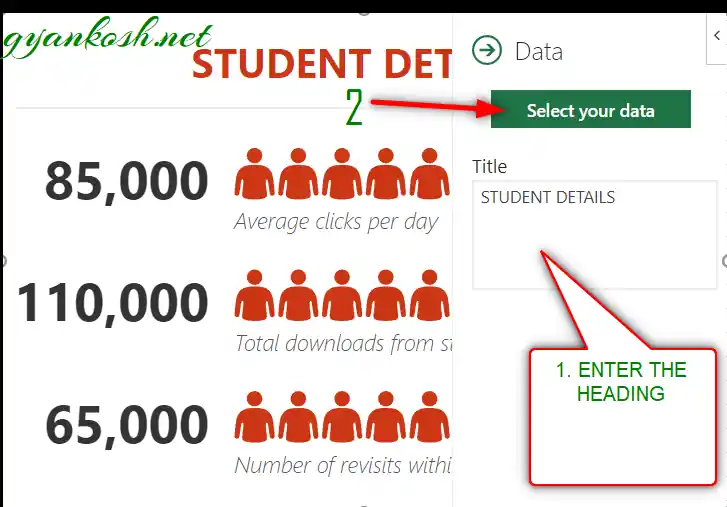
- Click Data button.
- A small window will open asking you the NAME OF THE GRAPH and a button SELECT YOUR DATA.
- Enter the name of the graph in the field as shown in the picture below and click SELECT YOUR DATA.
- Select the data and click CREATE.
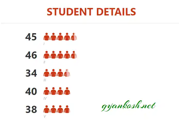
The PEOPLE GRAPH is created.
The picture below shows the created people graph or people chart.
You can see that small human shapes are acting like the bars and representing the value.
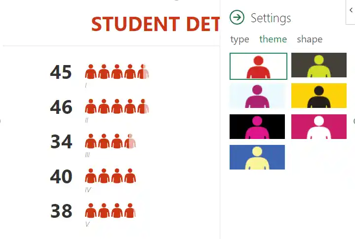
HOW TO CHANGE THE COLOR OF THE PEOPLE GRAPH IN EXCEL ?
PEOPLE GRAPH in Excel provides the option to change the color of the PEOPLE GRAPH.
The colors can’t be chosen selectively but we do have a number of color based themes.
FOLLOW THE STEPS TO CHANGE THE COLOR OF PEOPLE GRAPH OR PEOPLE CHART::
- Click anywhere on the people chart or graph to select it.
- Click SETTINGS.

- Go to THEMES.
- The chart will be changed accordingly.
- Choose any desired colors or theme.
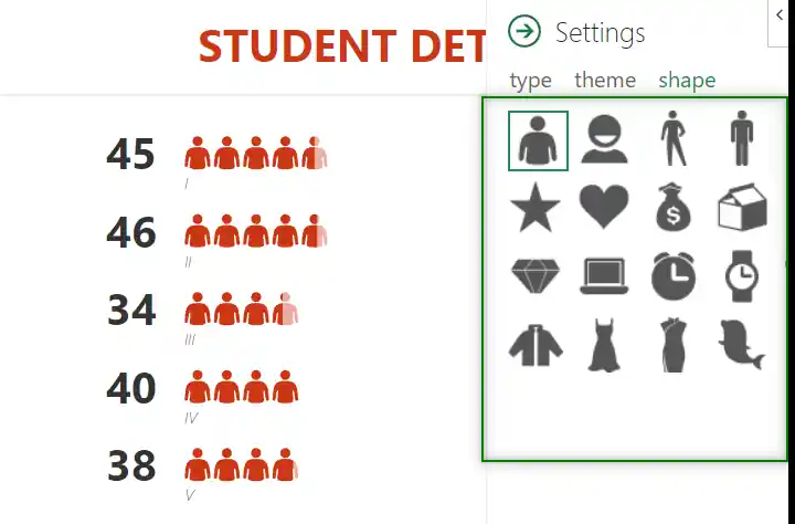
HOW TO CHANGE THE SHAPE IN PEOPLE GRAPH IN EXCEL ?
In the PEOPLE CHART or PEOPLE GRAPHS in Excel , we are not only depending upon the HUMAN SHAPE or PEOPLE SHAPE but other shapes too.
Following shapes are present in the PEOPLE CHART which can be used as per requirement:
- Human Shape up to torso.
- Smiling human bust
- Simple Standing Human Shape.
- Star
- Heart
- MoneyBag
- A Box
- Diamond
- Laptop
- Table Clock
- Watch
- Jacket
- Cat
- Female Dress
- Dolphin
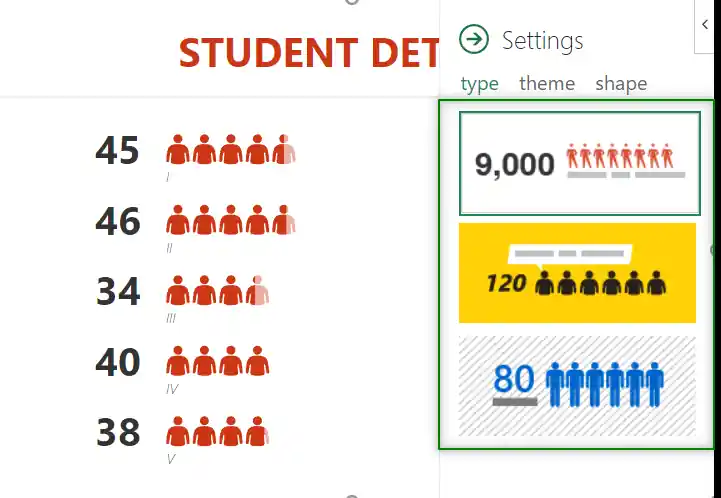
HOW TO CHANGE THE TYPE/STYLE OF PEOPLE GRAPH?
You can change the type or style [ Layout of the titles, numbers, shapes etc. ] in the following way.
FOLLOW THE STEPS TO CHANGE THE TYPE OF THE PEOPLE GRAPH/CHART
- Click anywhere on the chart.
- The settings button will appear.
- Click Settings button.
- Choose TYPE.
- Choose the type/ style you like and click on it.
- The Type will be changed.
HOW TO DELETE PEOPLE GRAPH OR PEOPLE CHART?
Sometimes it becomes a problem while deleting the people chart or people graph.
Normally, we always click in the chart , it gets selected and we simply use the DELETE KEY on the keyboard to delete it. But it might not work while trying it for People Chart or People Graph.
To delete the PEOPLE GRAPH, follow any of the given procedures.
WAY 1:
- Click on the LEFT ARROW DROP DOWN on the upper right corner and choose DELETE.
- It’ll delete the people graph in excel.

WAY 2:
In addition to this we may try one more way.
- Select the PEOPLE GRAPH or PEOPLE CHART from the edge where the cursor will become a Cross.
- Click DELETE KEY on the keyboard.
- The chart will be deleted.
After making different choices, here is the final PEOPLE GRAPH or CHART for our example.
In this article, we learnt the use of PEOPLE GRAPH or PEOPLE CHART in Excel.