Table of Contents
- INTRODUCTION
- WHEN TO USE XY SCATTER CHARTS
- BUTTON LOCATION FOR XY SCATTER CHARTS
- STEPS TO INSERT A XY SCATTER CHART IN EXCEL
- NAMING THE AXIS IN XY SCATTER CHARTS IN EXCEL
- NOTE:CHANGING THE NAME OF THE CHART, CHANGING THE AXIS , CHANGING THE CHART STYLE ETC.
INTRODUCTION
CHARTS are the graphic representation of any data . As we know that EXCEL is a super analytical tool.
Analysis of data is the process of deriving the inferences by finding out the trends, averages etc. about different parameters.
Data is everywhere. There is no work, where we don’t deal with the data. Sales data in business, employee data, patient data in hospitals, students data in school etc.
Maximum data is presented in the tables but we all know that visual representation is easier to interpret. That is the reason that as the Excel developed, so the charts options in Excel.
Excel gives us a variety of charts which are beautiful, colorful, more customizable and more powerful.
In this article we are going to discuss one particular type of the charts which are known as XY SCATTER CHART.
This is the only chart which supports the presentation of the values as if it is a graph.
Other than these charts, all other charts have one value constantly growing but XY chart or graph let us repeat the coordinates.
It is the same reason XY Chart lets us do a lot of difficult operations such as creating a vertical chart in excel or putting labels on the vertical axis.
These charts are specifically used when we need to show the data with two coordinates. Normally other charts have the category on one of the axis.
This graph or chart is mainly used for the scientific, statistical or engineering type of data.
WHEN TO USE XY SCATTER CHARTS
XY SCATTER charts should be used when we need to plot two data on the same chart. It can be some pollution data, such as PM10 and temperature or PM10 and PM2.5, rainfall data, or any other data.
XY CHART matches the LINE CHART. Let us understand the difference between the two.
XY plots the graph or chart with the two coordinates or values whereas Line draws the data with categories or labels and values .[ It’ll use only one value].
If we have two values, XY SCATTER CHART will make one chart but LINE CHART will plot both the series separately.
So we need to be very specific, what we want.
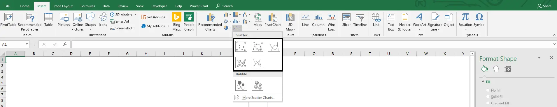
BUTTON LOCATION FOR XY SCATTER CHARTS
The button for column chart is found under the INSERT TAB > CHART SECTION under the button Insert Scatter (X, Y) or Bubble Chart.
The location is shown in the picture below.
STEPS TO INSERT A XY SCATTER CHART IN EXCEL
EXAMPLE DETAILS
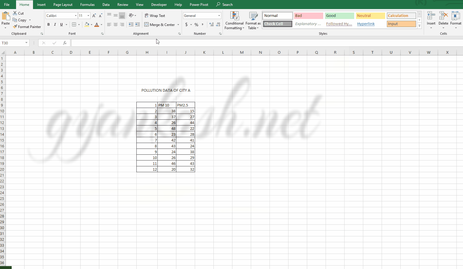
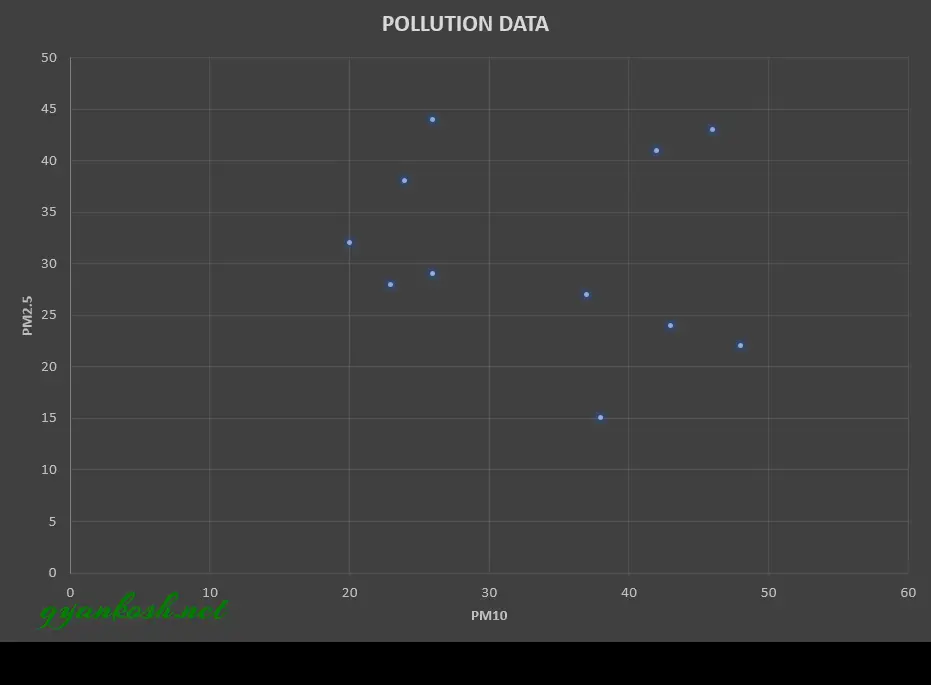
We will demonstrate the chart using a sample data. The data will be taken of the pollution of a certain city.
| PM 10 | PM2.5 | |
| 1 | 38 | 15 |
| 2 | 37 | 27 |
| 3 | 26 | 44 |
| 4 | 48 | 22 |
| 5 | 23 | 28 |
| 6 | 42 | 41 |
| 7 | 43 | 24 |
| 8 | 24 | 38 |
| 9 | 26 | 29 |
| 10 | 46 | 43 |
| 11 | 20 | 32 |
The procedure to insert an XY SCATTER chart are as follows:
STEPS TO INSERT A XY SCATTER CHART IN EXCEL:
- The first requirement of any chart is data. So create a table containing the data.[We have already created in the form of table above]
- Refer to our data above, we have the PM10 and PM2.5 data for City A for a day.
- Select the complete table including the HEADER NAMES.
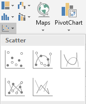
- Go to INSERT TAB> CHARTS> and click the XY SCATTER button under Insert Scatter (X, Y) or Bubble Chart button as shown in the BUTTON LOCATION above and in the following picture for reference.
- The chart will be created and shown to you as the following figure.
The complete process is shown in the animated picture below.
So , we have successfully created an XY SCATTER CHART in Excel.
We can use this chart to check the scatter of the data. We can have the scatter chart of the data for one day having the two concerned parameters.
But there are few options which we can insert in the chart to make it better.
NAMING THE AXIS IN XY SCATTER CHARTS IN EXCEL
If we look at the chart above, we find that the chart is lacking the axis names and other information. Let us try to put the axis names in the chart. For this task , we need to insert the chart elements in the chart. Follow the steps to name the axis properly.
- Select the Chart by double click.
- The DESIGN TAB will open.
- In the DESIGN TAB, click on ADD CHART ELEMENTS found on the extreme left of the ribbon as shown in the picture below.
- CLICK add chart elements>Axis titles> Primary horizontal and primary vertical both.
- Double Click the axis titles and rename as you want.
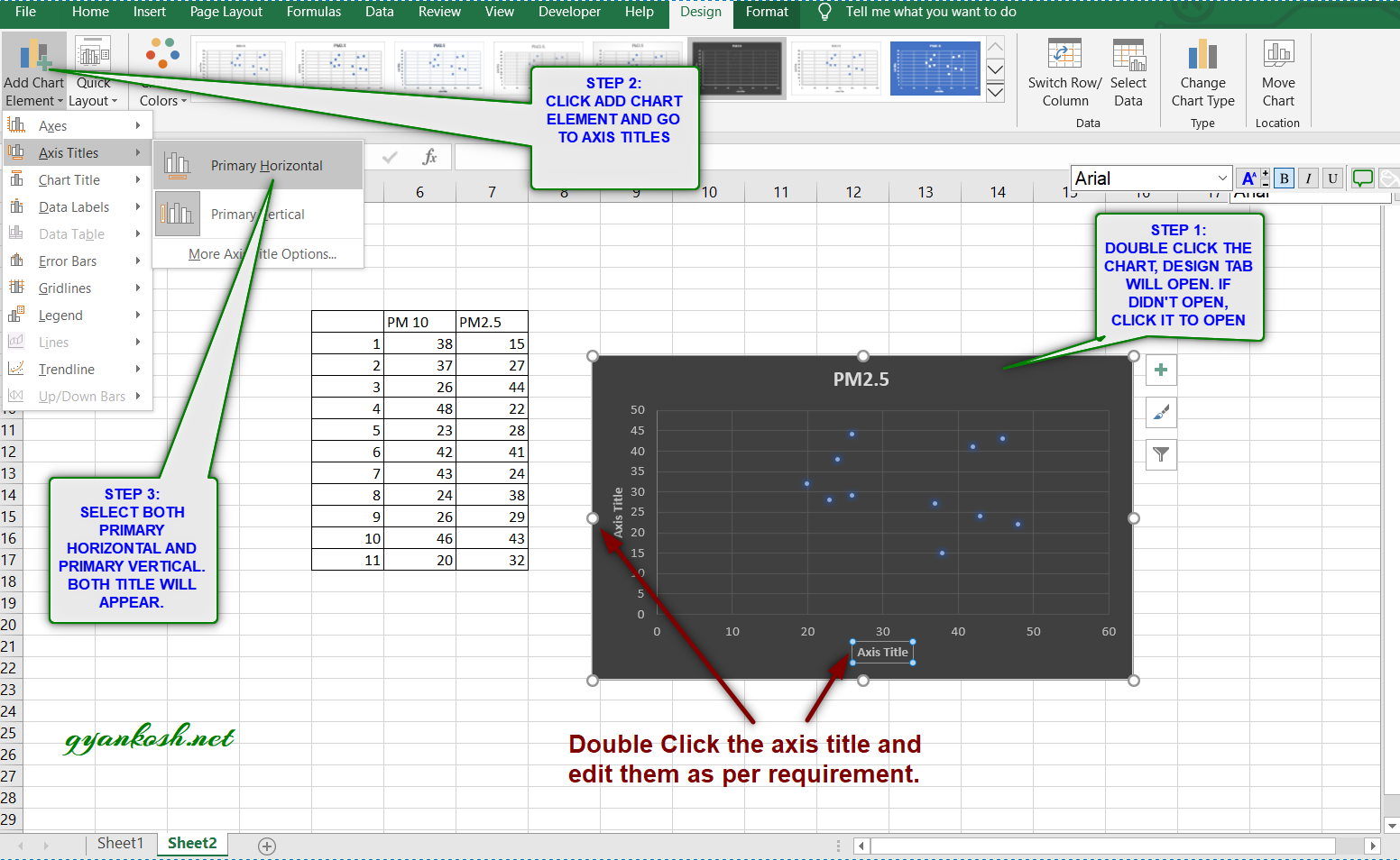
After editing the axis titles, chart names etc. , here is our final XY SCATTER CHART.
NOTE:CHANGING THE NAME OF THE CHART, CHANGING THE AXIS , CHANGING THE CHART STYLE ETC.
FOR ALL OTHER TASKS LIKE CHANGING THE NAME OF THE CHART, CHANGING THE AXIS , CHANGING THE CHART STYLE ETC. VISIT HERE [HOW TO CREATE A CHART IN EXCEL].
