Table of Contents
- INTRODUCTION
- WHEN DO WE USE MAP CHARTS ?
- BUTTON LOCATION FOR INSERTING COLUMN CHARTS
- STEPS TO CREATE A MAP CHART IN EXCEL
- CHANGE THE COLOR OF THE MAP CHART IN EXCEL
- ADDITIONAL OPTIONS IN MAP CHART IN EXCEL
- FAQs
INTRODUCTION
A new chart style has been introduced in EXCEL named as a MAP CHART.
As we all are familiar that charts give us a visual representation of the various data. It is a scientific proven fact that we understand better and faster if something is presented visually rather than the theoretical presentation.
MAP CHART facilitates us with the option of showing the data of different geographical regions of the earth.
We can show the data related to countries/regions, states, counties or postal codes. The complete world map will be shown and it’ll take help of the bing [Service of MICROSOFT] to locate your mentioned place.
The data against it can be shown in various ways.
In this article we would learn to use the MAP CHARTS in EXCEL.
WHEN DO WE USE MAP CHARTS ?
These charts are very appealing and creative.
Use these charts when you need to show any data related to different countries/regions, states, counties or postal codes.
For example, population of the world, crime rate, education, temperatures, any other data which relates any geography.
The good thing is the different options which we get with this map.
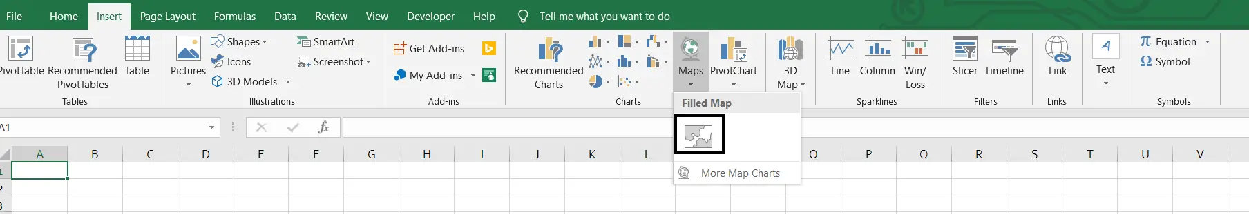
BUTTON LOCATION FOR INSERTING COLUMN CHARTS
Let us find out the option location present in Excel to create a MAP CHART.
The button for column chart is found under the INSERT TAB under the CHARTS SECTION.
STEPS TO CREATE A MAP CHART IN EXCEL
EXAMPLE DETAILS
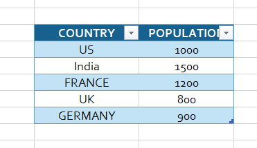
We can demonstrate a chart by the use of an example.
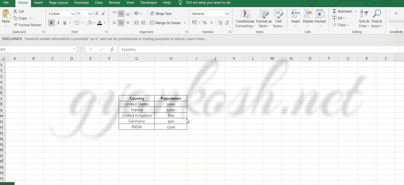
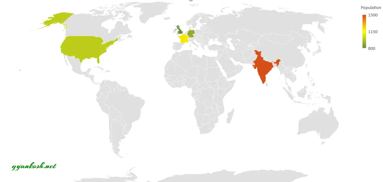
We will find out the population of the few countries in the world. Let us say our table is the following one.
The details are fictitious. Don’t go by them.
| COUNTRY | POPULATION |
| US | 1000 |
| India | 1500 |
| FRANCE | 1200 |
| UK | 800 |
| GERMANY | 900 |
The procedure to insert a MAP chart are as follows:
STEPS TO INSERT A MAP CHART IN EXCEL:
- Click anywhere on the table.
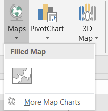
- Go to Insert> Charts> Maps>Filled Maps.
The complete process is shown in the animated picture below.
The MAP has been created.
After the map creation, we can go for some changes if we want. For example the changes in color etc.Let us try to change the color to different options.
CHANGE THE COLOR OF THE MAP CHART IN EXCEL
Now let us see how we can change the color of the map chart in excel.
The one we saw in the above column is a 2 color chart.
Now we will try a three color chart. Follow the steps to change the color scheme of the chart.
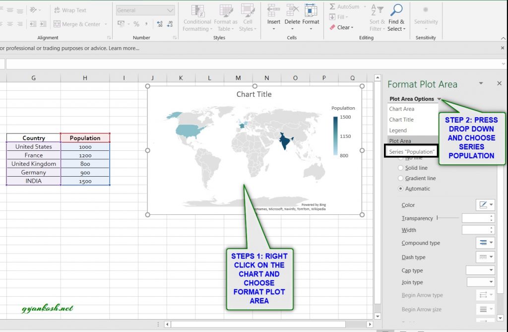
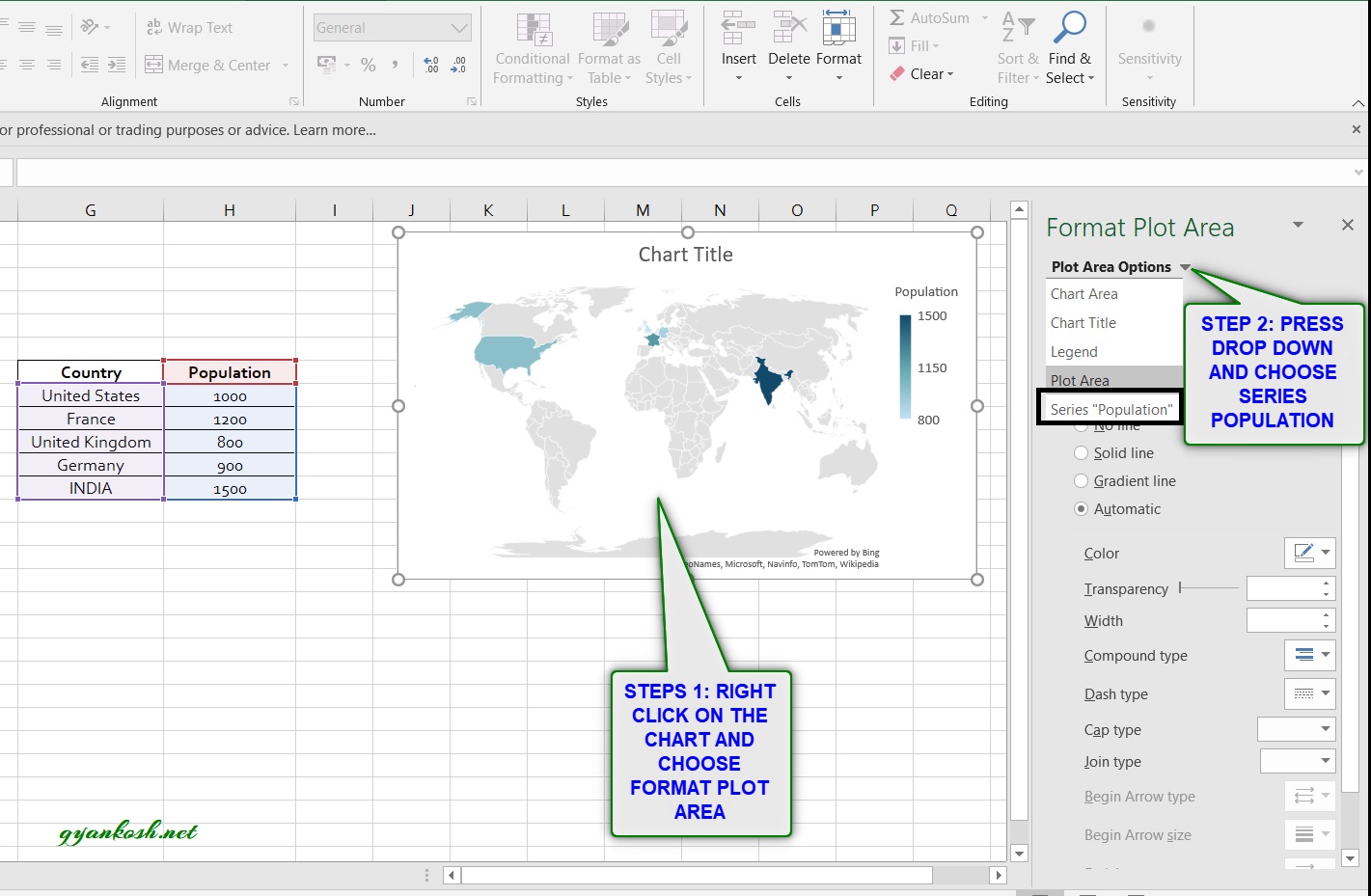
- Right Click on the chart and select FORMAT PLOT AREA. If we double click the chart, it gets open by that gesture too.
- Click the DROP DOWN as shown in the picture below and choose SERIES POPULATION as we are going to set the colors according to the series.
- After selecting the series we’ll get the following option. -SERIES OPTIONS AND SERIES COLOR
- Choose SERIES COLOR
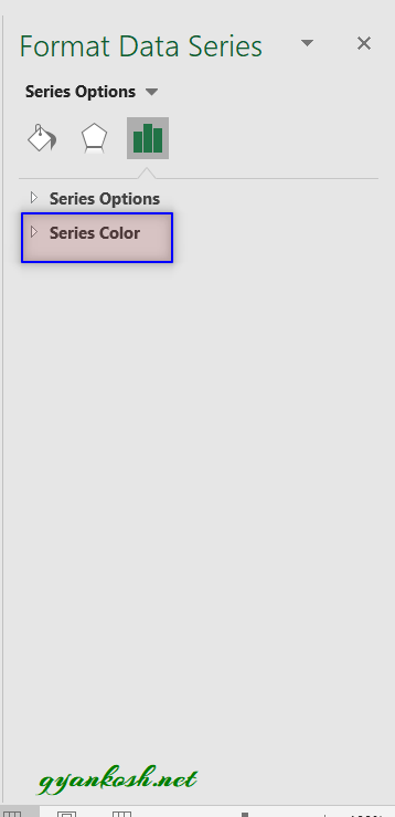
- After selecting the series we’ll get the following option. -SERIES OPTIONS AND SERIES COLOR
- Choose SERIES COLOR.
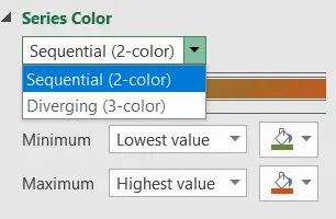
- After choosing the SERIES COLOR, we’ll find the new options of choosing a 2 color scheme or 3 color scheme.
- Choose 3 color scheme as 2 color scheme is already chosen.
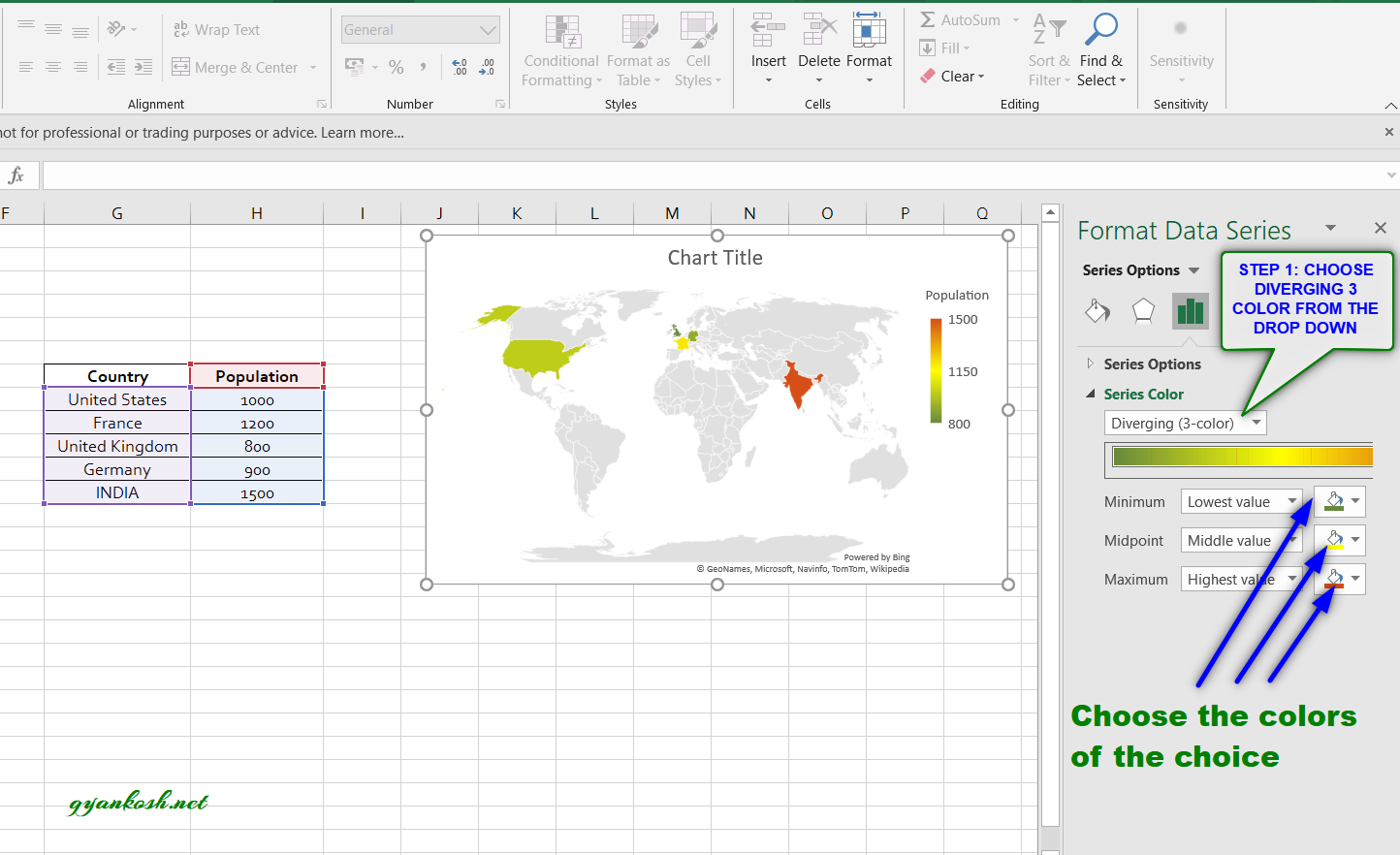
- The three color scheme gives us the option of choosing the different colors for lowest value , number or percentage through the middle value, number or percentage to the highest value, number or percentage.
- Choose the colors of the choice and the chart would change its colors as per the choice.
- If again want 2 color scheme. Repeat the procedure but choose 2 color scheme.
- The only difference is the present of middle value. We can choose two colors in this whereas three colors in the other scheme.
- Our colorful chart is ready. Here is the output.
ADDITIONAL OPTIONS IN MAP CHART IN EXCEL
There are a few more options available in the MAP CHART.For example, Adding labels to the countries, Setting the map projection and setting the map area.
Follow the steps to reach the options.
- Right Click on the chart and select FORMAT PLOT AREA. If we double click the chart, it gets open by that gesture too.
- Click the DROP DOWN as shown in the picture below and choose SERIES POPULATION .
- After selecting the series we’ll get the following option. -SERIES OPTIONS AND SERIES COLOR
- Choose SERIES OPTIONS.
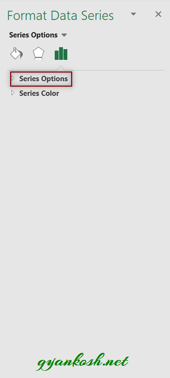
Series option in the MAP CHARTS have three options. We’ll discuss them one by one.
SETTING MAP PROJECTION IN MAP CHART IN EXCEL
The first option in the SERIES OPTIONS is setting the map projection.
MAP PROJECTION gives us the various types of projections available as the options in Map chart.
The options are MERCATOR, MILLER and ROBINSON. We can choose any of them.
By default AUTOMATIC OPTION gives us the best choice as per algorithm in EXCEL.
MAP PROJECTION IS THE WAY TO LAY THE GLOBE ON A FLAT PLANE. THERE ARE VARIOUS WAYS TO DO SO. THE MENTIONED THREE WAYS ARE ONE OF THEM.
Picture below shows the outputs of three different map projections available in the EXCEL.
Visually, you can choose the one you want.

SETTING MAP AREA IN MAP CHART IN EXCEL
MAP AREA can be chosen as per the need.
We have got two options for the MAP AREA [other than the automatic which Excel decides itself].
ONLY REGIONS WITH DATA:
This option will zoom the map and only focus on the region with the data. For example, if the data pertains to only one country, that country will be zoomed in and only the country map will be shown.
WORLD:
This option shows the complete World Map.
The picture below shows the output of both the options.

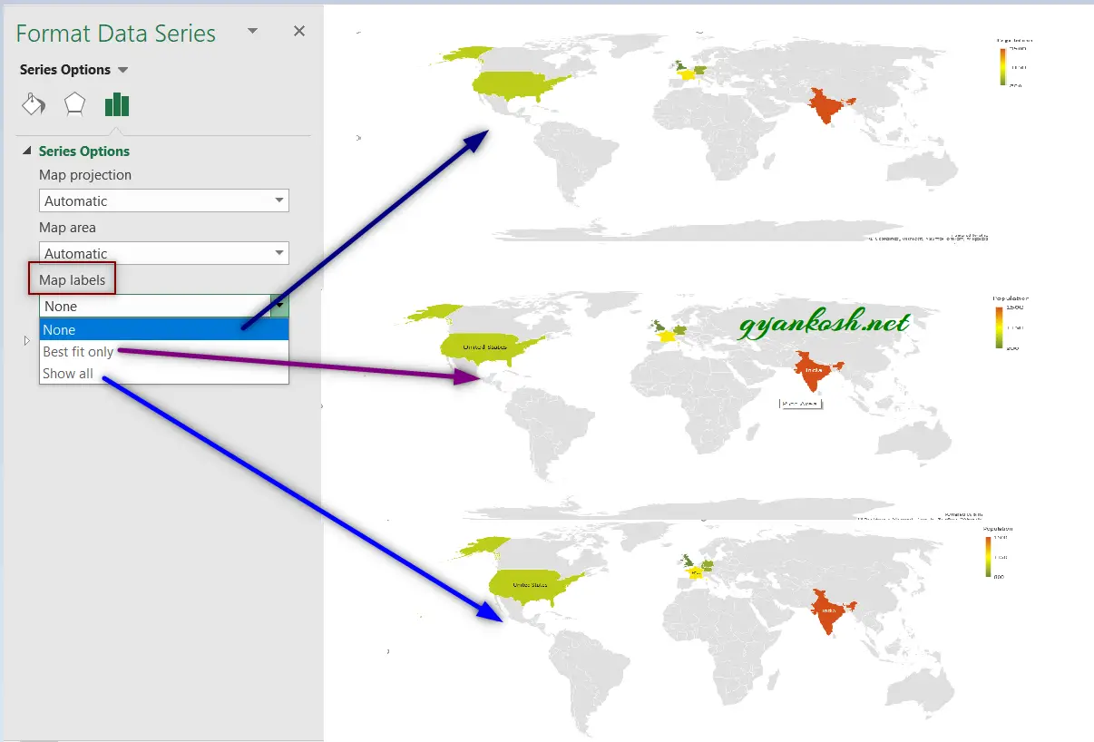
SETTING MAP LABELS IN MAP CHART IN EXCEL
The final option available for formatting the MAP CHARTS IN EXCEL is setting the labels on the maps.
Excel offers Three options for labels.
NONE: No labels.
BEST FIT ONLY: Label only those countries where the label fits easily. Look at the picture below , the European countries could not accommodate the label, so Excel didn’t name them.
SHOW ALL: Put label in all the locations whether the label fits or not. The picture shown below can be examined to see that European countries could not accommodate the name even then Excel tried to give one.
FAQs
Let us discuss a few random questions which might strike your mind.
WHICH COUNTRIES ARE COMPATIBLE WITH EXCEL’S MAP CHART?
Almost all the countries are compatible with Excel’s map chart.
You need not to worry about that.
Actually, Excel has introduced this new data type, which you must take care of, known as GEOGRAPHY DATA TYPE or GEOGRAPHY NUMBER TYPE. As soon as the datatype is changed to GEOGRAPHY, you can be sure that EXCEL has recognized the word as the name of a country or any place.
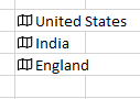
HOW TO RECOGNIZE THAT A PARTICULAR TEXT IS REPRESENTING A COUNTRY OR NOT?
Now, they have made this very easy too. A small icon will appear before the country name if it is properly linked. The following picture shows the same.
HOW TO CONVERT A COUNTRY NAME INTO GEOGRAPHY DATA TYPE?
Although, if you have already typed a few country names in a column or in a table, Excel would ask you if you want these names as GEOGRAPHY DATA TYPE? If not simply select the cell or cells containing the country names, go to DATA TAB and choose GEOGRAPHY DATA TYPE. [ It is noteworthy that not all versions of Excel support this data type. Excel 365 and higher support this data type. If you can’t find this, it is not supported for your version.]
After all this process, the icon of the GEOGRAPHY DATA TYPE will appear before the country names.
HOW TO CREATE A GEOGRAPHICAL MAP IN EXCEL?
There is no requirement of creating a geographical map in Excel. It is already available and we can make use of the same. Follow the same article from the top and you can make use of this.
I CAN’T FIND MAP CHART IN MY EXCEL 2007,2010,2013.
Map chart was introduced in EXCEL 2016 and higher versions. If you have Excel 2016 and still not finding this, try updating your EXCEL to the latest update meant for your Excel version by going to FILE>ACCOUNTS>UPDATES.
If still not finding this, perhaps it wasn’t made available to the particular version you are having. You might need to upgrade your version.
HOW TO ZOOM IN THE MAP CHART?
So, I was trying to zoom the map inside the chart, but couldn’t find any proper functionality to do the same.
But for fulfilling the purpose, we can increase or decrease the size of the chart by hold and drag one of the small discs which appears around the chart when we click the chart, just like the way we change the size of the picture.
THE SIZE OF THE MAP VISIBLE INSIDE THE CHART DEPENDS UPON THE COUNTRIES AND RESPECTIVE DISTANCE BETWEEN THEM GEOGRAPHICALLY. IF THE COUNTRIES ARE TOGETHER, THE MAP WILL BE FOCUSED ON THAT PARTICULAR PORTION ONLY AND WILL BE ENLARGED AUTOMATICALLY.
I WANT TO SHOW THE COMPLETE WORLD MAP, BUT EXCEL DOESN’T LET ME.
You can try one thing. Simply add a country [Dummy] which is at the other end of the map. Don’t give it any value.
Simply add this while creating a map chart. The chart will show a complete world map.