Table of Contents
- INTRODUCTION
- WHAT IS A PARETO CHART IN EXCEL?
- WHEN TO USE PARETO CHARTS
- BUTTON LOCATION FOR PARETO CHARTS
- STEPS TO CREATE A PARETO CHART IN EXCEL
- CONFIGURE PARETO CHARTS IN EXCEL
- ANALYSIS OF THE PARETO CHART
- NOTE:
- FAQs
INTRODUCTION
CHARTS are the graphic representation of any data .
Analysis of data is the process of deriving the inferences by finding out the trends, averages etc. about different parameters.
Data is everywhere. There is no work, where we don’t deal with the data. Sales data in business, employee data, patient data in hospitals, students data in school etc.
Maximum data is presented in the tables but we all know that visual representation is easier to interpret. That is the reason that as the Excel developed itself with time, so the charts options in Excel.
Excel gives us a variety of charts which are beautiful, colorful, more customizable and more powerful.
In this article we are going to discuss one particular type of the charts which are known as PARETO CHART.
PARETO CHART is used to contains both columns sorted in descending order and a line representing the cumulative total percentage.
PARETO CHART is used to show the biggest factor responsible for any process.It is one of the quality tools.
WHAT IS A PARETO CHART IN EXCEL?
A pareto chart has both columns chart and a line chart.
The Columns are sorted in Descending order and a line represent the cumulative total percentage.
It simply highlight the biggest factors in the given data and is one of the very important QUALITY CONTROL TOOLS as it’ll highlight the issues with respect to their contribution to the problems.
The first column will show the factor contributing the most to any problem.
A PARETO CHART is also known as a SORTED HISTOGRAM CHART.
WHEN TO USE PARETO CHARTS
PARETO CHARTS comprise of a histogram type graph in the descending order i.e. the first column represents the factor which has highest value to the last column which has the least value.
In addition to there is a line which shows the cumulative values together with the columns.
BUTTON LOCATION FOR PARETO CHARTS
Let us find out where we get the PARETO CHART option if available.
The button for column chart is found under the INSERT TAB under the CHARTS SECTION.
STEPS TO CREATE A PARETO CHART IN EXCEL
EXAMPLE DETAILS
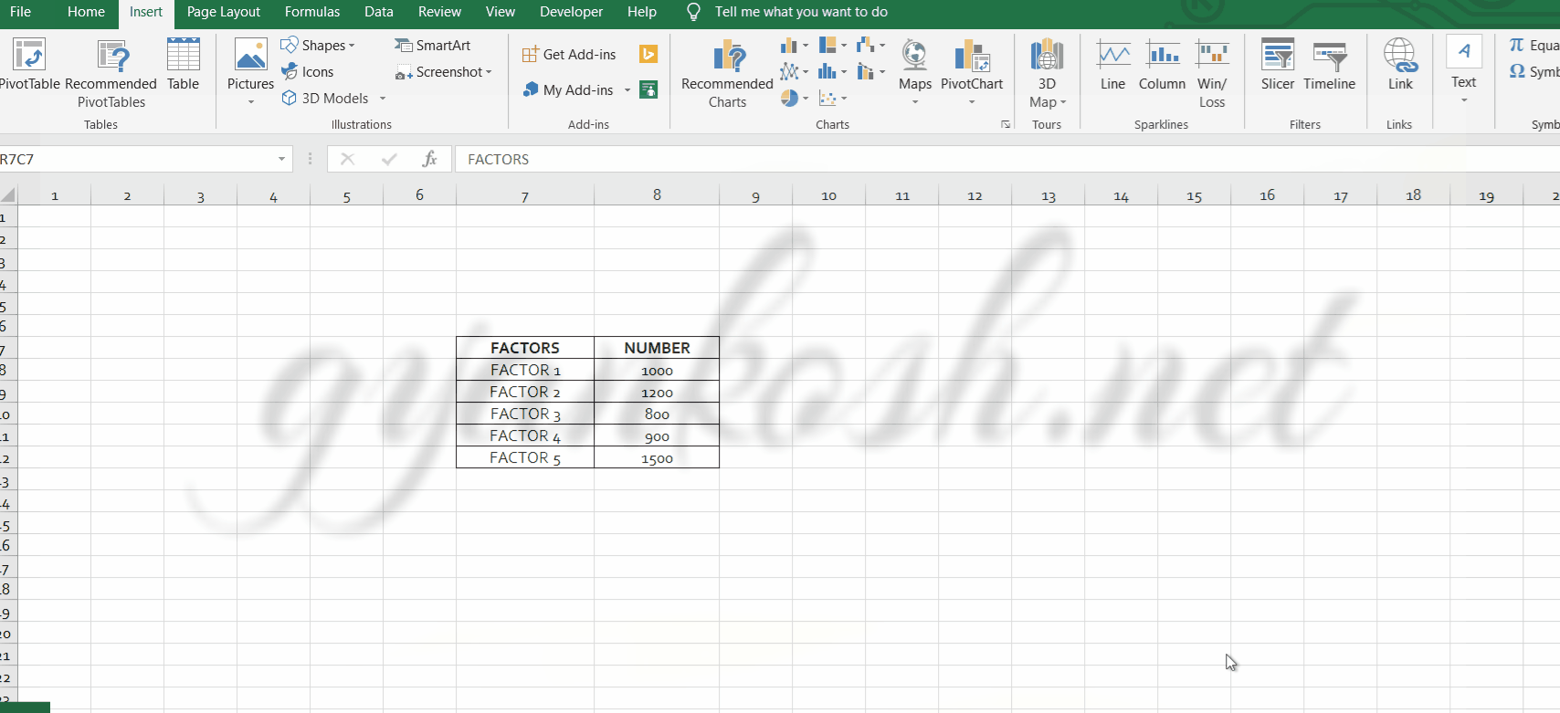
We can demonstrate the chart using an example. We are taking the example of a fictitious process. We have five factors, which can be any processes etc. with the values against them.
| FACTORS | NUMBER |
| FACTOR 1 | 1000 |
| FACTOR 2 | 1200 |
| FACTOR 3 | 800 |
| FACTOR 4 | 900 |
| FACTOR 5 | 1500 |
The procedure to insert a PARETO chart are as follows:
STEPS TO INSERT A PARETO CHART IN EXCEL:
- The first requirement of any chart is data. So create a table containing the data.[We have already created in the form of table above]
- Refer to our data above, we have a collection of different factors affecting a process.
- Select the complete table including the HEADER NAMES.
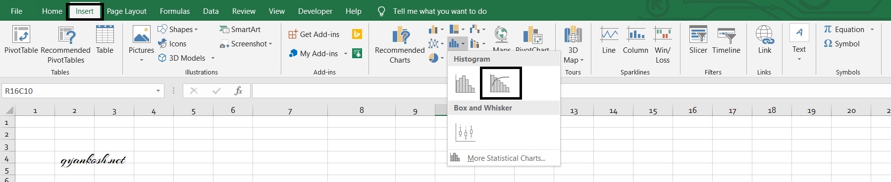
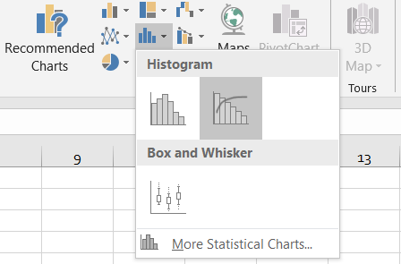
- Go to INSERT TAB> CHARTS>INSERT STATISTIC CHARTS and click the PARETO CHART button under HISTOGRAM as shown in the BUTTON LOCATION above and in the following picture for reference.
- The chart will be created and shown to you as the following figure.
The complete process is shown in the animated picture below.
So , we have successfully created a pareto chart in Excel.
We can see that EXCEL put the factors as per their descending values and put the columns as per the value of the factors which makes easy for us to find the most important factor at once.
Similarly the cumulative percentage value is also shown as a line graph.
CONFIGURE PARETO CHARTS IN EXCEL
HOW TO CONFIGURE BINS IN PARETO CHARTS
Follow the steps to configure bins in PARETO CHARTS.
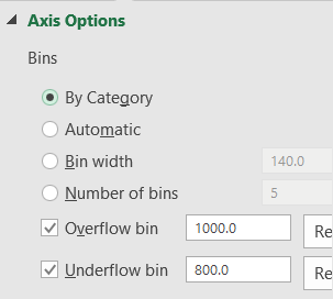
Bins are the number of different groups which we use to show our data.
Bins can be adjusted by many ways. For example,
by
- CATEGORY [ DEFAULT AS SHOWN ABOVE]
- BY WIDTH [WIDTH AS VALUE]
- NUMBER OF BINS[ THE VALUES WILL BE DIVIDED IN A SPECIAL PATTERN AND BINS WILL BE FORMED. THE NUMBER WILL BE INCLUDING OVERFLOW BIN AND UNDERFLOW BIN]
- OVERFLOW BIN [ ALL ABOVE VALUES WILL BE PUT IN THAT]
- UNDERFLOW BIN[ ALL LOWER VALUES WILL BE PUT IN THAT]
Follow the steps to change the BIN SIZE in PARETO CHART:
- Right Click on the horizontal axis >FORMAT AXIS>AXIS OPTIONS [ON THE RIGHT]
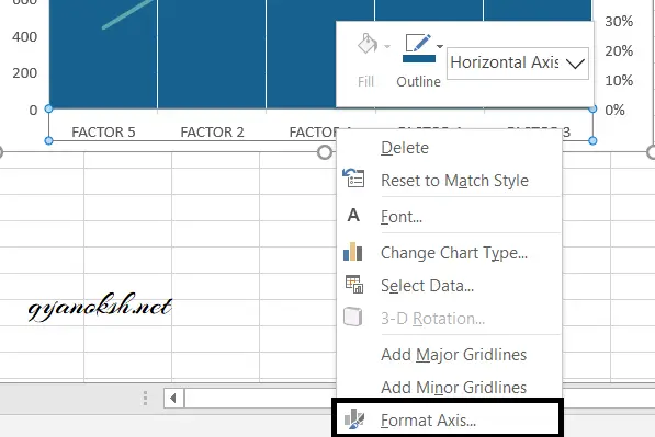
- The FORMAT AXIS BOX will open on the right.
- Go to the AXIS OPTIONS.
- Go to BINS.
- Choose the type of bin as per requirement.
- The chart will be redrawn as per the choice.
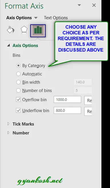
We can choose the bin type from the above options.
FORMULAS TO CREATE HISTOGRAMS [ THE COLUMNS IN PARETO CHART]
Scott’s normal reference rule: 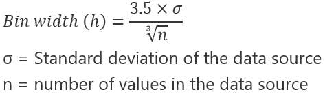
Scott’s normal reference rule tries to minimize the bias in variance of the Pareto chart compared with the data set, while assuming normally distributed data.
Overflow Bin 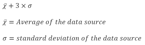
Underflow Bin  The final CHART AFTER CHANGING THE STYLE ETC. IS SHOWN HERE.
ANALYSIS OF THE PARETO CHART
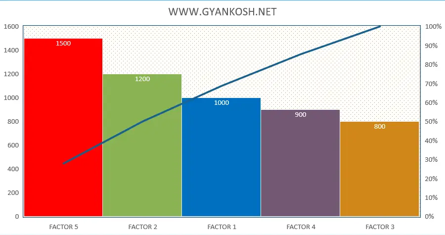
In the picture above, we had a data with various factors and their contribution.
In the result we can see that the factor which contributed most, has been put on the first place.
In the result picture above, we can see that FACTOR 5 is contributing the most. [ Of course this data is too small and we can do that visually too. But practical data is going to be too big to analyze visually.]
The LINE PLOT shows the cumulative percentage of the factors contribution.
For example, we can see that the first two factors are almost contributing more than 50% of the total.
NOTE:
FOR ALL OTHER TASKS LIKE CHANGING THE NAME OF THE CHART, CHANGING THE AXIS , CHANGING THE CHART STYLE ETC. VISIT HERE [HOW TO CREATE A CHART IN EXCEL].
- In this article, we learnt about the process of creating a PARETO CHART in EXCEL AND ITS CUSTOMIZATION.
FAQs
CAN I CREATE A PARETO CHART IN EXCEL?
Yes , you can.
Excel gives you a dedicated option to create a pareto chart which is pretty simple. But yes, you should have the correct version. Broadly, EXCEL 2016 and above are give this option.
CAN I CREATE PARETO CHART IN EXCEL 2010, 2013,2007 ?
Pareto chart option is given in EXCEL 2016 and above. So you won’t find this option in the lower version i.e. 2010, 2013,2007.
HOW TO INTERPRET A PARETO CHART IN EXCEL?
A very simple interpretation is given here. For in-depth details, you can read any book or google it.